Saginaw Historic Preservation
Style and Color Guide Key
Complete with Style Drawings & Color Charts
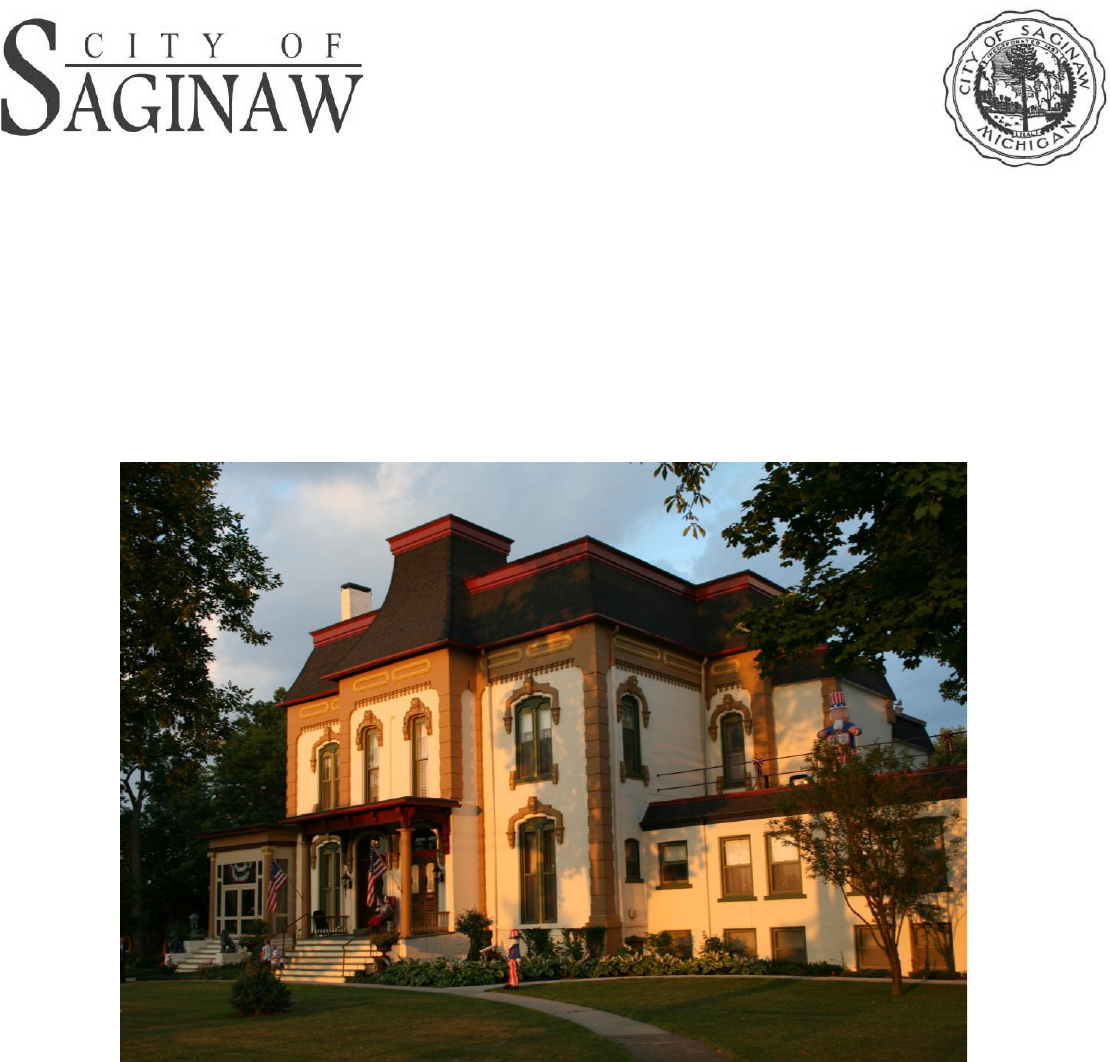
The Corning Mansion
Second Empire Architectural Style
Saginaw, Michigan
Rev. 02/2023
2
Paint and Color Guidelines
The Saginaw Historic Districts Style and Color Guide was developed according
to the study of architecture styles in designated historic districts and the
determination of historically accurate colors for those houses. A basic
classification system was developed consisting of twenty-three architecturally
stylistic classifications and six color systems. These twenty-three classifications
include composite and miscellaneous categories so that every building receives
a classification number and corresponding color system.
Paint colors should reflect the historical age
and style of the house, show the best
features of the design, and represent the
current owner's taste.
A house of one period rarely looks good with
colors of another period. For example, an
1870’s brick or stone house requires a dark
sash so that the windows will appear to
recede into the facade. A white sash, as
would be seen on a Colonial Revival style
house of c.1910, makes the windows stick out, thus projecting outward,
changing the relationship between the walls and the window openings.
There should be some thought given to the styles and colors used by owners of
other houses on the street or throughout the district. By ignoring the historically
appropriate palette for house style and district period, the owner risks injecting a
discordant note into the neighborhood that may directly influence the
appearance and property values of the entire area.
When dealing with historic neighborhoods, it is safer to select colors that are
contemporary with the date and style of the house, leaving ‘modern' colors for
simpler and often characterless suburban homes. This method of selecting
colors does not mean that every house in a neighborhood or of a particular
period and style should be painted the same color. There is a wide range of
attractive color which may be combined in hundreds of ways to provide for
individuality with overall neighborhood continuity. All of these combinations are
based on colors known to have been available and used in Saginaw throughout
the 19th and 20th-Centuries.
Rev. 02/2023
3
Color Systems
Nearly all houses built in America prior to
World War I were intended to be "defined"
by the trim color(s). Trim color is used to
define wood elements such as corner
boards, cornices, and outlining belt
courses along the siding. All these
elements are usually painted the major
trim color to provide contrast or definition
to the body color. In the same fashion, the
vertical and horizontal elements of the
porches are painted to provide an outline
of color in contrast to the body siding.
• Unpainted brick, stone, or stucco
buildings: The trim will be one color to provide contrast to the masonry
while harmonizing well with the color of the brick, stone, or stucco. Brick
structures are never painted.
• Frame or masonry buildings: The gutters and downspouts should be the
same color as the trim to which they are attached.
After the structure has been fully defined in the trim color, additional colors may
be introduced if appropriate to the system being followed. A good guideline to
follow is: the simpler the design of the structure, the fewer colors used.
• When the brackets are fabricated from three or more boards there is a
recessed scroll on the sides. In those cases the recesses are usually
picked out in the body color against the trim color (on a frame house) or in
a slightly lighter shade of the same color (in the case of a masonry
structure) to provide some contrast.
• Sash and shutters, however, may carry different colors from the main
trim color. As a general rule, these two elements will be the darkest parts
of the house. Especially for the houses erected between 1840 and 1900,
the sash should be darker than the trim, usually a deep reddish or
chocolate brown, dark green, olive, or even black.
• If wooden storm windows are available, they should be painted the sash
color. Shutters too, should usually be darker. Occasionally, they are
painted in the trim color with recessed panels picked out in a slightly

Rev. 02/2023
4
lighter shade of the same color. The use of multi-color schemes appears
to be rare.
• In general, roofs of Victorian homes were of natural materials such as
stained wooden shingles, slate, or tile and occasionally metal, such as
copper. The post Victorian era through the 1930s generally followed these
traditional colors and even the later introduction of asphalt colors tended to
imitate darker natural colors.
• Doors, likewise, should be stained or varnished to highlight natural wood;
painted to simulate rich wood; painted the same color as the trim; or
painted the same color as the sash. Generally, the doors should be of one
color with little or no picking out of details.
• Although wood shingles were stained in the past, most surviving shingles
have long since been painted. The colors given in the Color Systems
provide an accurate color scheme for additional repainting.
Paint Types
Today, all historic paints are recognized as semi-gloss. Any high-quality latex
paint is acceptable for most house painting.
Rev. 02/2023
5
STYLE AND COLOR GUIDE KEY
The Saginaw Historic District Style and Color Guide was developed according to the study
of architectural styles in designated historic districts and the determination of historically
accurate colors for those structures. A basic classification system was developed using
research on colors available during the period the structure was built. This color guide
uses California Paint Company’s historic buildings palette for continuity and broad
coverage of architectural styles. Most major paint manufacturers have historically
appropriate color schemes certified by the National Trust for Historic Preservation and can
match the color you choose from this guide.
Below you will find the different color systems and styles to help guide you on your
historically appropriate color scheme for your home or building.
NOTE: The online and printed style guide is provided for the public’s convenience by the
Saginaw Historic District Commission. The colors that appear on your screen or printer
may not be exact representations of the appropriate colors to use on your building.
Commission approval is not required for “touch up” painting when using the exact
same color. However, if painting with a new colors, commission approval is
necessary.
COLOR SYSTEM A
COLOR SYSTEM B
Mid-Century Vernacular (1830-1860)
Composite Victorian (1850-1900)
Eastlake (1870-1890)
French Renaissance (1860-1890)
Gothic Revival (1840-1880)
Italianate (1830-1890)
Queen Anne (1880-1900)
Queen Anne/Romanesque (1870-1900)
Romanesque Revival (1870-1900)
Second Empire (1840-1880)
Shingle (1880-1900)
Stick (1860-1890)
*NOTE: Brick and stone is never painted.
Only trim portions on these structures.
Rev. 02/2023
6
COLOR SYSTEM C
COLOR SYSTEM D
COLOR SYSTEM E
COLOR SYSTEM F
Colonial Revival (1890-1900)
Neo-Dutch Colonial (1910-Present)
Neo-Georgian (1900-1940)
Post-1940 Colonial (1940-Present)
*NOTE: Brick and stone is never painted.
English Revival (1900-Present)
*NOTE: Only trim is painted, never brick.
Bungalow (1900-1940)
Prairie (1900-1920)
*NOTE: Only trim is painted, never brick.
Mediterranean (1900-1940)
Neo-Classical (1890-1920)
*NOTE: Brick and stone is never painted.
Stucco is allowed.
Rev. 02/2023
7
COLOR SYSTEM C, D, E, F
Miscellaneous Color System
20th Century Composite (1900-1940)
*NOTE: Brick and stone is never painted.
Stucco is allowed.
20th Century Miscellaneous (1900-Present)
*NOTE: Brick and stone is never painted. Stucco
is allowed.
Rev. 02/2023
8
Detailed Style and Color Guide
ARCHITECTURAL BUILDING TYPES:
Mid-19
th
Century Vernacular (1830-1860)
Early Victorian houses, those erected between c.1840 and c.1870, display a variety of
color schemes than the white clapboard or board-and-batten structures with white window
frames, sash, and dark green shutters, that were popular in America from c.1800 to
c.1840. Although white may still be employed, the majority of buildings show a greater use
of color, even on relatively simple structures.
The trim colors on masonry structures of this early date, following the new color scheme,
should blend harmoniously with the brick or stone color.
Also, painted stucco structures require paint that matches the original sand color
(determined by examining a broken fragment). Otherwise, use Yarmouth Oyster, Andover
Cream, Jonquil, or Gable Green and paint the trim the same color as the clapboard
structures.
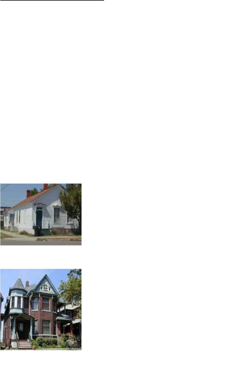
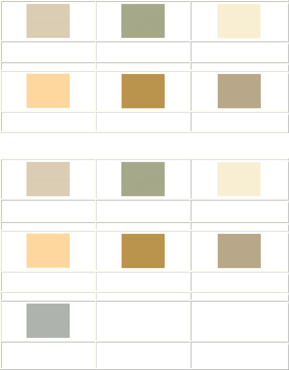
In the mid-1800s, many inexpensive, small frame residences were built in Saginaw. The
Heritage Square Historic District contains several of these simple, one to two story
dwellings, often called "workingman's" or "laborer's cottages." Typically rectangular in
plan, with clapboard or board-and-batten siding, these modest dwellings were often
influenced by the Italianate or Carpenter Gothic Styles. Ornament was minimal, the
exposed rafters or brackets supporting projecting gable roofs, the wooden hoods over the
windows, and the wooden carvings in the gables suggested the picturesque character of
more substantial dwellings.
Rev. 02/2023
9
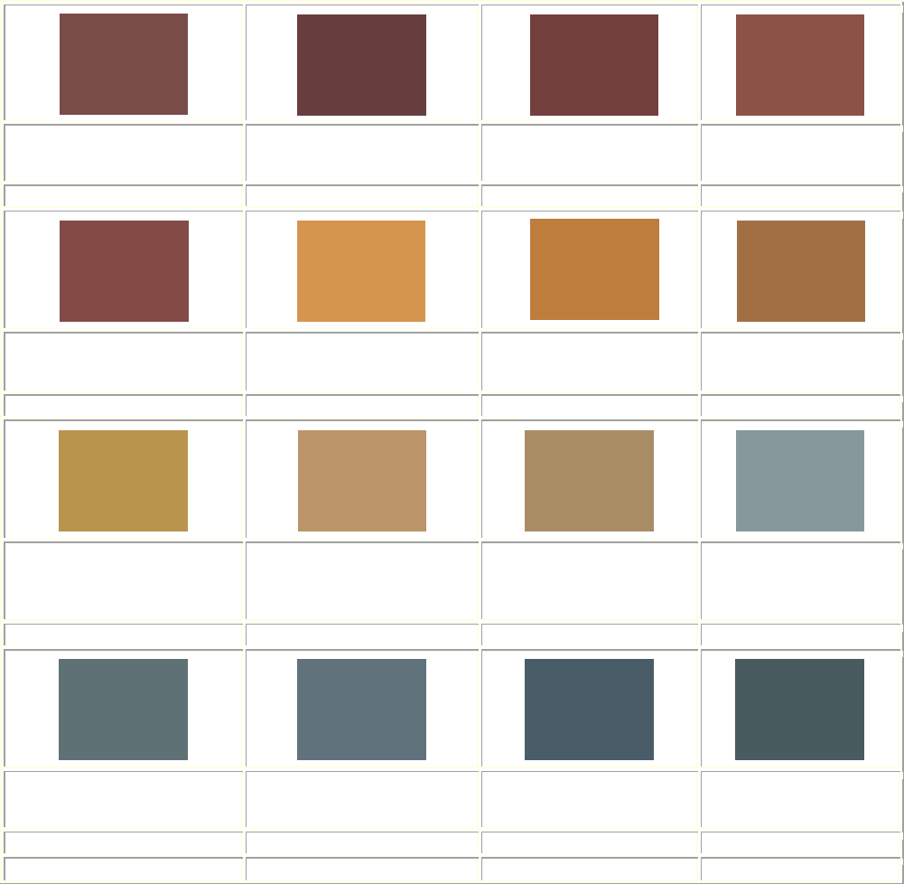
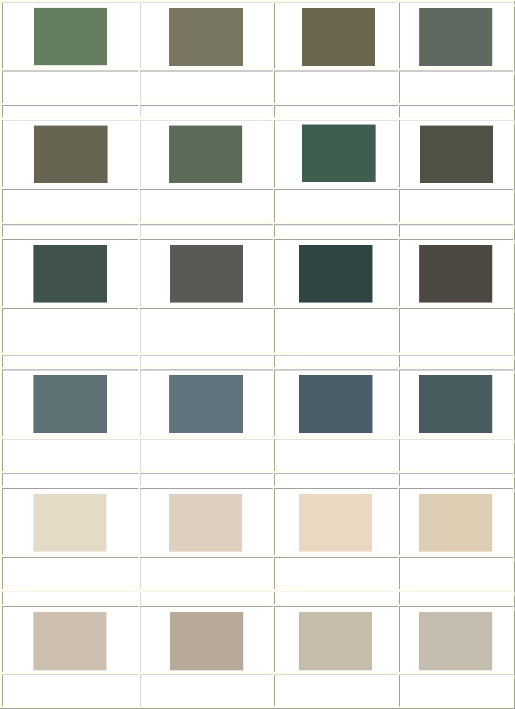
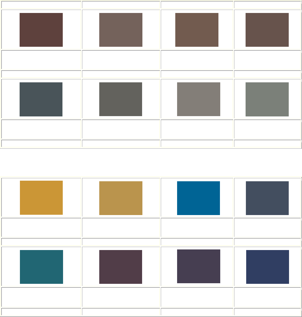
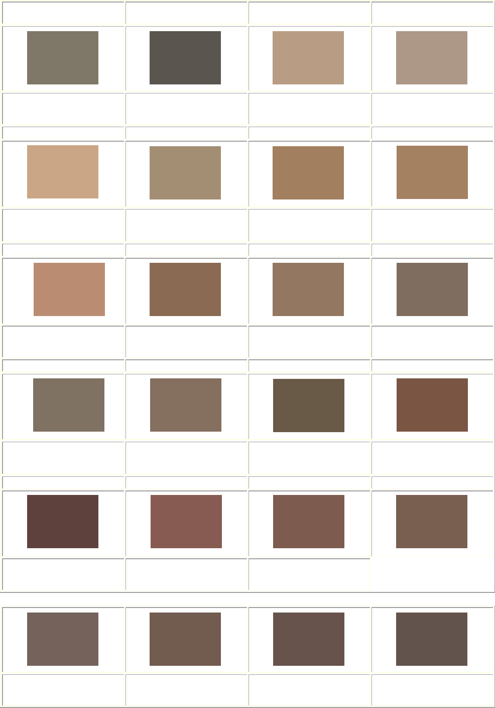
ACCEPTABLE COLOR COMBINATIONS *Based on California Paint. RGB Color Standard
NOTE: The colors that appear on your screen may not be exact representations of the
appropriate colors to use on your building.
Exterior: Siding (clapboards) Brick or stone is NEVER painted.
Yarmouth Oyster
RGB: 219, 204, 180
Wainscott Green
RGB: 159, 156, 131
Andover Cream
RGB: 248, 238, 209
Jonquil
RGB: 254, 215, 159
Gable Green
RGB: 186, 148, 76
Bayberry Wax
RGB: 183, 168, 137
Trim Choices (corner boards, crown moldings, wooden brackets, window hoods,
ornamentations)
Yarmouth Oyster
RGB: 219, 204, 180
Wainscott Green
RGB: 159, 156, 131
Andover Cream
RGB: 248, 238, 209
Jonquil
RGB: 254, 215, 159
Gable Green
RGB: 186, 148, 76
Bayberry Wax
RGB: 183, 168, 137
Vinal Haven
RGB: 175, 179, 174
Rev. 02/2023
10
Window Sash (or match trim choice)
Brattle Spruce
RGB: 68, 69, 66
Shutters (or match trim choice)
Richardson Brick
RGB: 129, 76, 70
*The RGB color system is a means to visually identify and match color for anything from
paint to fabrics.
RGB stands for Red, Green, Blue, the primary colors. Each parameter (red, green, and
blue) defines the intensity of the color with a value between 0 and 255. This means that
there are 256 x 256 x 256 = 16777216 possible colors!
For example, an RGB value of 255, 0, 0 is displayed as red, because red is set to its
highest value (255), and the other two (green and blue) are set to 0.
RGB: 255, 0, 0
The RGB color model standard specifies 256 shades for red, green, and blue spaces,
totaling 16 million colors, much more than what the human eye can distinguish, which is
only 10 million colors.

Rev. 02/2023
11
Detailed Style and Color Guide
COLOR SYSTEM B
ARCHITECTURAL BUILDING TYPES:
Composite Victorian (1850-1900) Eastlake (1870-1890)
French Renaissance (1860-1890) Gothic Revival (1840-1880)
Italianate (1830-1890) Queen Anne (1880-1900)
Queen Anne / Romanesque (1870-1900) Romanesque Revival (1870-1900)
Second Empire (1840-1880) Shingle (1880-1900)
Stick (1860-1890) Mid-Century 19
th
Vernacular (1830-1860)
The explosion of styles in the High and Late Victorian periods required a deeper palette of
colors to unify the diverse elements of these designs and to highlight the variety of
materials and textures used by Saginaw’s architects and builders. At the same time, paint
manufacturers such as the Acme White Lead Works in Detroit and other national firms with
a strong market in the region, such as the Sherwin Williams Company, developed ready-
mixed paints in re-sealable cans in ever-richer and darker colors. Deep olives, browns, and
greens in a wide variety of shades became readily available for the first time. While the
light colors of the mid-century were manufactured throughout the High and Late Victorian
periods (and consequently could, historically, be used on the later styles), the lighter colors
were generally used on simple frame buildings. The more imposing High and Late
Victorian structures, especially when erected of brick or stone, require the darker colors to
bring out their best features, particularly the window frames and sash which almost
universally were painted darker than the main body color to make the windows appear to
recede into the facade.
The trim color for masonry buildings of this period should always be selected with the color
of the brick or stone in mind. Because the natural materials have already determined the
overall body color of the house - red, brown, or yellow brick, green or gray stone, for
example - the trim color should tend towards the earth tones: browns, yellows, greens,
olives, and grays. Modern pastels, especially pale yellows, blues, and pinks simply are
historically incorrect. Occasionally black was suggested as a sash color to provide contrast
to one of the browns or greens used for the window frames. This was a logical
consequence of trimming a brick or stone building in a color darker than the masonry and
then seeking an even darker color for the sash.
If the structure has stone detailing (above windows and doors, for example) it would be
appropriate to paint the cornice or porch a color that matches the stone, selecting a darker
color for the window frames and sash. If the structure has iron cresting, railings, or
brackets they should be painted, black, dark brown, or green. Often such details were
painted to look like weathered bronze.
Shingle Style houses or those with shingles in the gables pose a special problem.
Normally it was recommended that these surfaces be stained, although most surviving
examples have long since been painted. The colors of this stain (or, if repainting, the paint)
should follow the colors given, with the darker greens, olives, browns and yellows (in that
order) being the most popular.
Rev. 02/2023
12
Composite Victorian 1850 - 1900 Color System B
The architecture of the Victorian Period was known for its eclecticism. The combination
of styles, including Greek, Italianate, Gothic, Romanesque, Colonial, Stick, Queen
Anne, French and others, resulted in buildings which are difficult to categorize.
Examples of composite styles are found in most of the Historic Districts. A unique
example in the South Jefferson Avenue Historic District; 307 South Jefferson, appears
castle like and combines Gothic and Flemish elements in a manner typical of the
Victorian eclectic. Most examples, however, tend to have more where various Queen
Anne and Colonial elements were added in an unusual way to a basic hip-roof box.
Rev. 02/2023
13
Eastlake 1870 - 1890 Color System B
Like the Queen Anne and Stick Styles, Eastlake was another decorative and
picturesque Victorian Style. Eastlake residences had irregular massing similar to
Queen Anne, but were typically more compact and vertical, and generally had no
tower or encircling veranda; porches instead tended to be small with a mansard
roof. Carved wooden porch posts, railings, gable and window ornamentation were
often massive and knoblike, loosely taken from the style Eastlake furniture, popular
at the time. Two story bay windows were common as were shingled gables. The
majority of Eastlake Style residences remaining in Saginaw are masonry with
wooden ornamentation. Therefore, the frame Eastlake residences at 616 South
Warren and 748 South Park Avenue are a rare and valuable example.
Rev. 02/2023
14
French Renaissance 1860 - 1890 Color System B
The French Renaissance style is often referred to as the Chateauesque since
earlier examples were based on the Chateaux of 16th Century France. The unique
Castle Museum of Saginaw County History is an impressive example. A massive
limestone body is topped with a very steep, hipped slate roof which is pierced with
pointed picturesque elements including elaborately carved dormers and wall
gables. Round or faceted towers and turrets, and tall elaborate chimneys add to the
irregular and picturesque silhouette. Rectangular windows, typically grouped in
twos or threes have stone mullions and transoms.
Rev. 02/2023
15
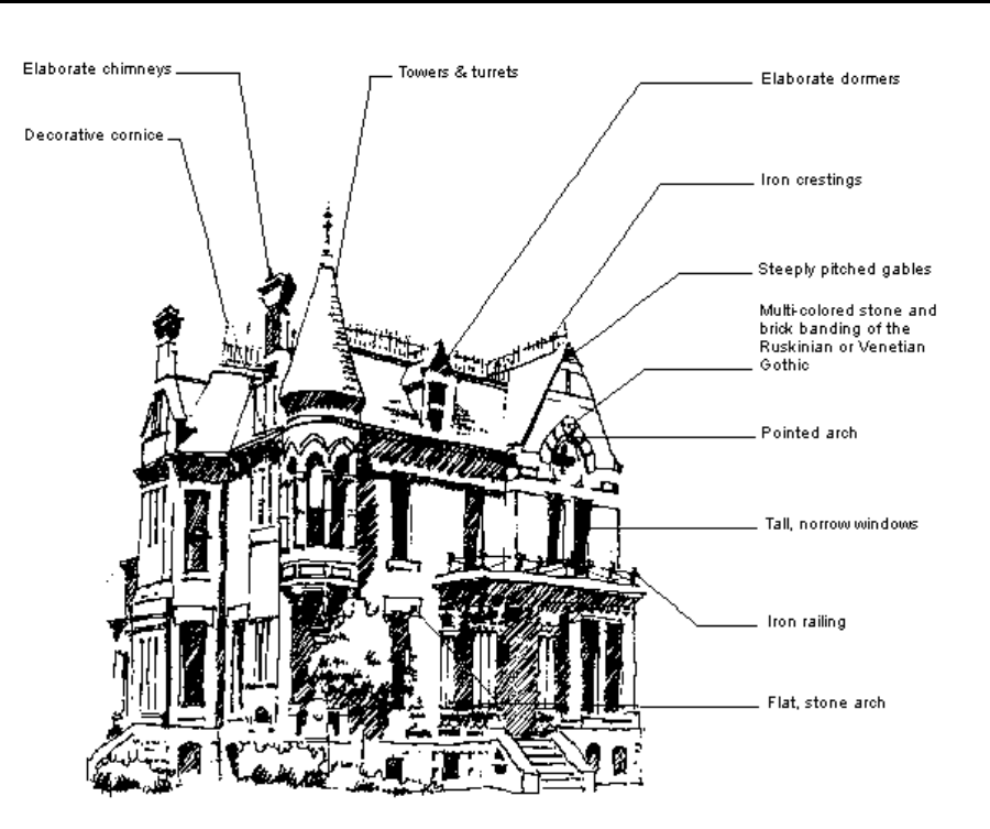
Gothic Revival 1840 - 1880 Color System B
The Gothic Revival, in reaction to the classical formalism of the Greek Revival, was
a picturesque style with multiple gables, wings, porches and dormers. Steeply
pitched hip and gable roofs, often decorated with bands of multi-colored slate and
punctured by dormers and elaborate, high chimneys, gave a vertical character to
Gothic residences which was achieved by the spires in the churches of this style.
Pointed or straight-headed arches over tall doors and windows were often striped,
and multi-colored bands at floor levels were characteristic of the Ruskinian or
Venetian Gothic of the late 19th Century. Decorative woodwork at the gables,
eaves, dormers and porches evolved from the Carpenter Gothic of the mid-Century.
Though many of the mid to late Century churches remaining are Gothic Revival,
there are very few residential examples.
Rev. 02/2023
16
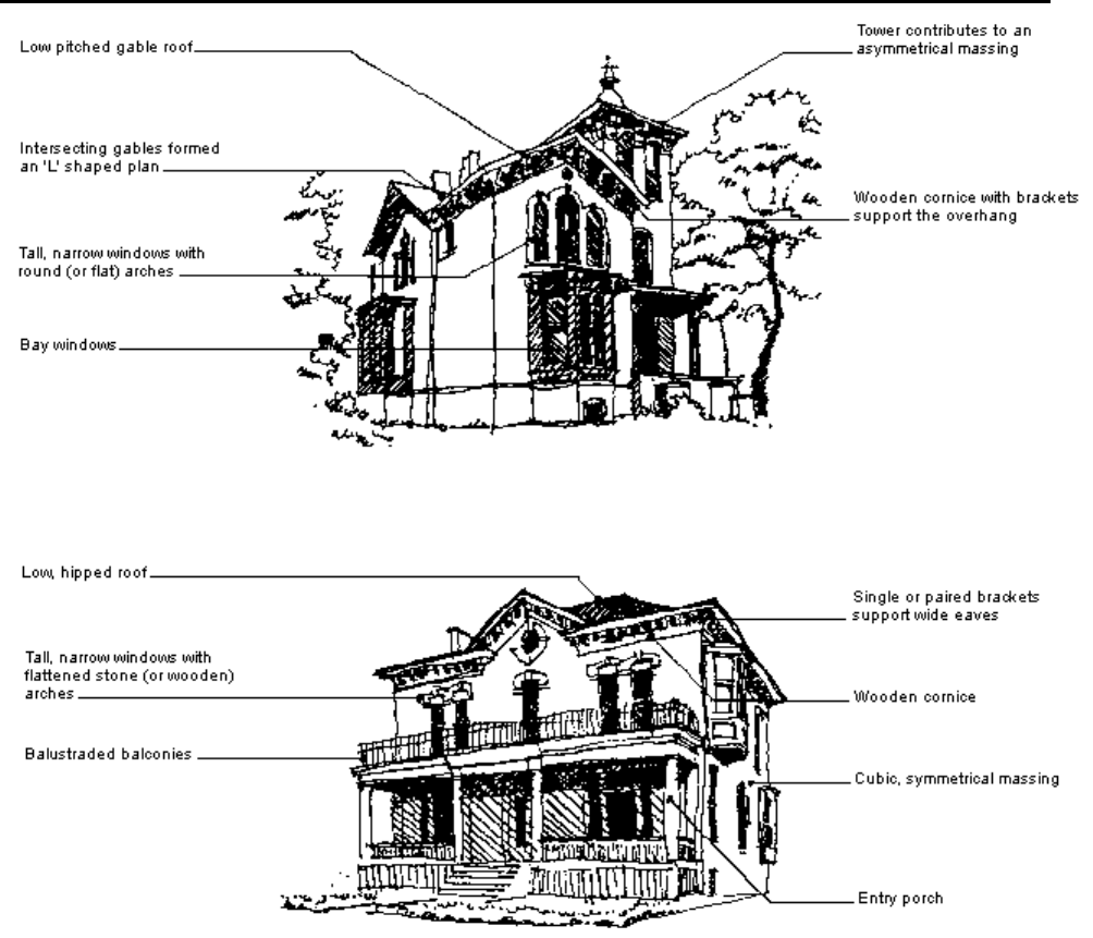
Italianate 1830 - 1890 Color System B
Suited to Gothic asymmetry or classical symmetry, the Italianate was one of the most popular
styles of the mid-to late 19th Century. L-shaped plans with gable roofs and the addition of
towers and bay windows created the picturesque Italian Villa while the rectangular or square
mass with a low hip roof and symmetrical facade were typical of the Italianate Style at its
simplest. Facades of many late 19th Century commercial buildings were also adorned with the
detailing of this versatile style. Earlier examples were often frame structures with board and
batten or stucco finishes (See Mid-Century Vernacular). The typically low pitched, hip or gable
roofs with intersecting gables have characteristic wooden cornices and single or paired
brackets supporting wide eaves. Tall, narrow windows, typical of the Victorian Styles, have
round or flat, brick, stone or wooden arches. One or two story bay windows are common, as
are verandas, balconies, and entry porches. A notable example is the Passolt mansion at
1105 S. Jefferson Avenue and another at 321 S. Jefferson Avenue (though heavily modified
from its original 19
th
century appearance).
Rev. 02/2023
17
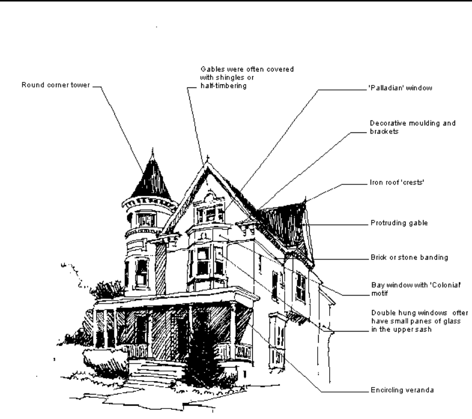
Queen Anne 1880 - 1900 Color System B
The Queen Anne Style combined elements of the Stick and Eastlake Styles with
Colonial elements such as Palladian windows and doors with fan and sidelights.
Irregular silhouettes, with gables, turrets, towers, tall and elaborate brick chimneys, and
encircling verandas contributed to the picturesqueness of the style. Wall surfaces and
gables were broken up by a variety of textures and materials including clapboard siding,
half-timber, wooden shingles in various shapes, decorative brick work and carved
brownstone and cast terra cotta. With the influence of the Richardsonian Romanesque,
Shingle and Colonial Revival Styles on late Queen Anne houses, airy gingerbread was
replaced with heavier, simple motifs. This combination of styles resulted in late 19th
Century residences that are difficult to describe simply. Queen Anne homes are found in
all of Saginaw’s historic districts. Two notable examples are the J.C. Caskey mansion
at 503 S. Jefferson and the Frank J. Wolfarth mansion at 1000 Hoyt Avenue.
Rev. 02/2023
18
Queen Anne / Romanesque 1870 - 1900 Color System B
The Queen Anne Style combined elements of the Stick and Eastlake Styles with Colonial
elements such as Palladian windows and doors with fan and sidelights. Irregular silhouettes, with
gables, turrets, towers, tall and elaborate brick chimneys, and encircling verandas contributed to
the picturesqueness of the style. Wall surfaces and gables were broken up by a variety of textures
and materials including clapboard siding, half-timber, wooden shingles in various shapes,
decorative brick work and carved brownstone and cast terra cotta. With the influence of the
Richardsonian Romanesque, Shingle and Colonial Revival Styles on late Queen Anne houses,
airy gingerbread was replaced with heavier, simple motifs. This combination of styles resulted in
late 19th Century residences that are difficult to describe simply. One outstanding example is the
Clarence Hill Mansion at 523 South Jefferson Avenue and another at 307 S. Jefferson Avenue,
affectionately referred to as “The Castle”. Queen Anne homes are found in all of Saginaw’s
Historic Districts.
Rev. 02/2023
19
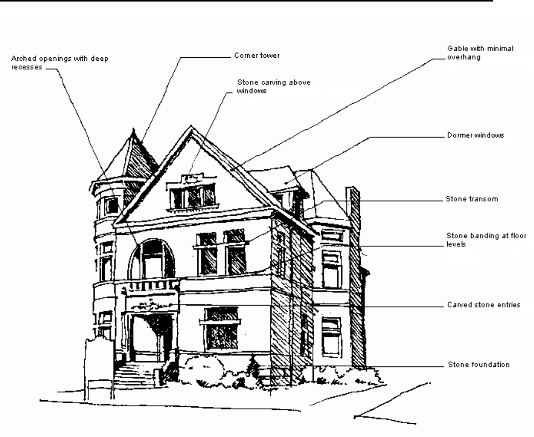
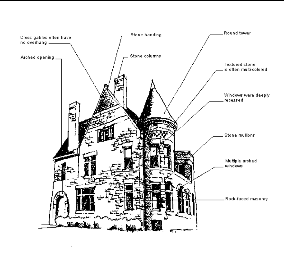
Romanesque Revival 1870 - 1900 Color System B
Romanesque dwellings are built of rock-faced masonry or brick walls are patterned with
variously colored and textured stone or brick window trim, arches and belt courses.
Multiple round-arched openings are sometimes supported by polished stone columns.
Square or round-arched windows have stone mullions and transoms. Roofs combine a
steep hip with a cross gable, and are often pierced with small dormers and short
chimneys. The picturesque quality of the plan, roof, and tower are very much like the
Queen Anne Style. With the influence of the architect H.H. Richardson, however, the
style took on a heavier, more horizontal appearance and the monochrome rock-faced
masonry walls were rougher and pierced by deep windows and heavy arched entries. A
famous Saginaw home of this style that is still standing is the Charles Lee Mansion at
633 South Washington Avenue.
Rev. 02/2023
20
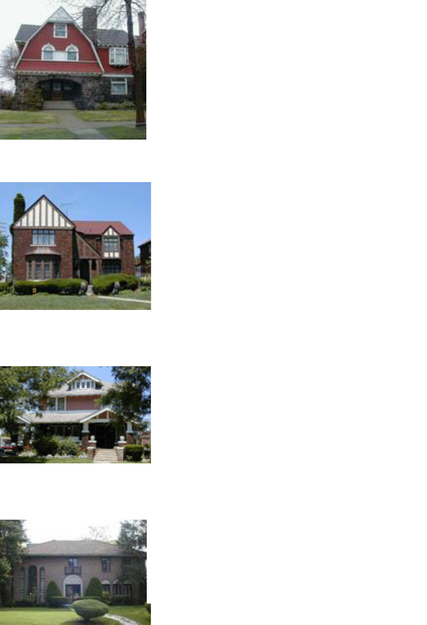
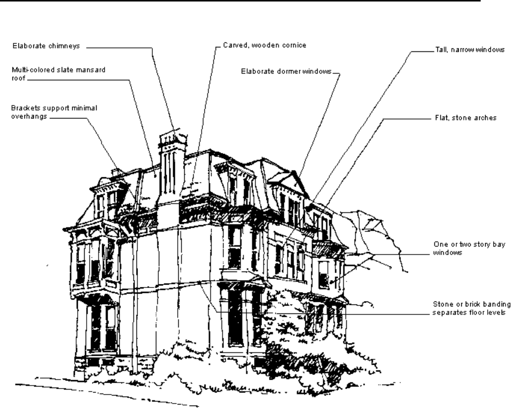
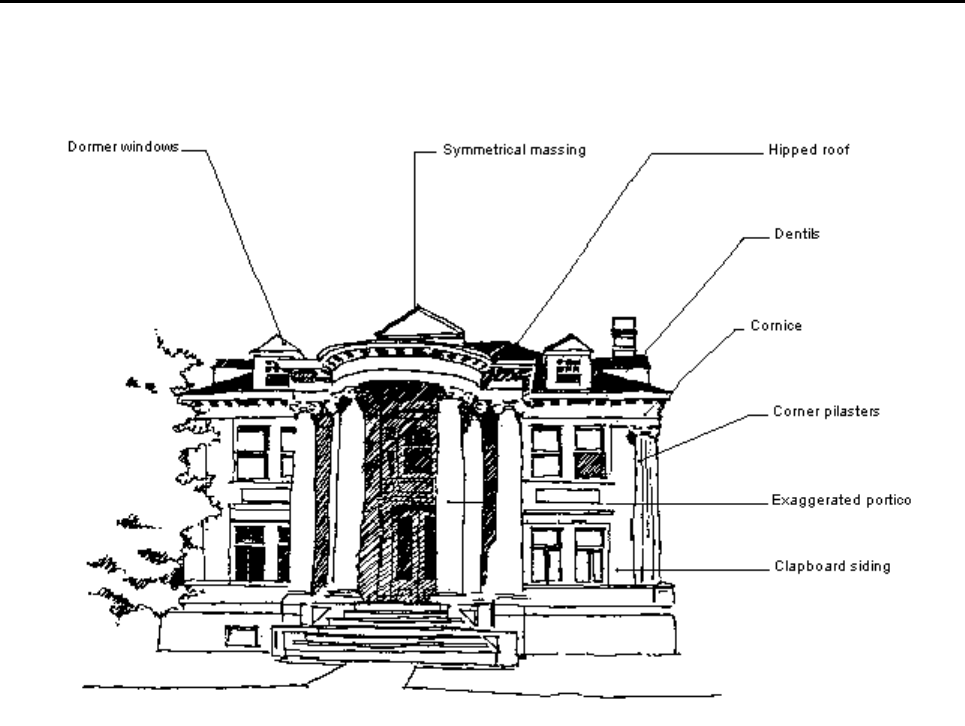
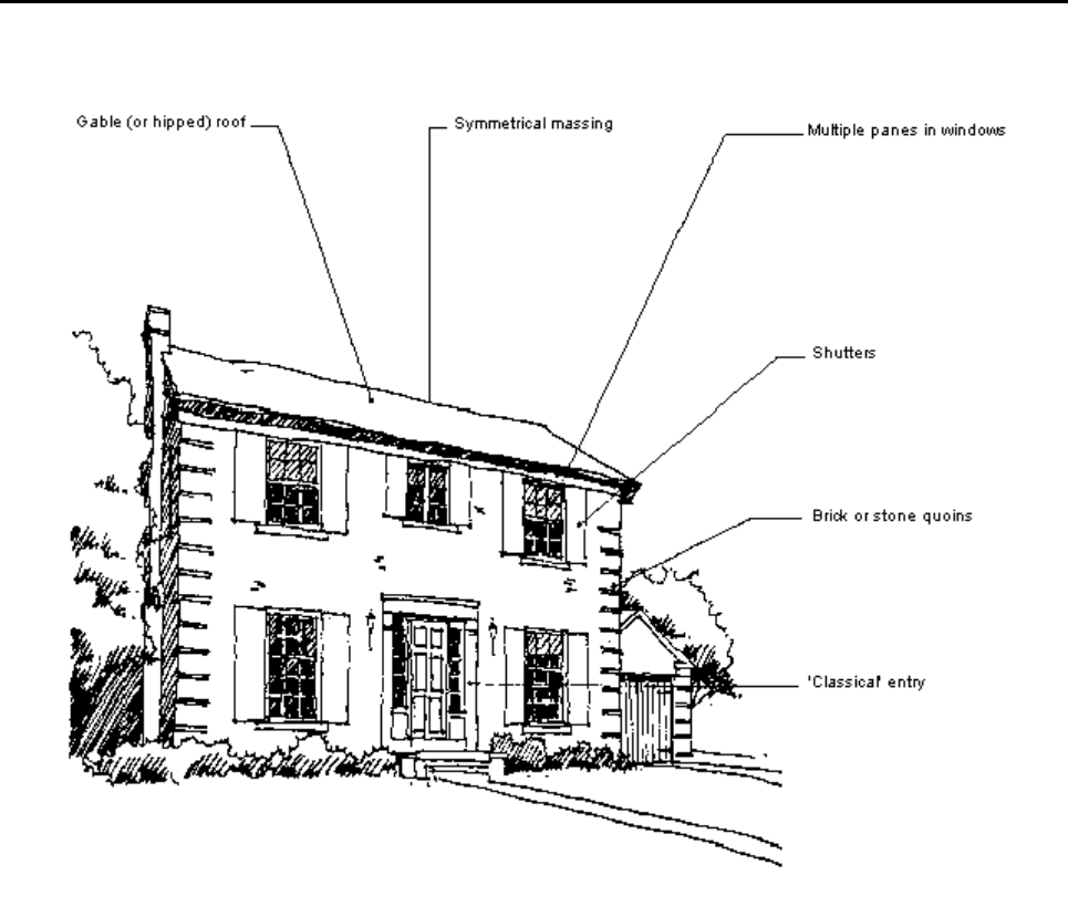
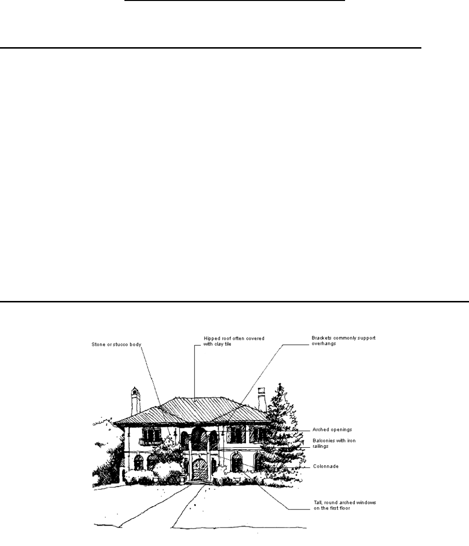
Second Empire 1840 - 1880 Color System B
The second empire style in America began by using French elements, specifically the French
Mansard roof, on the Italianate style residence. Therefore, like the Italianate style, the Second
Empire could be either symmetrical or asymmetrical in mass, with or without a square tower. The
tall paired windows with flat or curved arches, the one or two story bay windows and the brackets
were also characteristics shared with the Italianate Style, while the multi-colored slate roofs and
stone or brick banding at the floor levels and windows were characteristics often found in the
Victorian Gothic Style. A wonderful example of the style is the Corning Mansion, also known as
“The Home” at 1446 South Washington Avenue in an area once called “The Grove”.
Rev. 02/2023
21
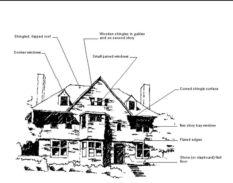
Shingle 1880 - 1900 Color System B
The informal simplicity and strength of the shingle style evolved from the Queen Anne and
Richardsonian Romanesque Styles, with Colonial elements frequently used. A horizontal
profile was emphasized by bands of different materials, typically a clapboard or stone
lower floor with a dominating wooden shingle upper floor. Well defined entries, often with a
large arch, fixed windows with small panes of glass, two story bays and eyebrow dormers
were common characteristics. The low rambling profile and large verandas of the Shingle
Style were well suited to the resorts which became extremely popular in the opulent
1880's. However, the style was adapted to suburban sites as well. The flowing nature of
the Shingle surface is evident in the flared edges and curved surfaces at door and window
openings. However, the confines of the city or suburban lot and the lack of sea views and
breezes tended to restrain the typically rambling plan and profile and diminished the need
for the large verandas found on the East Coast.
Rev. 02/2023
22
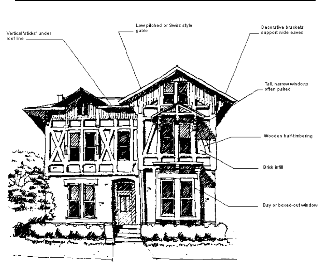
Stick 1860 - 1890 Color System B
The Stick Style combined the influences of the carpenter Gothic and Swiss Styles with medieval
half- timbering. Asymmetrical massing and tall proportions created a picturesque character typical
of 19th Century styles. Diagonal framing members with brick or clapboard infill resembled half-
timber construction or an exposed balloon frame. Rafters or brackets supported wide overhangs
and decorative stick- work in the gables and at porches, created an airy character.
Rev. 02/2023
23
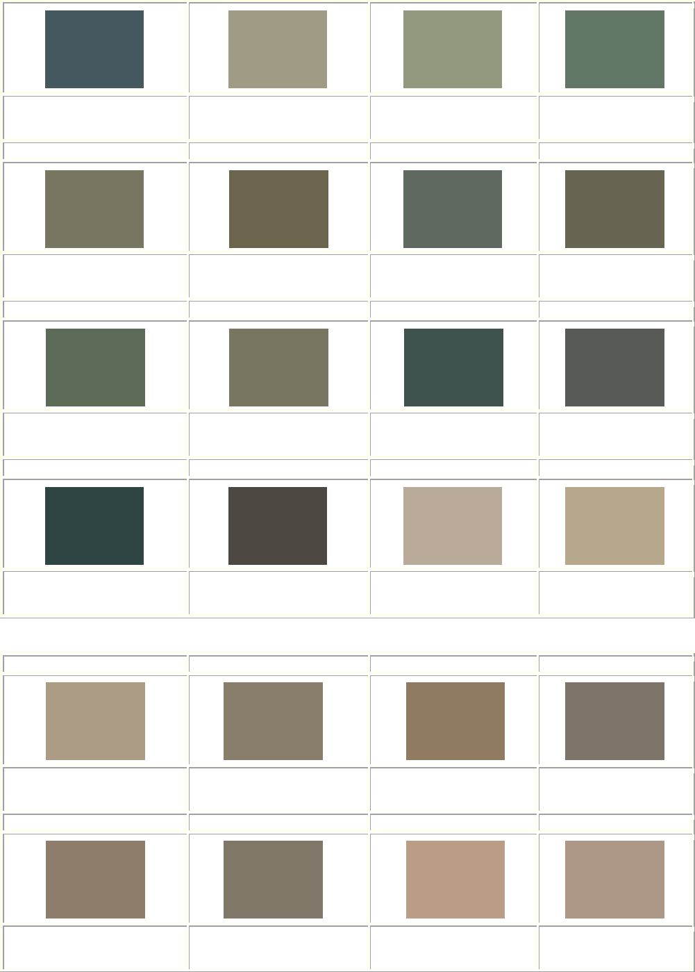
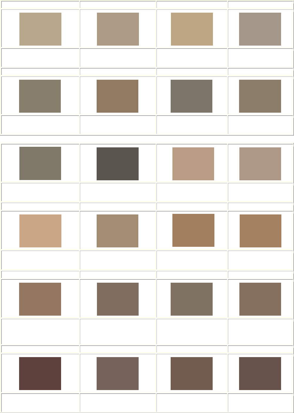
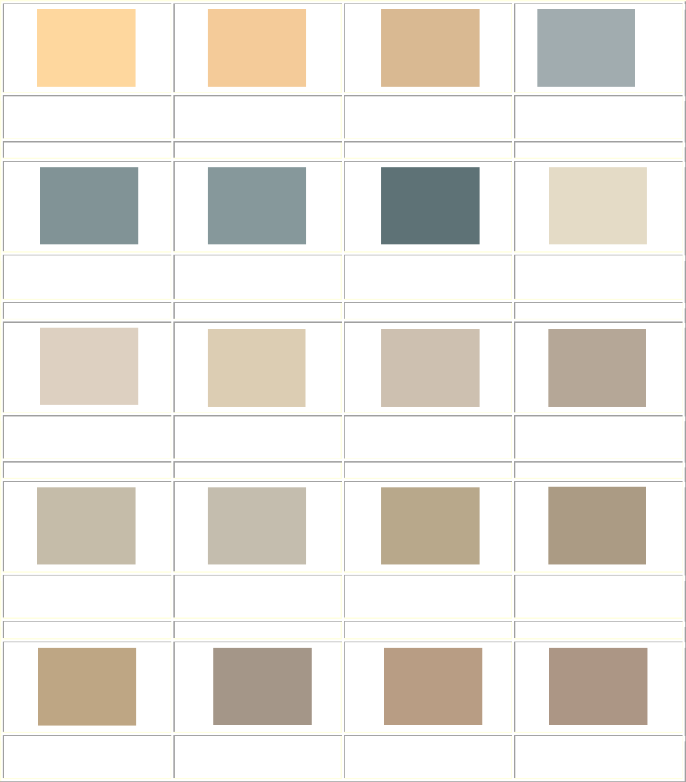
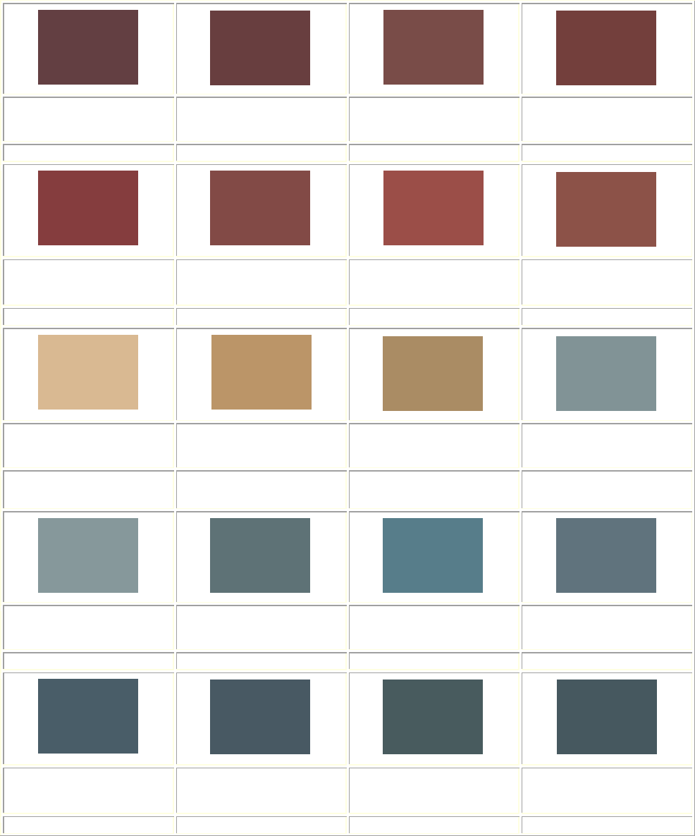
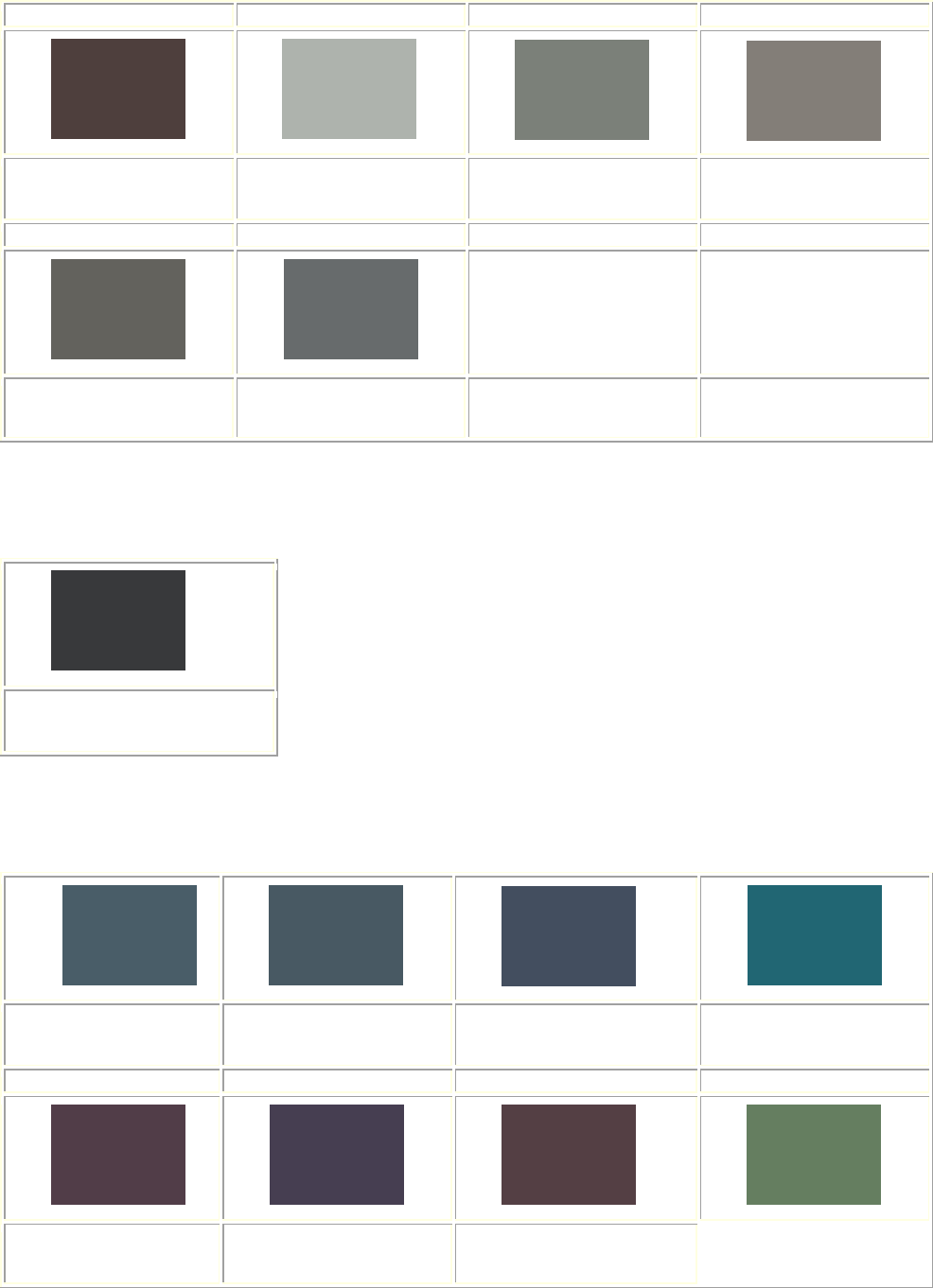
Color System B
ACCEPTABLE COLOR COMBINATIONS *Based on California Paint. RGB Color Standard
NOTE: The colors that appear on your screen may not be exact representations
of the appropriate colors to use on your building.
Queen Anne / Stick / Tudor Styles 1875-1900
Exterior Siding (Clapboards / Shingles) Stone & Brick are NEVER painted.
Alden till
RGB: 122, 76, 73
Covered Bridge
RGB: 104, 63, 61
Shaker Red
RGB: 116, 64, 60
Cogswell Cedar
RGB: 140, 83, 73
Richardson Brick
RGB: 129, 76, 70
Georgian Yellow
RGB: 211, 148, 78
Farmhouse Ochre
RGB: 189, 126, 60
English Bartlett
RGB: 161, 112, 68
Gable Green
RGB 186, 148, 76
Danish Pine
RGB: 186, 149, 103
Canyon Gold
RGB: 169, 139, 100
Standish Blue
RGB: 134, 152, 154
Portsmouth Blue
RGB: 94, 115, 118
Winter Harbor
RGB: 96, 116, 126
Saxon Blue
RGB: 71, 92, 102
Volute
RGB: 72, 91, 94
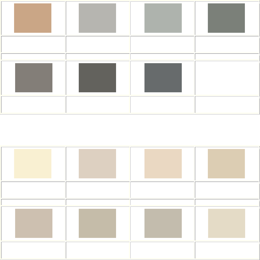
Rev. 02/2023
24
Asher Benjamin
RGB: 71, 89, 95
Wainscot Green
RGB: 159, 156, 131
Whispering Willow
RGB: 147, 153, 126
Brookside
RGB: 97, 118, 100
Boardman
RGB: 120, 118, 97
Warren Tavern
RGB: 107, 100, 79
Hazelwood
RGB: 95, 105, 96
Newbury Moss
RGB: 101, 101, 82
Picholine
RGB: 91, 107, 87
Baize
RGB: 78, 84, 70
Gedney Green
RGB: 65, 83, 77
Pointed Fir
RGB: 88, 92, 85
Winter Balsam
RGB: 47, 70, 68
Moss Glen
RGB: 76, 73, 67
Langdon Dove
RGB: 183, 170, 153
Bayberry Wax
RGB: 183, 168, 137
Sandy Bluff
RGB: 172, 156, 134
Pettingill Sage
RGB: 136, 126, 105
Wooly Thyme
RGB: 143, 123, 98
Burnished Pewter
RGB: 125, 117, 105
Milkweed
RGB: 140, 125, 105
Pitch Pine
RGB: 127, 119, 103
Nankeen
RGB: 184, 157, 130
Winter Meadow
RGB: 171, 151, 134
Rev. 02/2023
25
Coastal Sand
RGB: 202, 167, 132
Britches
RGB: 161, 142, 115
Toffee
RGB: 162, 128, 93
Ginger Root
RGB: 164, 130, 95
Palomino
RGB: 147, 119, 96
Portobello
RGB: 117, 110, 95
Tankard Gray
RGB: 126, 114, 99
Cummings Oak
RGB: 105, 89, 70
Otis Madeira
RGB: 94, 64, 60
Tyson Taupe
RGB: 115, 99, 88
Rawhide
RGB: 98, 84, 76
Monument Gray
RGB: 123, 128, 122
Fieldstone
RGB: 130, 127, 121
Gropius Gray
RGB: 100, 98, 93
Polished Pewter
RGB: 102, 106, 107
Exterior Trim (Wood columns, spindles, brackets, trim work)
Beetroot
RGB: 98, 62, 67
Madder
RGB: 116, 77, 80
Covered Bridge
RGB: 104, 63, 61
Alden Till
RGB: 122, 76, 73
Shaker Red
RGB: 116, 64, 60
Richardson Brick
RGB: 129, 76, 70
Cogswell Cedar
RGB: 140, 83, 73
India Trade
RGB: 223, 159, 98
Rev. 02/2023
26
Pumpkin
RGB 189, 115, 65
Jonquil
RGB: 254, 215, 159
Knightley Straw
RGB: 242, 203, 153
Asian Jute
RGB: 216, 185, 146
Georgian Yellow
RGB: 211, 148, 78
Goldenrod
RGB: 224, 175, 86
Farmhouse Ochre
RGB: 189, 126, 60
English Bartlett
RGB: 161, 112, 68
Danish Pine
RGB: 186, 149, 103
Canyon Gold
RGB: 169, 139, 100
Citadel Blue
RGB: 160, 172, 173
Lexington Blue
RGB: 128, 146, 147
Standish Blue
RGB: 134, 152, 154
Portsmouth Blue
RGB: 94, 115, 118
Rocky Hill
RGB: 88, 125, 138
Winter Harbor
RGB: 96, 116, 126
Saxon Blue
RGB: 71, 92, 102
Seal Blue
RGB: 72, 89, 100
Volute
RGB: 72, 91, 94
Asher Benjamin
RGB: 71, 89, 95
Beauport Aubergine
RGB: 82, 62, 67
Wainscot Green
RGB: 159, 156, 131
Whispering Willow
RGB: 147, 153, 126
Brookside
RGB: 97, 118, 100
Rev. 02/2023
27
Grasshopper
RGB: 101, 126, 95
Boardman
RGB: 120, 118, 97
Warren Tavern
RGB: 107, 100, 79
Hazelwood
RGB: 96, 105, 96
Newbury Moss
RGB: 101, 101, 82
Picholine
RGB: 91, 107, 87
Amish Green
RGB: 64, 94, 78
Baize
RGB: 78, 84, 70
Gedney Green
RGB 65, 83, 77
Pointed Fir
RGB: 88, 92, 85
Winter Balsam
RGB: 47, 70, 68
Moss Glen
RGB: 76, 73, 67
Portsmouth Blue
RGB: 94, 115, 118
Winter Harbor
RGB: 96, 116, 126
Saxon Blue
RGB: 71, 92, 102
Volute
RGB: 72, 91, 94
Jewett White
RGB: 229, 219, 202
Plymouth Beige
RGB: 220, 209, 193
Wild Oats
RGB: 235, 216, 194
Yarmouth Oyster
RGB: 219, 204, 180
Parsnip
RGB: 204, 193, 176
Langdon Dove
RGB: 183, 170, 153
Jackson Antique
RGB: 196, 188, 169
Phelps Putty
RGB: 196, 188, 172
Rev. 02/2023
28
Bayberry Wax
RGB: 183, 168, 137
Sandy Bluff
RGB: 172, 156, 134
Flaxen Field
RGB: 189, 165, 132
Rain Barrel
RGB: 164, 151, 137
Pettingill Sage
RGB: 136, 126, 105
Wooly Thyme
RGB: 143, 123, 98
Burnished Pewter
RGB: 125, 117, 105
Milkweed
RGB: 140, 125, 105
Pitch Pine
RGB: 127, 119, 103
Sturgis Gray
RGB: 89, 85, 79
Nankeen
RGB: 184, 157, 130
Winter Meadow
RGB: 171, 151, 134
Coastal Sand
RGB: 116, 64, 60
Britches
RGB: 161, 142, 115
Toffee
RGB: 162, 128, 93
Ginger Root
RGB: 164, 130, 95
Palomino
RGB 147, 119, 96
Portobello
RGB: 127, 110, 95
Tankard Gray
RGB: 126, 114, 99
Hitching Post
RGB: 133, 112, 96
Otis Madeira
RGB: 94, 64, 60
Tyson Taupe
RGB: 115, 99, 88
Wooden Nutmeg
RGB: 116, 91, 80
Bargeboard Brown
RGB: 104, 83, 76
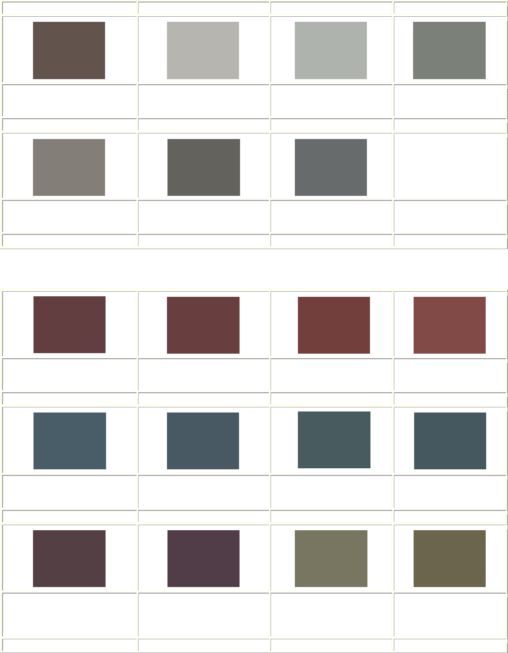
Rev. 02/2023
29
Rawhide
RGB: 98, 84, 76
Quincy Granite
RGB: 182, 181, 175
Vinal Haven
RGB: 175, 179, 174
Monument Gray
RGB: 123, 128, 122
Fieldstone
RGB: 130, 127, 121
Gropius Gray
RGB: 100, 98, 93
Polished Pewter
RGB: 102, 106, 107
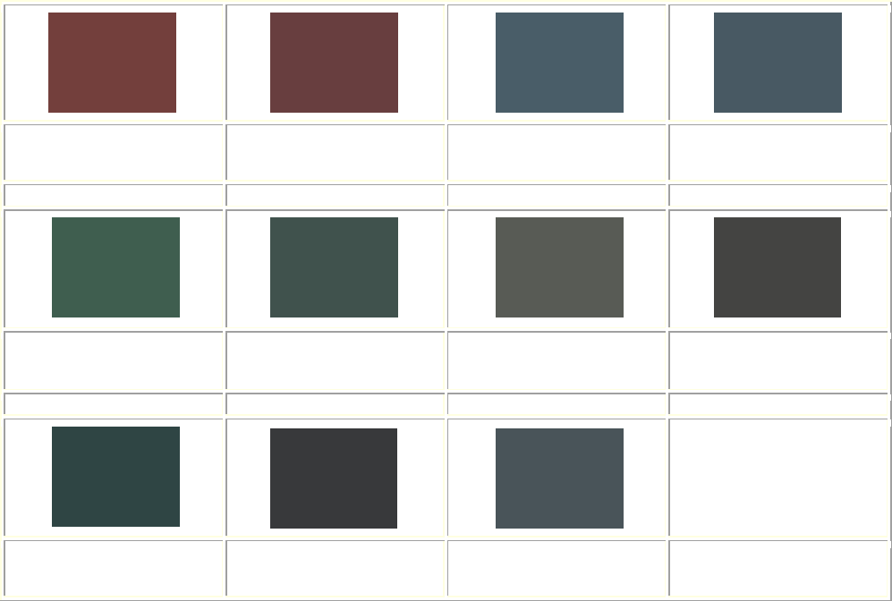
Exterior (Window Sash, Sills, Doors, and Shutters)
Beetroot
RGB: 98, 62, 67
Covered Bridge
RGB: 104, 63, 61
Shaker Red
RGB: 116, 64, 60
Richardson Brick
RGB: 129, 76, 70
Saxon Blue
RGB: 71, 92, 102
Seal Blue
RGB: 72, 89, 100
Volute
RGB: 72, 91, 94
Asher Benjamin
RGB: 71, 89, 95
Beauport Aubergine
RGB 82, 62, 67
Concord Grape
RGB: 81, 61, 73
Boardman
RGB: 120, 118, 97
Warren Tavern
RGB: 107, 100, 79
Rev. 02/2023
30
Hazelwood
RGB: 96, 105, 96
Newbury Moss
RGB: 101, 101, 82
Picholine
RGB: 91, 107, 87
Baize
RGB: 78, 84, 70
Gedney Green
RGB: 65, 83, 77
Pointed Fir
RGB: 88, 92, 85
Brattle Spruce
RGB: 68, 69, 66
Winter Balsam
RGB: 47, 70, 68
Moss Glen
RGB: 76, 73, 67
Sayward Pine
RGB: 56, 57, 58
Pettingill Sage
RGB: 136, 126, 105
Wolly Thyme
RGB: 143, 123, 98
Burnished Pewter
RGB: 125, 117, 105
Milkweed
RGB: 140, 125, 105
Pitch Pine
RGB: 127, 119, 103
Sturgis Gray
RGB: 89, 85, 79
Cummings Oak
RGB: 105, 89, 70
Hickory Nut
RGB: 121, 96, 78
Chocolate
RGB: 78, 65, 61
Ginger Root
RGB: 164, 130, 95
Palomino
RGB 147, 119, 96
Portobello
RGB: 127, 110, 95
Tankard Gray
RGB: 126, 114, 99
Hitching Post
RGB: 133, 112, 96
Rev. 02/2023
31
Otis Madeira
RGB: 94, 64, 60
Tyson Taupe
RGB: 115, 99, 88
Wooden Nutmeg
RGB: 116, 91, 80
Bargeboard Brown
RGB: 104, 83, 76
Vermont Slate
RGB: 73, 83, 90
Gropius Gray
RGB: 100, 98, 93
Fieldstone
RGB: 130, 127, 121
Monument Gray
RGB: 123, 128, 122
Accent Colors Only (details on spindles, fretwork, fine trim)
Curry
RGB: 203, 151, 54
Gabel Green
RGB: 186, 148, 76
Glacier Bay
RGB: 0, 101, 149
China Aster
RGB: 68, 78, 97
Bold Bolection
RGB: 35, 102, 115
Concord Grape
RGB: 81, 61, 73
Plum Island
RGB: 70, 63, 80
Newport Indigo
RGB: 49, 64, 98

Rev. 02/2023
32
Detailed Style and Color Guide
COLOR SYSTEM C
ARCHITECTURAL BUILDING TYPES:
Colonial Revival (1890-1900)
Neo-Dutch Colonial (1910-Present)
Neo-Georgian (1900-1940)
Post – 1940 Colonial (1940-Present)
As the nineteenth-century waned, American domestic architecture began to return to
simpler lines inspired in part by our colonial past. With this revival paint colors also
changed. Body colors moved towards the pastels; white again became the most popular
trim color and was even used for sash. This trend developed in the 1890s, but only for
colonial and classically inspired houses; the darker colors found in the High and Late
Victorian Styles continued to be popular and it would be inappropriate to use the colonial
colors listed for houses not in the Colonial Revival style. Knowledge of true colonial colors
was primitive in the late 19th and early 20th centuries. The so-called "Williamsburg" dark
reds, uniform blues and greens that resulted from early studies to discover colors used in
the colonial era were actually decades in the future.
For the stucco or clapboard, frame colonial, yellow was the most popular body color,
although gray or blue was used. Normally these were then trimmed with white or ivory on
the cornice, corner-boards, window frames, sash, etc., depending on which gave the
lesser contrast. The yellow, gray, and blue were less often used as trimming colors for
masonry houses where the darker red brick or stone usually was accompanied by white or
ivory trim and dark green shutters. An exceptional example is located at 632 Thompson,
though the stunning brackets and upper details were removed in the early 1980’s.
Rev. 02/2023
33
Colonial Revival 1890 - 1900 Color System C
The Colonial Revival of the late 19th Century began with the addition of Colonial elements
such as dormers, fanlights, swan's neck pediments, and Palladian windows to the vertical
and picturesque massing of the Victorian home. As the Style moved towards greater
accuracy in the early 20th century, (then referred to as Neo-Georgian), it began to return to
greater formality and symmetry, but exaggerated the elements. Large dormers and entry
porches and vertical doors and windows retained Victorian proportions. As this transition
occurred, the color also changed from the rich deep tones characteristic of the High
Victorian Styles to the pastels of the Colonials. The mansion at 632 Thompson is an
example of the Colonial Revival with its highly exaggerated portico, dormers, and
windows.
Rev. 02/2023
34
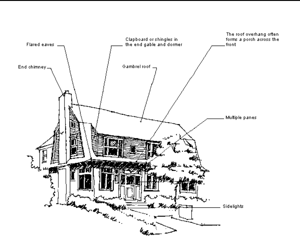
Neo-Dutch Colonial 1910 - Present Color System C
The most predominant feature of the Neo-Dutch Colonial Style is a gambrel roof, often with
flared eaves. However, this type of roof could also be found on Shingle, Arts and Crafts
(English Revival) and Neo-Georgian Style homes. The entrances to Neo-Dutch Colonials
were often classical, borrowed from the Georgian Styles, as were the shutters and
windows with small panes. Clapboard or brick with wooden shingles in the dormer were
common building materials with the latter being more prevalent in Saginaw. Neo-Dutch
Colonial residences can be found throughout Saginaw with a good example at 622
Sheridan Avenue in the Cathedral District.
Rev. 02/2023
35
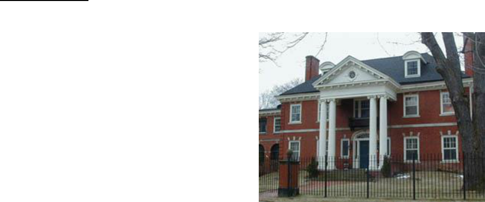
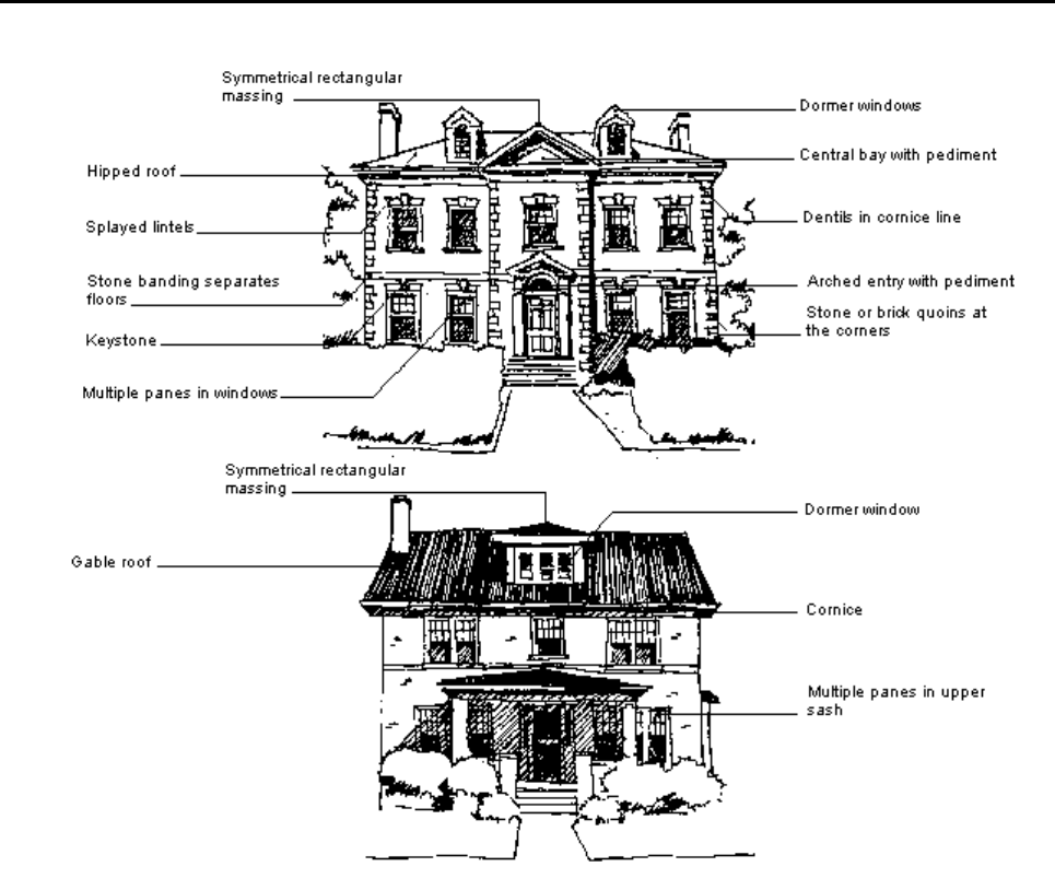
Neo-Georgian 1900 - 1940 Color System C
The relative simplicity and formality of the Neo-Georgian Style appears to have been a
reaction against the picturesque Victorian Styles. The exaggerated classical elements
often attached to the Victorian homes of the 19th Century Colonial Revival gave way to a
more subdued and accurate use of classical detail and proportion, even though at times
the accuracy was diluted by the Prairie and Arts and Crafts movement. These two story
rectangular dwellings could have a hip, gable, or gambrel roof. The fronts were often
symmetrical, based on the standard 5-bay facade, with porches at one or both sides.
Saginaw has many examples of Neo-Georgian residences, in nearly every Historic District.
The accuracy and amount of detail on these residences vary to a great extent. Most are
masonry, even though wooden sided Neo-Georgian homes tended to be more common
elsewhere. Brick or stone quoins or corner pilasters, swan's neck pediments, Palladian
windows, splayed lintels, articulated cornices, shutters, large keystones and fan lights can
be found on many, while others are stripped of detail, identified mainly by form and window
placement. The home at 212 S Porter is a good example of Neo-Georgian.
Rev. 02/2023
36
Post - 1940 Colonial 1900 - 1940 Color System C
The post-1940 Colonial homes built from the mid-20th Century to the present are
contractor constructed houses which return to the traditional American ideals of the
Colonial, and Georgian styles. Imitation shutters, attached garages, brick and aluminum
siding, quoins and pedimented Colonial homes. Ranches and split-levels with Colonial or
Neo-Georgian elements are also in this category. This style of home is scattered
throughout the Delaware Boulevard neighborhood.
Rev. 02/2023
37
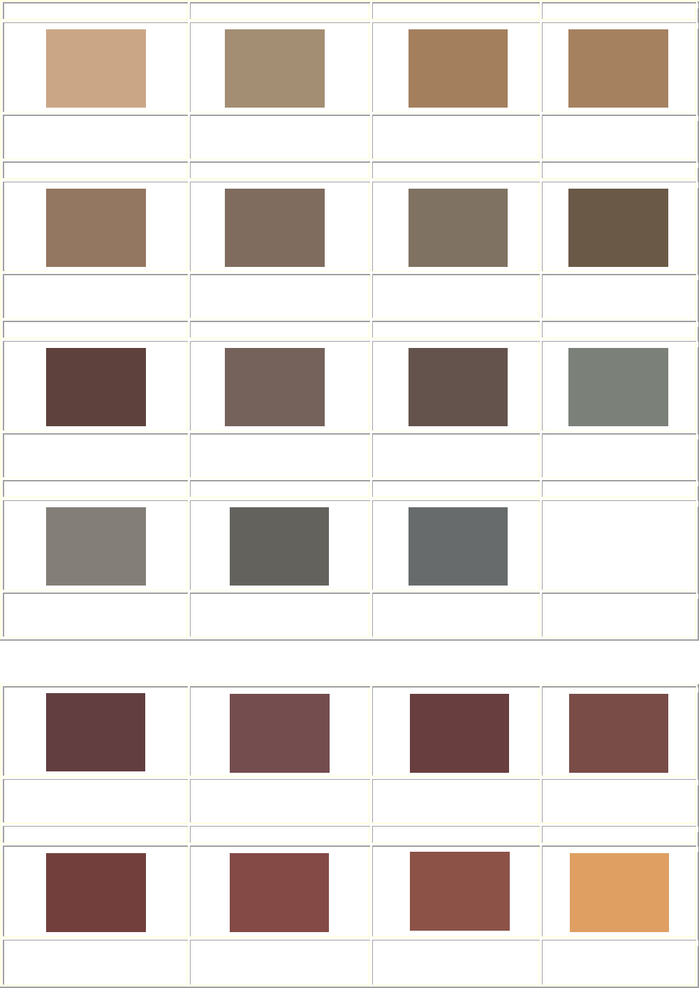
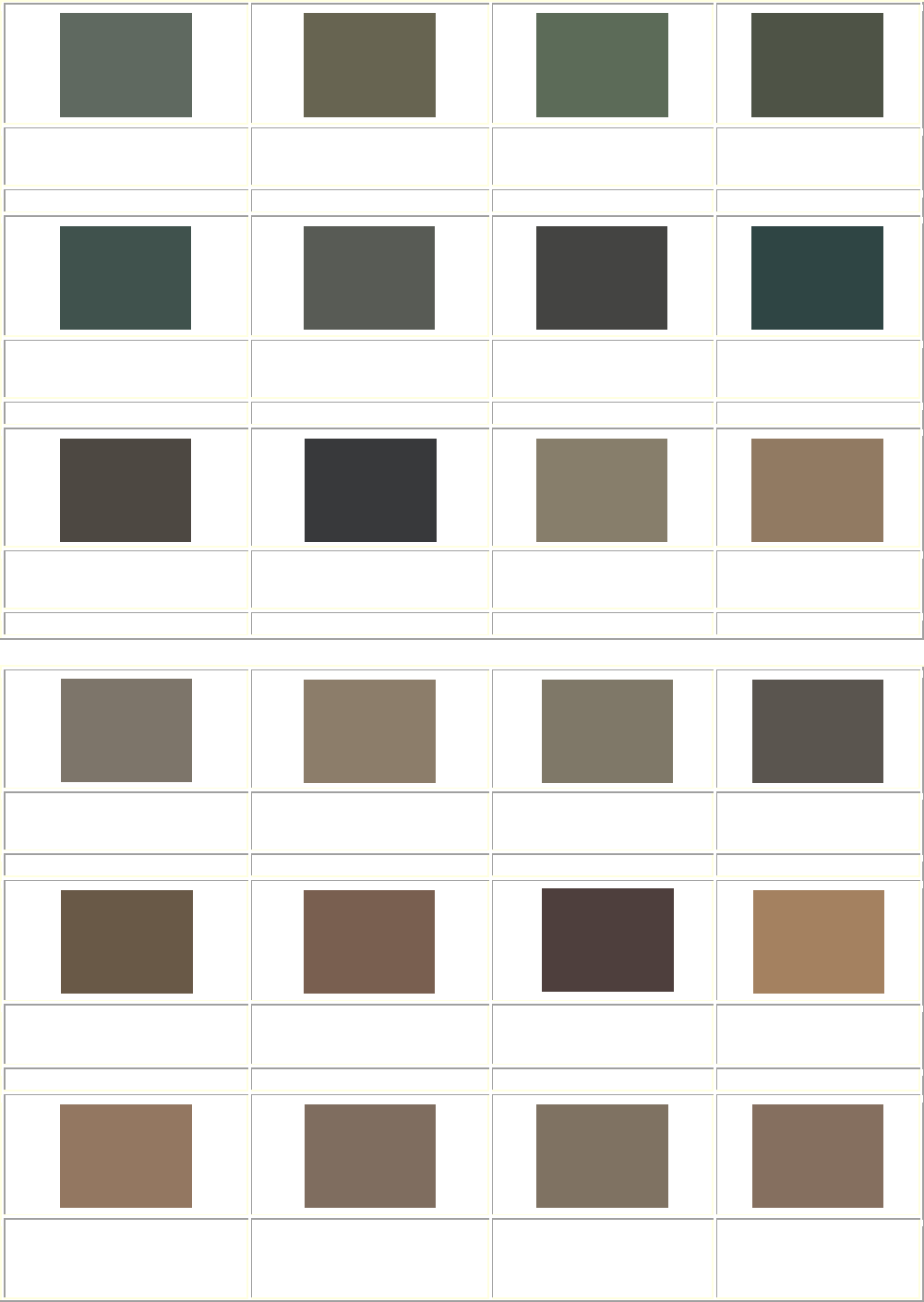
Color System C
ACCEPTABLE COLOR COMBINATIONS *Based on California Paint. RGB Color Standard
NOTE: The colors that appear on your screen may not be exact representations of the
appropriate colors to use on your building.
Exterior (clapboard siding / shingle siding)
Jonquil
RGB: 254, 215, 159
Knightley Straw
RGB: 242, 203, 153
Asian Jute
RGB: 216, 185, 146
Citadel Blue
RGB: 160, 172, 173
Lexington Blue
RGB: 128, 146, 147
Standish Blue
RGB: 134, 152, 154
Portsmouth Blue
RGB: 94, 115, 118
Jewett White
RGB: 229, 219, 202
Plymouth Beige
RGB: 220, 209, 193
Yarmouth Oyster
RGB: 219, 204, 180
Parsnip
RGB: 204, 193, 176
Langdon Dove
RGB: 183, 170, 153
Jackson Antique
RGB: 196, 188, 169
Phelps Putty
RGB: 196, 188, 172
Bayberry Wax
RGB: 183, 168, 137
Sandy Bluff
RGB: 172, 156, 134
Flaxen Field
RGB: 189, 165, 132
Rain Barrel
RGB: 164, 11, 137
Nankeen
RGB: 184, 157, 130
Winter Meadow
RGB: 171, 151, 134
Rev. 02/2023
38
Exterior (clapboard siding / shingle siding)
Coastal Sand
RGB: 202, 167, 132
Quincy Granite
RGB: 182, 181, 175
Vinal Haven
RGB: 175, 179, 174
Monument Gray
RGB: 123, 128, 122
Fieldstone
RGB: 130, 127, 121
Gropius Gray
RGB: 100, 98, 93
Polished Pewter
RGB: 102, 106, 107
Exterior (trim and window sash)
Andover Cream
RGB: 248, 238, 209
Plymouth Beige
RGB: 220, 209, 193
Wild Oats
RGB: 235, 216, 194
Yarmouth Oyster
RGB: 219, 204, 180
Parsnip
RGB: 204, 193, 176
Jackson Antique
RGB: 196, 188, 169
Phelps Putty
RGB: 196, 188, 172
Jewett White
RGB: 229, 219, 202
Rev. 02/2023
39
Exterior (shutters and doors ONLY)
Shaker Red
RGB: 116, 64, 60
Covered Bridge
RGB: 104, 63, 61
Saxon Blue
RGB: 71, 92, 102
Seal Blue
RGB: 72, 89, 100
Amish Green
RGB: 64, 94, 78
Gedney Green
RGB: 65, 83, 77
Pointed Fir
RGB: 88, 92, 85
Brattle Spruce
RGB: 68, 69, 66
Winter Balsam
RGB: 47, 70, 68
Sayward Pine
RGB: 56, 57, 58
Vermont Slate
RGB: 73, 83, 90

Rev. 02/2023
40
Detailed Style and Color Guide
COLOR SYSTEM D
ARCHITECTURAL BUILDING TYPES:
English Revival (1900-Present)
Saginaw has many fine examples of the Tudor, Gothic, and English Cottage Styles erected
after the turn of the century. Usually of stone, brick, and heavy timber construction, these
houses were often influenced by the Arts and Crafts Movement which stressed the use of
such natural materials. Therefore, the colors used on these houses should reflect this
concern for nature and an understanding of the original English prototypes on which the
styles were based.
A particular problem is encountered with the half-timbering that is so typical of these styles.
In the original medieval buildings, these exposed timbers were the structural supports of
the frame and roof with spaces between filled with lime plaster or rough cast sand stucco,
stone, or brick. With this in mind, these heavy frames should be painted to look like
weathered English oak; black, dark brown, or, perhaps, dark green, or olive. When the infill
is brick, that area is not a problem unless it has been painted, in which case the paint
should be removed or repainted in dark red or dark brown to match the original brick color.
If, however, the infill between the framing is stucco, it should be painted white, as so many
English originals are, to suggest the lime rich plastering which is naturally white or one of
the river sand stuccoes which are more nearly yellow or cream when left in their natural
state. On rare occasions when the sand used was of a reddish cast, the stucco assumed a
faint rose beige.
Normally, the window and door frames and the projecting cornices will be painted the color
selected for the heavy timber frames or a gray, brown or greenish stone color to match the
actual stone trim of the house if such exists, or, a dark color such as black, dark brown, or
dark green to suggest the metal casement windows which were normally iron and lead set
in oak, frames which, like the heavy framing, darkened with age.
The trim of such houses rarely looks well done in a color lighter than the stone trim and
certainly not in light reds, blues, yellows, or greens. Occasionally, these houses were
trimmed in white, but this generally provides too great a contrast to the usual brick and
stone construction; therefore, it is not recommended.
The more self-consciously Arts and Crafts houses will hew closely to the guidelines set
down above, stressing the darker browns, reds and greens and a concern for stucco that is
natural in color and lighter than the dark framing of heavy wood and stone.
Rev. 02/2023
41
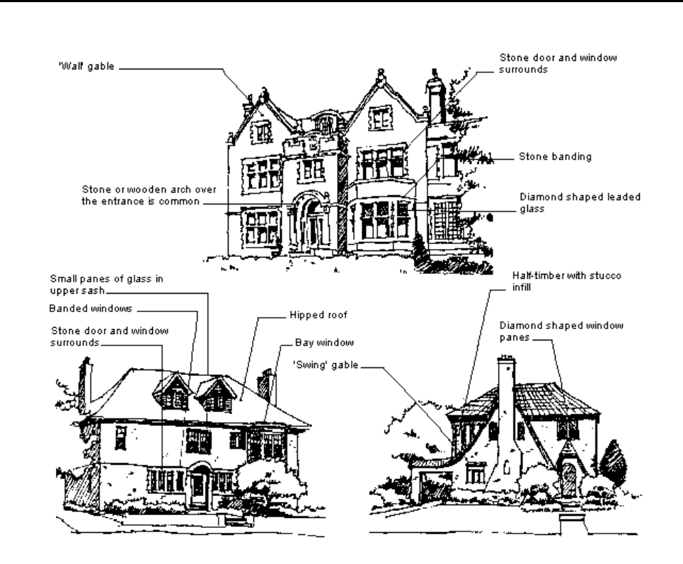
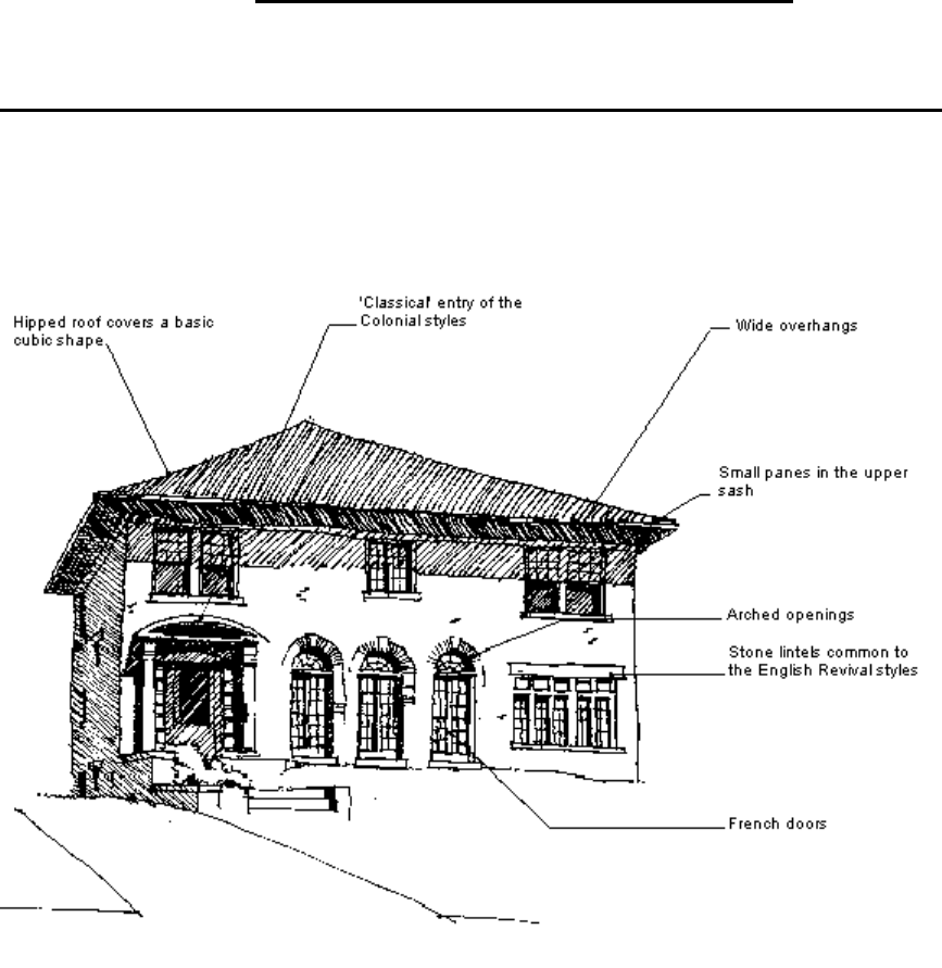
English Revival 1900 - Present Color System D
The English Styles are a major influence on Saginaw's residential and church architecture,
even up to the present. The medieval Tudor and Gothic Styles were prevalent as well as
the informal Cottage Style, based on the English Arts and Crafts Movement, which
returned to natural materials and a hand-made aesthetic. A medieval character is seen in
the irregular massing with cross-gables, the half-timber upper walls and gables with brick
or stucco infill, the massive, ornate chimneys, the small leaded casements and, often, an
overhanging second floor. Pointed arch windows, crenulated walls and wall gables are
characteristic of the Gothic while other English Styles often had elaborately carved verge
boards. Stone quoins and window surrounds were common. The simple English Cottage
Style had broad wall surfaces and banded windows located according to function of interior
spaces. A variety of materials were used such as stucco, shingles, half-timber, brick, stone
and wood. The 1930-40's saw medieval elements, such as the flowing ‘swing' gable and
half-timbering added to a basic hip or gable roof box. The English Styles can be found in
throughout neighborhoods that had building activity in the 20th Century.
Rev. 02/2023
42
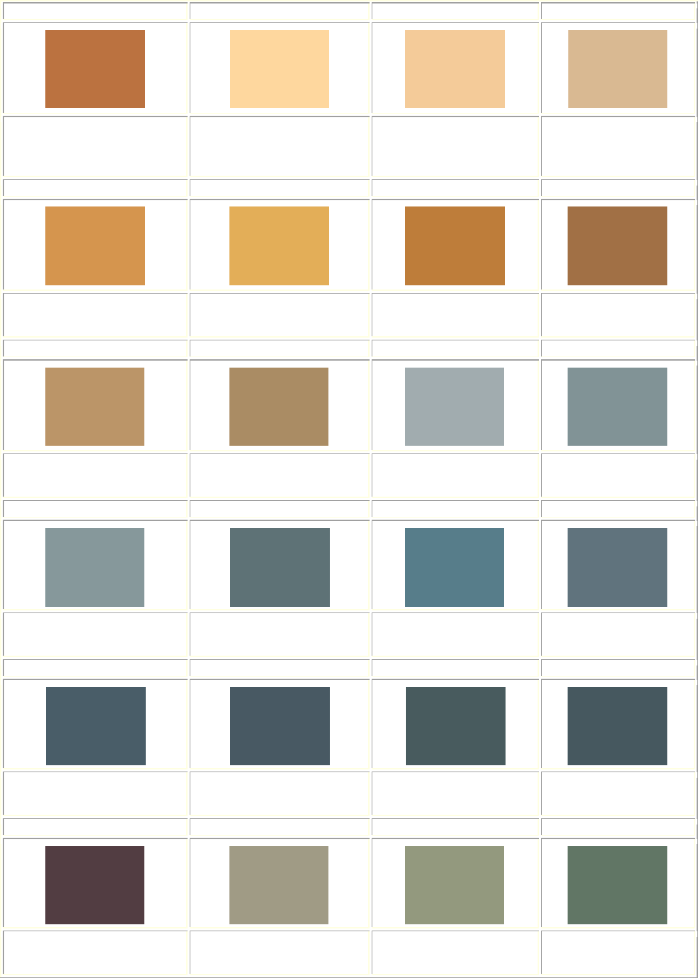
Color System D
ACCEPTABLE COLOR COMBINATIONS *Based on California Paint. RGB Color Standard
NOTE: The colors that appear on your screen or print may not be exact representations of
the appropriate colors to use on your building.
Exterior (Stucco) Brick and Stone are NEVER painted.
Fire Dance
RGB: 220, 201, 118
Butterball
RGB: 255, 245, 196
Pale Quartz
RGB: 239, 235, 219
Allison Lace
RGB: 242, 234, 215
October Bounty
RGB: 223, 199, 167
Back to Basics
RGB: 196, 154, 105
Exterior (Half-timbering)
Clover Patch
RGB: 59, 63, 49
Lover’s Kiss
RGB: 130, 53, 54
Baby Vegetable
RGB: 95, 105, 69
Pleasant Hill
RGB: 77, 100, 87
Emperors Robe
RGB: 123, 73, 63
Connoisseur
RGB: 98, 79, 69
Wing Man
RGB: 120, 107, 61
Battle Spruce
RGB: 68, 69, 66
Rev. 02/2023
43
Beetroot
RGB: 98, 62, 67
Exterior (Shingles / Clapboard) Brick & Stone are NEVER painted.
Emperors Robe
RGB: 123, 73, 63
Connoisseur
RGB: 98, 79, 69
Baby Vegetable
RGB: 95, 105, 69
Wing Man
RGB: 120, 107, 61
Battle Spruce
RGB: 68, 69, 66
Trim (window and door casings)
Match half-timbering color or match stone
Shutters should match window trim or sash.
Clover Patch
RGB: 59, 63, 49
Lover’s Kiss
RGB: 130, 53, 54
Emperors Robe
RGB: 123, 73, 63
Connoisseur
RGB: 98, 79, 69
Rev. 02/2023
44
Baby Vegetable
RGB: 95, 105, 69
Pleasant Hill
RGB: 77, 100, 87
Wing Man
RGB: 120, 107, 61
Battle Spruce
RGB: 68, 69, 66
Beetroot
RGB: 98, 62, 67
Sash (Match trim or below)
Shutters should match window sash or trim.
Beetroot
RGB: 98, 62, 67
Lover’s Kiss
RGB: 130, 53, 54
Black
RGB:

Rev. 02/2023
45
Detailed Style and Color Guide
COLOR SYSTEM E
ARCHITECTURAL BUILDING TYPES:
Bungalow (1900-1940) Craftsman (1895-1930)
Prairie (1900-1920) Arts & Crafts (1895-1930)
The Prairie School houses with their Neo-Georgian and Chicago School Vernacular spin-
offs and the ubiquitous Bungalow Style, all partake of the same color theory as the post-
1900 English Revival houses. Both the Prairie School and the Bungalow houses, however,
followed a trend toward the lighter colors introduced later in the century. If the owner
wished to follow Color System D, he would certainly be historically correct in so doing,
however, both Prairie and Bungalow Style houses permit a wider range of choice.
Those Neo-Georgian Vernacular houses that are touched by the Prairie Style (low hip
roofs with side overhanging eaves, ribbon windows, a change of materials from the first to
the second floors) should not be painted with the Colonial color palette as their name might
suggest. Just as the Prairie details might have been grafted onto what is essentially a 4-
square box, so the colors of the Prairie Style should be used.
Stucco houses of these styles might be painted in grays, yellows, browns, or when used
only for the second floor which is stuccoed above a first floor of another material, one of
two oranges. However, stark white was rarely used for Prairie or Bungalow (or for that
matter Arts and Crafts) houses.
The heavy timber framing and shingles occasionally used on Prairie or Bungalow Style
houses should be painted or stained a dark color to give what one early twentieth-century
manufacturer called "the weathered idea of the old bungalow which gained its beauty
largely by leaving the unprotected lumber to be exposed to the weather."
It is in the choice of trim colors that there is the greatest freedom, for the use of whites,
grays, soft greens, browns, and yellows are all acceptable. Keeping in mind the need to
provide color contrast between the trim and any shingles or stucco and half-timbering, (the
stucco color should also be different than the half-timbering), grays, yellows, browns,
greens and oranges would be appropriate trim colors. For houses of this type, one
manufacturer suggested that "green is by far the most popular color for shutters, though in
many instances they are painted to correspond to the body or trimmings of the house."
Sash is "usually painted black, white, ivy green or deep rich colors such as copper
browns.... If desired, one of the same shades may be used that is employed for the body of
the house."
Rev. 02/2023
46
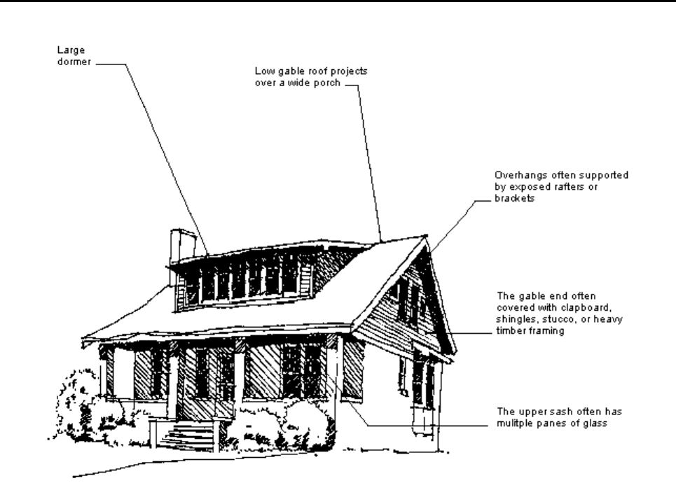
Bungalow 1900 - 1940 Color System E
The Bungalow was a functional, cottage-like structure with an informal plan and elevation.
Typically, one to two stories in height, these dwellings had low and simple roof lines
pierced by large dormers. Broad, projecting overhangs rested on heavy piers, forming
large porches. Found in many of Saginaw's early 20th Century neighborhoods, these
simple dwellings, with their exposed rafters, and natural materials such as cobblestone,
wood shingles and stucco show the evidence of the Craftsman, the Japanese, and Prairie
Styles. A very good example of this style of home is at 738 South Park in the Cathedral
District.
Rev. 02/2023
47
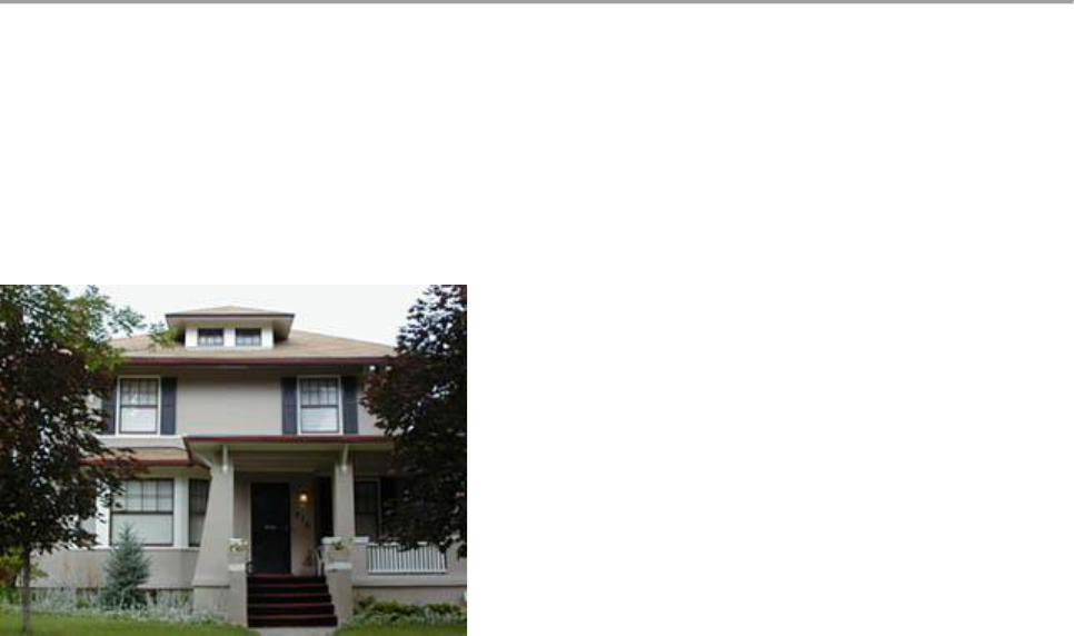
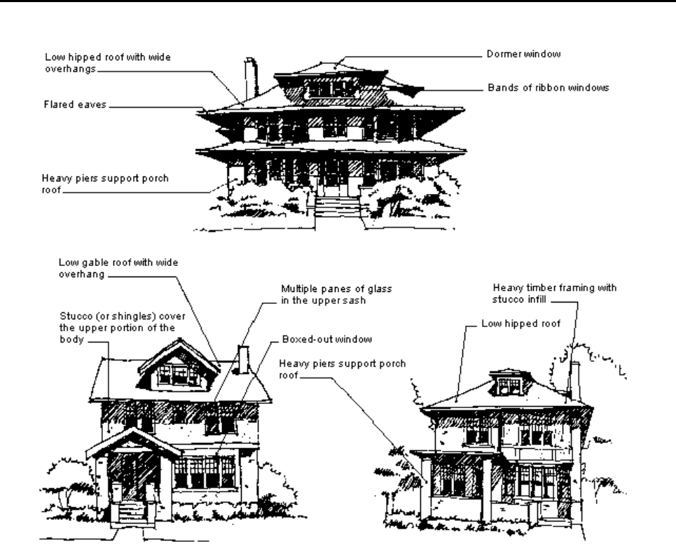
Prairie 1900 - 1920 Color System E
The development of the Prairie Style in the Midwest by Frank Lloyd Wright and others was
concurrent with the Arts and Crafts movement in Saginaw. Attention to craftsmanship and
the use of natural materials were characteristics of both. Even though Wright was
attempting to destroy the box with the low, long lines of large terraces, overhanging eaves
and bands of ribbon windows, most examples of homes in Saginaw that were influenced
by the Prairie Style tended to retain the box-like shape of the 4-square or Neo-Georgian
Vernacular Style while exhibiting Prairie characteristics. Low hip or gable roofs with wide
overhangs and flared eaves, ribbon windows and a change of materials from the first to the
second floor suggest the horizontality of the Prairie Style. Shingles, brick (often Roman),
and stucco were common materials. A wonderful example of the Prairie Style is 315 South
Jefferson in the Cathedral District. Large porches with heavily battered piers were
characteristics shared with the Bungalow Style. However, many of Saginaw's Prairie
influenced homes have a simple arched canopy borrowed from the Arts and Crafts
movement.
Rev. 02/2023
48
Color System E
ACCEPTABLE COLOR COMBINATIONS *Based on California Paint. RGB Color Standard
NOTE: The colors that appear on your screen may not be exact representations of the
appropriate colors to use on your building. Please consult with the Historic District
Commission Staff before beginning any work.
Exterior (Siding / Trim / Sash, Doors, & Shutters)
Beetroot
RGB: 98, 62, 67
Covered Bridge
RGB: 104, 63, 61
Alden Till
RGB: 122, 76, 73
Shaker Red
RGB: 116, 64, 60
Codman Claret
RGB: 134, 62, 60
Richardson Brick
RGB: 129, 76, 70
Redrock Canyon
RGB: 155, 77, 71
Cogswell Cedar
RGB: 140, 83, 73
Asian Jute
RGB: 216, 185, 146
Danish Pine
RGB: 186, 149, 103
Canyon Gold
RGB: 169, 139, 100
Lexington Blue
RGB: 128, 146, 147
Standish Blue
RGB: 134, 152, 154
Portsmouth Blue
RGB: 94, 115, 118
Rocky Hill
RGB: 88, 125, 138
Winter Harbor
RGB: 96, 116, 126
Saxon Blue
RGB: 71, 92, 102
Seal Blue
RGB: 72, 89, 100
Volute
RGB: 72, 91, 94
Asher Benjamin
RGB: 71, 89, 95
Rev. 02/2023
49
Brookside
RGB: 97, 118, 100
Boardman
RGB: 120, 118, 97
Warren Tavern
RGB: 107, 100, 79
Hazelwood
RGB: 96, 105, 96
Newbury Moss
RGB: 101, 101, 82
Picholine
RGB: 91, 107, 87
Amish Green
RGB: 64, 94, 87
Baize
RGB: 78, 84, 70
Gedney Green
RGB: 65, 83, 77
Pointed Fir
RGB: 88, 92, 85
Brattle Spruce
RGB: 68, 69, 66
Winter Balsam
RGB: 47, 70 68
Moss Glenn
RGB: 76, 73, 67
Langdon Dove
RGB: 1183, 170, 153
Jackson Antique
RGB: 196, 188, 169
Phelps Putty
RGB: 196, 188, 172
Bayberry Wax
RGB: 183, 168, 137
Sandy Bluff
RGB: 172, 156, 134
Flaxen Field
RGB: 189, 165, 132
Rain Barrel
RGB: 164, 151, 137
Pettingill Sage
RGB: 136, 126, 105
Wooly Thyme
RGB: 143, 123, 98
Burnished Pewter
RGB: 125, 117, 105
Milkweed
RGB: 140, 125, 105
Rev. 02/2023
50
Pitch Pine
RGB: 127, 119, 103
Sturgis Gray
RGB: 89, 85, 79
Nankeen
RGB: 184, 157, 130
Winter Meadow
RGB: 171, 151, 134
Coastal Sand
RGB: 202, 167, 132
Britches
RGB: 161, 142, 115
Toffee
RGB: 162, 128, 93
Ginger Root
RGB: 164, 130, 95
Maple
RGB: 183, 140, 113
Bean Pot
RGB: 139, 106, 82
Palomino
RGB: 147, 119, 96
Portobello
RGB: 127, 110, 95
Tankard Gray
RGB: 126, 114, 99
Hitching Post
RGB: 133, 112, 96
Cummings Oak
RGB: 105, 89, 70
Brownstone
RGB: 122, 85, 67
Otis Madeira
RGB: 94, 64, 60
Liberty
RGB: 134, 91, 81
Burnt Umber
RGB: 125, 91, 78
Hickory Nut
RGB: 121, 96, 78
Tyson Taupe
RGB: 115, 99, 88
Wooden Nutmeg
RGB: 116, 91, 80
Bargeboard Brown
RGB: 104, 83, 76
Rawhide
RGB: 98, 84, 76
Rev. 02/2023
51
Chocolate
RGB: 78, 65, 61
Vinal Haven
RGB: 175, 179, 174
Monument Gray
RGB: 123, 128, 122
Fieldstone
RGB: 130, 127, 121
Gropius Gray
RGB: 100, 98, 93
Polished Pewter
RGB: 102, 106, 107
Exterior (The following color(s) can only be used on Sash, Doors, and
Shutters)
Sayward Pine
RGB: 56, 57, 58
Exterior (Accent Colors Only, for Brackets, Corbels, small areas of
raised trim details to highlight and make them “pop” out.)
Saxon Blue
RGB: 71, 92, 102
Seal Blue
RGB: 172, 89, 100
China Aster
RGB: 68, 78, 97
Bold Bolection
RGB: 35, 102, 115
Concord Grape
RGB: 81, 61, 73
Plum Island
RGB: 70, 63, 80
Beauport Aubergine
RGB: 82, 62, 67
Grasshopper
RGB: 101, 126, 95
Rev. 02/2023
52
Blue Winged Teal
RGB: 0, 133, 121
Vermont Slate
RGB: 73, 83, 90
Rev. 02/2023
53
Detailed Style and Color Guide
COLOR SYSTEM F
ARCHITECTURAL BUILDING TYPES:
Mediterranean (1900-1940)
Neo-Classical (1890-1920)
In the early twentieth century, a number of Mediterranean Styles became popular in Saginaw. These
limestone or stucco houses, inspired by the French and Spanish originals, ranged in size from modest
stuccoed and whitewashed cottages to imposing classical mansions. Generally, small houses of this type
(which often had red tile roofs) look best painted white. The larger structures, however, require more subtle
coloring.
If the house is constructed or trimmed with stone this material might be matched for painting the cornice,
windows, frames, sash, and doors. To create a contrast between body material and trim will defeat the
stately, formal character of the design.
If painting becomes necessary for a stucco house, the original color should be matched. Otherwise, the
stucco should be painted to match the stone trim above windows and around doors or one of the pale gray or
yellow stucco colors. Otherwise, the trim colors may be white, light gray, or one of the darker colors
suggested.
Mediterranean 1900 - 1940 Color System F
The Mediterranean Style includes everything from the formal and monumental Southern French or Italian
Renaissance to the informal Spanish Villa. Often of smooth stone or stucco with a low hip roof in green or red
tile, the more classical versions had a symmetrical facade with tall windows, French doors, and multiple
arches. Parapet walls, quoins, and small balconies were common. Brackets and wide eaves appeared on
many, borrowed from the earlier Italianate Style. Several of the more modest dwellings of the 1920-30's had
irregular massing, stucco walls and simple arches.
Rev. 02/2023
54
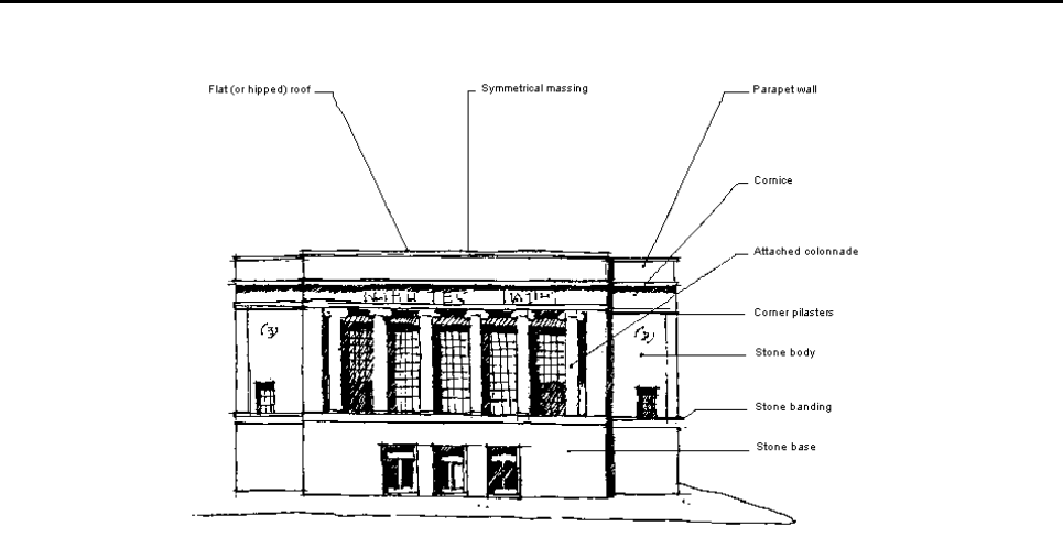
Neo-Classical 1890 - 1920 Color System F
A renewed interest in classical architecture began in the late 19th Century with the Ecole
de Beaux Arts in Paris and the World Columbian Exposition of 1893 in Chicago. The return
to symmetry and formal- ism was a reaction to the asymmetrical in formalism of the
Victorian Styles. Beaux Arts Classicism was a monumental style based on the Greek and
Roman orders with heavy stone bases, grand stairways and arched openings, large,
paired columns, statuary, and balustrades. Neo-Classicism tended to refine the grandiose
Beaux Arts with simpler detailing and less exaggeration. Attached colonnades, large
windows and parapet walls were common. This style was popular for many of Saginaw's
commercial structures while most of the classical residential structures had a
Mediterranean flavor. One of the most well-known of these is the old Second National
Bank building on the north-west corner of Court and Hamilton Streets in Old Town
Saginaw.
Rev. 02/2023
55
Color System F
ACCEPTABLE COLOR COMBINATIONS *Based on California Paint. RGB Color Standard
NOTE: The colors that appear on your screen may not be exact representations
of the appropriate colors to use on your building. Please consult with the Historic
District Commission Staff before beginning any work.
Parsnip
RGB: 204, 193, 176
Whispering Willow
RGB: 147, 153, 126
Jonquil
RGB: 254, 215, 159
Pale Yellow
RGB: 234, 206, 159
Winter Balsam
RGB: 47, 70, 68
Otis Madeira
RGB: 94, 64, 60
Rawhide
RGB: 98, 84, 76
Picholine
RGB: 91, 107, 87
Gedney Green
RGB: 65, 83, 77
Black
RGB:
Jewett White
RGB: 229, 219, 202
Yellowish White
RGB: 239, 223, 196
Rev. 02/2023
56
Detailed Style and Color Guide
COLOR SYSTEM C, D, E, or F
ARCHITECTURAL BUILDING TYPES:
20
th
Century Composite (1900-1940)
The eclecticism of the Victorian period did not end at the turn of the century.
Even though Arts and Crafts was primarily an English movement, Saginaw as
well as many Michigan architects tended to combine it with German, Dutch-
Colonial, Classical, Neo-Georgian, Mediterranean and Prairie influences. Many
of these styles were added to the basic hip roof box, sometimes called the 4-
Square Vernacular or Neo-Georgian Vernacular. Those examples where one
style dominates will be found under the dominating type; otherwise, it will be
considered a composite style. Saginaw has many composite dwellings from the
early 20th Century.
Rev. 02/2023
57
MISCELLANEOUS COLOR SYSTEM
ARCHITECTURAL BUILDING TYPES:
20
th
Century Miscellaneous (1900-Present)
Many of Saginaw's Historic Districts contain both commercial and residential infill
structures which may not fit in within the historical styles previously described.
Since the 1950's, contractor homes were built in any number of styles (see Neo-
Colonial). However, many styles (both residential and commercial) had little or
no historical precedent, and therefore, neither did the color scheme. If built
before 1960, the color choice should be made from an appropriate time period.
Contemporary structures, despite the availability of an infinite palette of colors to
choose from, should, nevertheless, be painted in colors which blend
harmoniously with existing materials as well as with their historical
neighbors. This style of home can be found on Delaware, Delaware Blvd, and in
the Heritage Square Historic District.

Rev. 02/2023
58
References Section
Sources for Guidance on Historic Materials and Landscape Features
Under the National Park Service Home page Web site, http://www.nps.gov and related service
links:
The Secretary of the Interior's Standards for Rehabilitation and Guidelines
for Rehabilitating Historic Buildings.
http://www2.cr.nps.gov/tps/tax/rehabstandards.htm
The Secretary of the Interior’s Guidelines for the Treatment of Historic Properties,
1995
http://www2.cr.nps.gov/tps/secstan1.htm
Preservation Briefs 1-41
http://www2.cr.nps.gov/tps/briefs/presbhom.htm
Technical Preservation Services for Historic Buildings.
http://www2.cr.nps.gov/tps/index.htm
For publications available through the Michigan State Historic Preservation Office:
http://www.sos.state.mi.us/history/preserve/shpopubs.htm
*Based on California Paint. California Paint color chips are available at West Side Decorating and can be color matched to your paint company
of choice. The HDC does not endorse or promote California Paint or West Side Decorating. It is mentioned for informational purposes only.
Saginaw Historic District Commission
Saginaw City Hall
1315 South Washington Avenue
Saginaw, Michigan, 48601
