DATAMYTE Digital Clipboard User Guide

Date
User Guide
Version
Release
Version
Description
Updated By
2023-05-
11
24.0
V2.14.0
#19323: Web - PowerBi Dashboard -
Navigating between Dasbhoards
#17360: Fill Workflow: Add Help (i)
icon button and viewer pop-up window
#19307: Workflow Builder - Extension
length parameter to torque wrench
#18846: Allow tables/Phone access to
Power BU dashboard via browser
Leonardo
Delcastanher
© 2023 DATAMYTE, Inc.
2800 Campus Drive, Suite 60
Plymouth, Minnesota 55441
Phone 763-553-1040 • Fax 763-553-1041
www.datamyte.com
Defense Supplement to the Federal Acquisition Regulations or other similar regulations of other governmental
agencies.
Export Notice—These commodities are licensed by the U.S. for ultimate destination (ELS Country). Diversion
contrary to U.S. Law prohibited.
Disclaimer—In no event shall DATAMYTE, Incorporated be liable for direct, indirect, special, incidental, or
consequential damages arising from the use or inability to use this product or documentation, even if advised
of the possibility of such damages. Information in this document is subject to change without notice and does
not represent a commitment on the part of DATAMYTE, Inc. Because of the variety of uses for the product
described in this document, those responsible for the application and use of this hardware and software must
satisfy themselves that all necessary steps have been taken to assure that any application and use meets all
performance and safety requirements, including any applicable laws, regulations, codes and standards.
Copyright Notice—Reproduction of the contents of this copyrighted publication, in whole or in part, without
written permission of DATAMYTE, Inc. is prohibited. Copyright © 2015 DATAMYTE, Inc. All rights reserved.
Microsoft
®
and Windows
®
are registered trademarks of Microsoft Corporation. Other product names
mentioned in this document are trademarks or registered trademarks of their respective companies and are
hereby acknowledged.
Introduction
DATAMYTE Digital Clipboard is used by companies that employ field staff to conduct sales, inspections,
and audits to automate their business processes by letting them replace the outdated and error-prone
pen-and-paper method to using a mobile workflow solution. DATAMYTE Digital Clipboard helps
companies to embrace the micro-app strategy that is faster and less expensive.
DATAMYTE Digital Clipboard creates mobile workflows and apps that can collect various types of data
easily on Revolution data collector. Storage of the collected data is securely done on the cloud and it can
also automatically generate reports and send them to the relevant parties in real-time. Data can also be
collected offline and the auto-sync feature helps in directing the data to the server without any manual
intervention.
The apps are designed to work offline as well, and employees can carry on using their app in places
without internet connectivity. Data generated by mobile workflows created on the DATAMYTE Digital
Clipboard platform can be stored locally on the device and synchronized with servers once connectivity is
available.
DATAMYTE Digital Clipboard platform consists of four main components that are used for building and
managing micro-apps.
Digital Clipboard Database
DATAMYTE Digital Clipboard Database is the place where all the collected data is stored. It allows
activities like searching, sorting, import/export, and printing of the data collected through mobile apps
using a relational database. DATAMYTE Digital Clipboard Database also features a workspace area
where users can view their notifications and tasks.
Workflow Builder
Workflow Builder, the most important component of the DATAMYTE Digital Clipboard platform, is used to
build mobile workflows. These mobile workflows can be created by dragging and dropping various
widgets, and by configuring the properties of each of the widgets included in the workflows to suit the
individual use cases.
Actions Designer
The Actions Designer is used for designing actions. Steps in the list of actions are added and configured
using the drag and drop feature. With the Actions Designer, data submitted using the mobile workflows
can be sent to various entities like users, documents and even external system APIs.
Digital Clipboard Client Apps
DATAMYTE Digital Clipboard Client App gets deployed on the DATAMYTE Revolution devices to do
mobile data collection.
Digital Clipboard Configurations
Digital Clipboard is a licensed DataMyte Product. There are three licensed configurations:
WORKFLOW APPLICATION—allows for collecting data in workflows on the Revolution device; reporting
is on the Digital Clipboard website. This includes basic workflow widgets.
WORKFLOW SOLUTION—allows for development of workflows by end-user(s), collecting data in
workflows on the Revolution device, and reporting is on the Digital Clipboard website. Advanced widgets
are included and Gage/Metrology devices and integration to DataMetrics Quality system and other
DataMyte products such as Escalate for immediate alerts and notifications.
WORKFLOW ENTERPRISE—allows for connecting Digital Clipboard to almost any type of system to
interface and exchange data and connecting processes for Enterprise integrations
DATAMYTE Digital Clipboard Client App
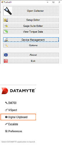
Login to DATAMYTE Digital Clipboard app
• Launch TranSend II and login with valid Username and Password. TranSend II main screen
displays
• Power On Revolution device. The Revolution main screen displays
• Connect USB cable to Revolution and PC running TranSend II
• TranSend II—Select Device Management
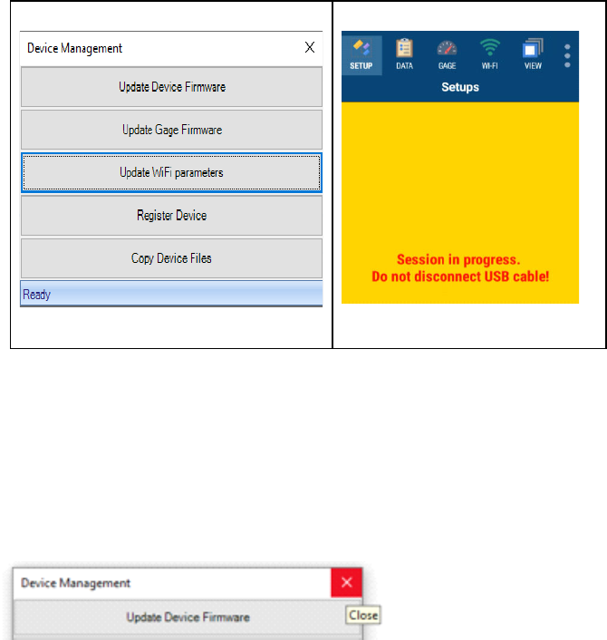
Device Management menu displays
Revolution device displays
• TranSend II Device Management—Click Update WiFi parameters; screen displays Busy in lower
left corner and dialog is inactive
• When Device Management displays active and Ready (lower left corner)—Click X in upper right
corner to close the dialog
• Select Digital Clipboard from Revolution main screen
• Digital Clipboard app Login displays
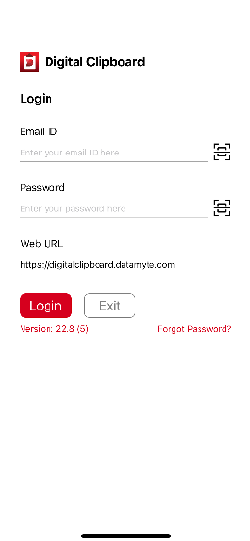
• Login using your Digital Clipboard application credentials—Email ID, User Name and Password
Note: If you do not have credentials for the DATAMYTE Digital Clipboard app, contact your
system admin and ask them to invite you to the app to be able to access it on your device
• User can login into application without email accounts and input user name manually or by
scanning QR or Barcode code
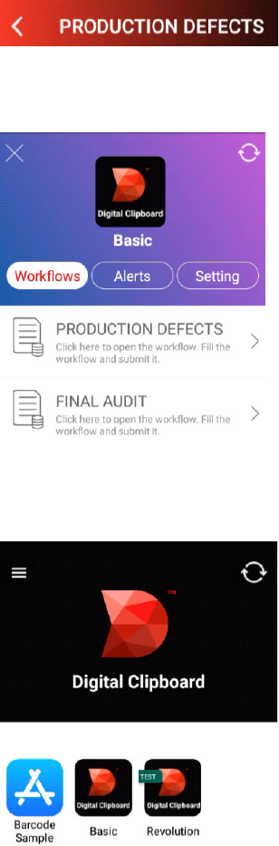
• Click Login—after login, the list of apps which have been built for you using the DATAMYTE
Digital Clipboard app builder platform, will appear on your device's screen.
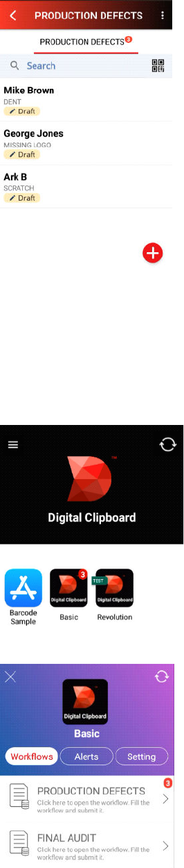
Example of Digital Clipboard apps on Revolution displays what you’ve been given access to.
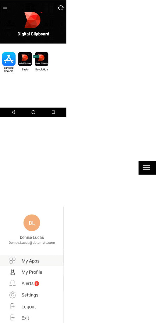
DATAMYTE Digital Clipboard App Main Screen
• Digital Clipboard menu icon is located in upper left corner
• Select Digital Clipboard menu icon—displays credentials for person logged in
Revolution Device—Digital Clipboard Alert example is shown below:
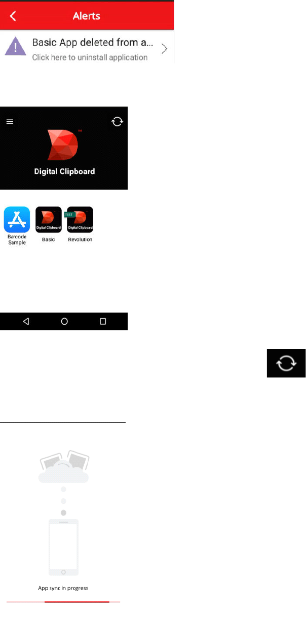
• Select My Apps—Digital Clipboard app main screen displays
• Digital Clipboard sync icon is located in upper right corner
• Select Digital Clipboard sync icon—displays App sync in progress
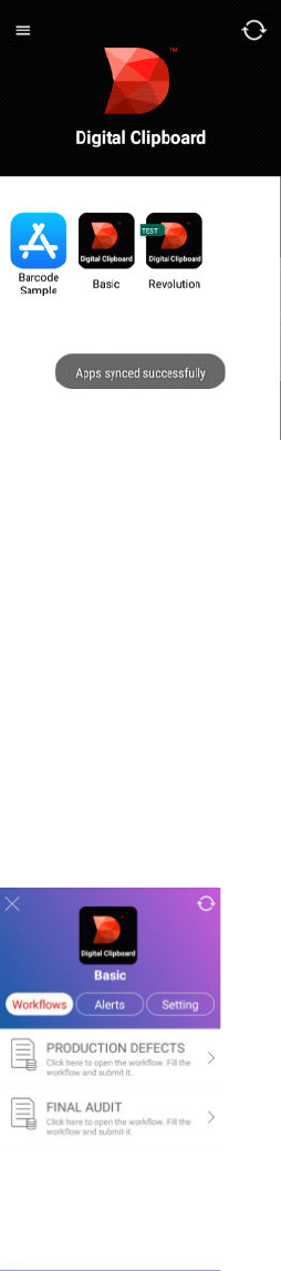
• Displays Apps synced successfully when complete. Note: this message automatically fades at the
bottom side of the screen.
Collect Data Using DATAMYTE Digital Clipboard App
• Select app on Revolution Device; i.e. Basic
• Workflows display; one or more Workflows display based on access in Digital Clipboard Workflow
Builder
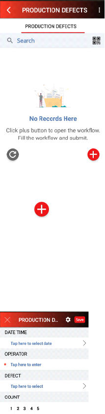
• Select Production Defects Workflow which displays
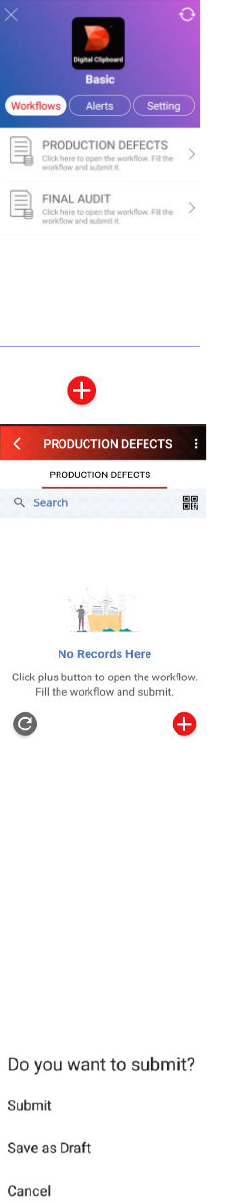
• Select (plus) icon in lower right corner to begin data collection
• Workflow displays with prompts created for data collection in Workflow Builder
• DATE TIME field displays. Instructions; i.e. Tap here to select date display on the Workflow. Tap
in the field. Note: Select default Date and Time or enter in Date and Time
• Select bottom right arrow to select default value (or select Done)
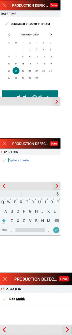
• OPERATOR prompt displays. Instruction “Tap here to enter” displays with onboard keyboard to
enter data.
• Tap in the field and enter OPERATOR name; i.e., Bob Smith. Press Done or
> to move to next
prompt
• DEFECT prompt displays with choice list. Select Defect from the list; i.e. MULTIPLE DEFECTS.
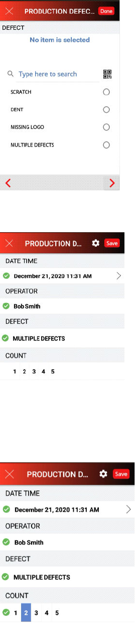
• Data collection advances to prompt COUNT. Select a COUNT; i.e. 2
Note: Above choice list displays in single line
• The Workflow is complete—displays a green checkmark next to each prompt.
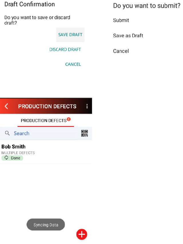
Submit Workflow Data Using DATAMYTE Digital Clipboard App
• Title bar display X and Save
X (upper left corner) dialog displays
Save (upper right corner) dialog displays
• Click Save. Select Submit from the menu. Syncing Data displays (as shown below). One
completed Workflow for Production Defects was uploaded to Digital Clipboard Cloud
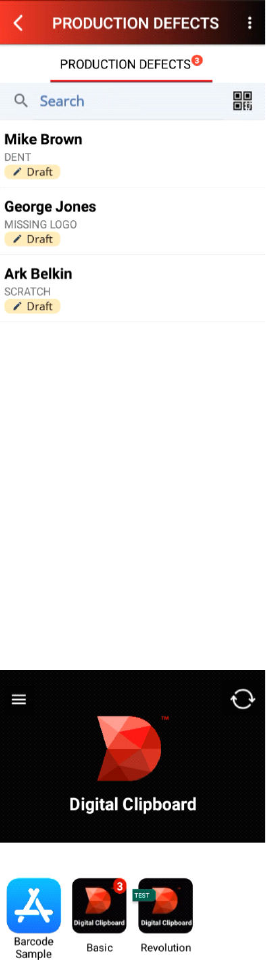
Select Different Digital Clipboard App with Workflow(s)
• Title bar displays current select Workflow; i.e. PRODUCTION DEFECTS. Select < back icon
• Click X (upper right corner) to close Basic app with its Workflows
• Digital Clipboard apps on the Revolution device displays what you’ve been given access to.
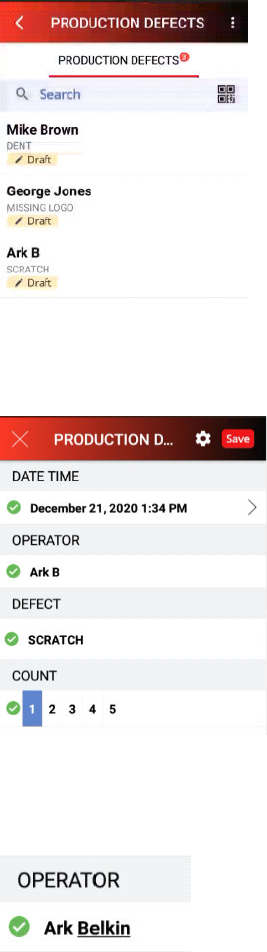
Collect Data—Save As Draft
• Select app on Revolution Device; i.e. Basic.
• Select Production Defects.
• Select (plus) icon in lower right corner to begin data collection.
• Workflow first data collection prompt—DATE TIME. Select bottom right arrow
> to select default
value.
• OPERATOR prompt displays. Tap in the field and enter OPERATOR name; i.e., Mike Brown.
• Press Done or
> to move to the next prompt.
• DEFECT prompt displays with choice list. Select Defect from the list; i.e., DENT
• COUNT prompt displays with choice list. Select Count from list; i.e., 1
• Workflow is complete—displays a green checkmark next to each prompt. Click Save and select
Save as Draft
• Collect multiple Workflows and Save as Draft. Example is shown below.
• Return to Digital Clipboard main screen—Click Title bar back arrow and X on Workflow screen).
Edit Data—Saved As Draft
• Select Basic app on Revolution Device—Note: Displays 3 workflows that have NOT been
submitted.
• PRODUCTION DEFECTS—Displays 3 workflows that have NOT been submitted.
• Select PRODUCTION DEFECTS—Displays Draft workflows.
• Select Draft workflow; i.e., Ark B. Draft display for Edit or Save (Submit).
• Click in OPERATOR field (Ark B)—Onboard keyboard displays for Edit.
• Edit field—Enter a last name; i.e. Belkin.
• Click Save—Save as Draft. NOTE: The Workflow form was edited and the draft saved.
Submit Data—Saved as Draft
• Select Basic app on Revolution Device—Note: Displays 3 workflows that have NOT been
submitted.
• PRODUCTION DEFECTS—Displays 3 workflows that have NOT been submitted.
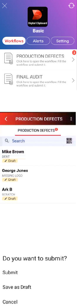
• Select PRODUCTION DEFECTS—Displays Draft workflows.
• Select Draft workflow—Selection displays with previously collected data.
• Click SAVE—Dialog displays Do you want to submit? Click Submit.
• PRODUCTION DEFECTS—Screen updates and displays Done.

• Data is synced and uploaded to the Digital Clipboard Cloud database. Repeat for all Draft data.
When all data has been synced, screen updates and displays No Records Here.
DATAMYTE Digital Clipboard Web App
Login to DATAMYTE Digital Clipboard Web App
• Launch desktop browser (recommend Google Chrome)—URL
https://digitalclipboard.datamyte.com/login
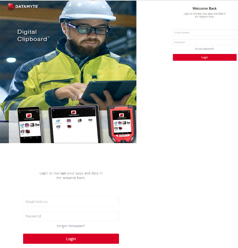
• Login using your credentials—Type Email Address and Password
• Click Login—If you do not have credentials or if you are not able to login to the web portal,
contact your system admin and ask them to invite you to the web portal.
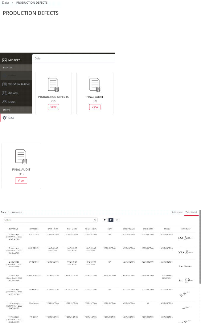
View Data Using DATAMYTE Digital Clipboard Web App
• Left Panel display Digital Clipboard app; i.e., Basic, example used for data collection. Select
Data
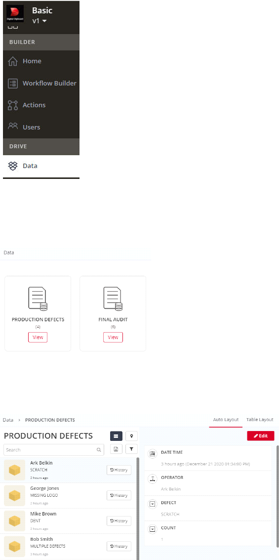
• Workflows with collected data display; i.e. PRODUCTION DEFECTS (4)—Collected data for four
workflows
• Click PRODUCTION DEFECTS—View icon. Default view Auto Layout displays
• Click individual record to view details; i.e., George Jones
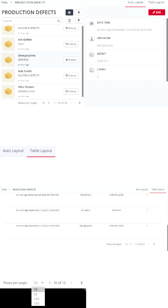
• Click Table Layout—top right corner
• Table Layout displays data records in individual rows. Table Layout Scroll bar allows you to view
more data than is shown.
• Rows per page defaults to 10 records Auto and Table Layout. Optionally, can be set to 50, 100,
or 150
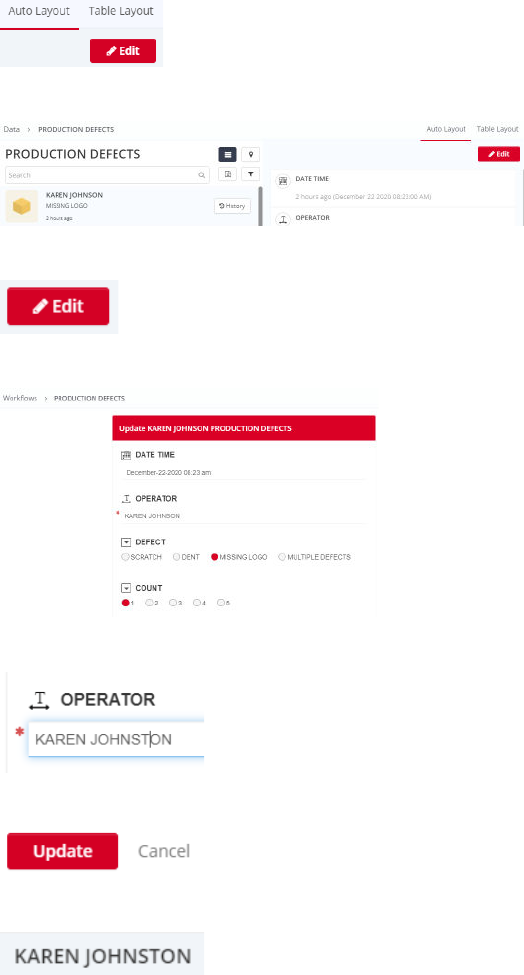
Edit Data Using DATAMYTE Digital Clipboard Web App
• Edit Data—available in Auto Layout only. Verify (or change) to Auto Layout is displayed
• Select record; i.e., KAREN JOHNSON . . .
• Click Edit icon—top right corner
• Selected record to edit displays
• Select field to edit; i.e., OPERATOR. Edit last name to JOHNSTON
• Click Update or Cancel (bottom Edit window). Click Update
• Record updated successfully—displays KAREN JOHNSTON
Change Workflow View Data Using DATAMYTE Digital Clipboard Web App
• Click Data—top left corner (or click Data in left panel)
• Workflows with collected data display; i.e. PRODUCTION DEFECTS and FINAL AUDIT
• FINAL AUDIT View icon
• Select Table Layout view. Table Layout displays data
Export Data from DATAMYTE Digital Clipboard Web App
• Left panel display Digital Clipboard app; i.e., Basic, example used for data collection. Select Data
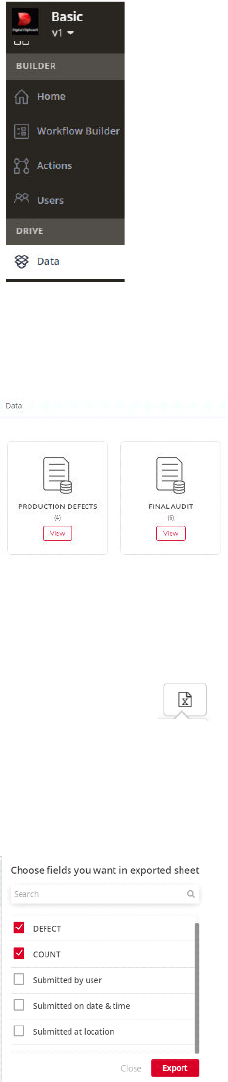
• Workflows with collected data display; i.e. PRODUCTION DEFECTS and FINAL AUDIT
• Click PRODUCTION DEFECTS—View icon. Default view Auto Layout displays
• Click export icon (placed next to search bar) — List of Workflow fields displays
• Select the fields to Export—Default all fields are selected. Example—uncheck Submitted by user,
Submitted on date & time and Submitted at location
• Click Export—Informational dialogs display:
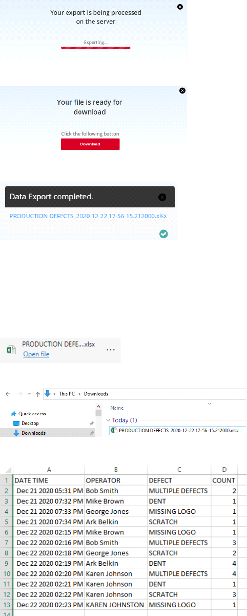
• Click X on dialog to close.
• Select Downloaded file— i.e., PRODUCTION DEFECTS…xlsx

How to annotate a picture with DATAMYTE Digital Clipboard Mobile App
DATAMYTE Digital Clipboard image annotation is a powerful feature to report problems, locate exact
place on the image and text notes. While collecting data using DATAMYTE Digital Clipboard mobile app,
users can capture the picture, put multiple annotations and notes against them.
This makes data collection even more effective when you have to notify the problems.
Steps:
• Open camera widget
• Take picture
• Tap on annotate
• Draw on picture
• Enter notes
DATAMYTE Digital Clipboard Workflow Builder
How Workflow Builder Works
The Workflow Builder allows the user to build mobile workflows without writing any code. The
mobile workflow created by Workflow Builder functions with the help of widgets that can be
dragged and dropped to a virtual mobile screen. Widget properties can be configured to
customize the widget behavior.
DATAMYTE Digital Clipboard Web App
• Login to your DataMyte Digital Clipboard account or create a new account if you are new.
Create DATAMYTE Digital Clipboard App
• Click Create App in upper right
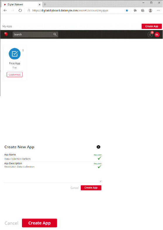
• Create New App dialog displays. App Name and App Description fields are required. Enter
App Name and App Description you are creating; i.e. App Name—Data Collection Defects and
App Description—Revolution Data Collection.
• Required and check mark display green when required fields are populated.
• Click Create App to continue or Cancel to close without saving. Click Create App.
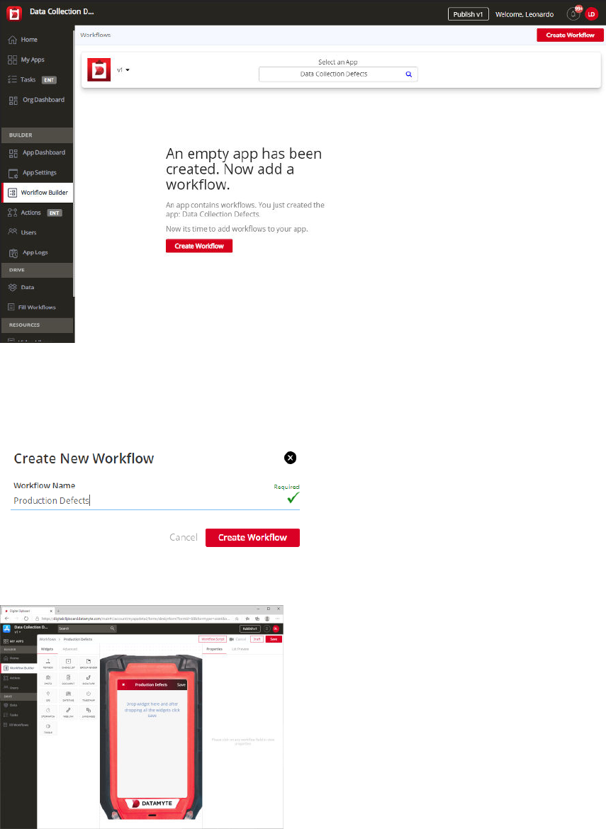
Create DATAMYTE Digital Clipboard Workflow
• Create Workflow for app you created
• Click Create Workflow—Create New Workflow dialog displays. Workflow Name is required. Type
New Workflow Name; i.e. Production Defects
• Workflow Builder window displays
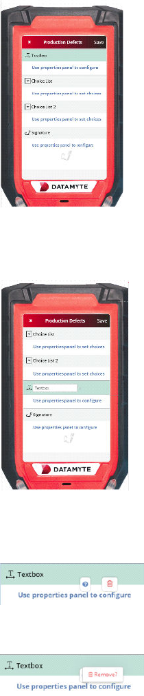
• Drag and Drop Widgets on the virtual mobile screen to build your workflow; i.e. Drag and Drop
Widgets—Text Box, Choice List, Choice List and Signature
• Change Widget Order—Click widget and drag and drop to new position; i.e., drag and drop
Textbox widget to position above Signature widget
• Remove Widget—Click off virtual mobile screen. Move mouse cursor over widget to remove; i.e.,
Textbox widget. Remove icon displays. Click Remove icon
• Click Remove to continue or move the mouse off field to cancel. Click Remove? The Textbox
Widget is removed from the virtual mobile screen.
• Add Textbox Widget to the virtual mobile screen as the first widget.
• Widget Properties—Properties of each widget can be defined by setting up the values as shown
on the right-hand side.
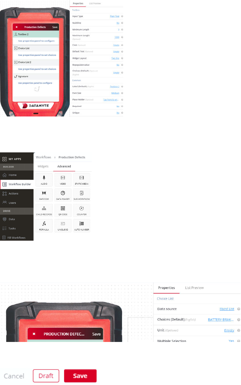
• Click the Advanced tab on the left-hand side of the screen. Advanced widgets include
functionality like adding a QR code or rich media files like video and audio to the workflow you are
creating.
• Click List Preview to display the configuration to customize list view
• Click Save—your mobile workflow will be created. Additional options include Cancel and Draft
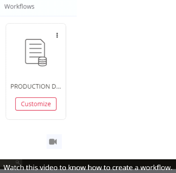
• Click Customize to customize or edit the saved (Draft) workflow. Note: Click ellipses to delete
workflow
• Click Video icon —Tutorial displays: how to create a workflow.
What are Mobile Workflows?
Mobile workflows are a digital version of a paper form or document using DATAMYTE Digital Clipboard
Workflow Builder. Fields or records contained on your paper form can be included in the DATAMYTE
Digital Clipboard digital workflow, which then can be accessed by Revolution device or web to collect
data. Additionally, you can design a digital workflow that can capture text input (like paper forms do), and
collect images, audio/video, etc. DATAMYTE Digital Clipboard Workflow data can be submitted and
stored in the cloud. The data is available to be shared or viewed in real-time.
Examples—Types of Workflows
• Inspection Workflow
• Audit Workflow
• Customer Lead Workflow
• Certification Workflow
• Compliance Checklist Workflow
• Incident Reporting Workflow
• Data Collection Workflow
• Pre-Inspection Workflow
• Proof of Delivery
• Dispatch Workflow
• Proof of Visits
• Invoice Workflow
• Work Order Management Workflow
• Asset Management Workflow
• Asset Capture Workflow
• Routine Checkup Workflow
Workflow Builder Types of Inputs—Capture Data using workflows
• Basic: Textbox, Date, Choice List, Yes/No
• Media: Pictures, Audio, Video
• Advanced: Barcodes, GPS Location, Signature
Enhancing Usability of Workflows Created by Workflow Builder
• Validations: Validations can be performed using different conditions. Validation of one input can
depend on the values of other inputs from either the same workflow or on the values of workflow
filled by previous users.
•
Visibility Conditions: A widget can be made visible or invisible depending on the value of other
input values from either the same workflow or on the values of workflow filled by previous users.
•
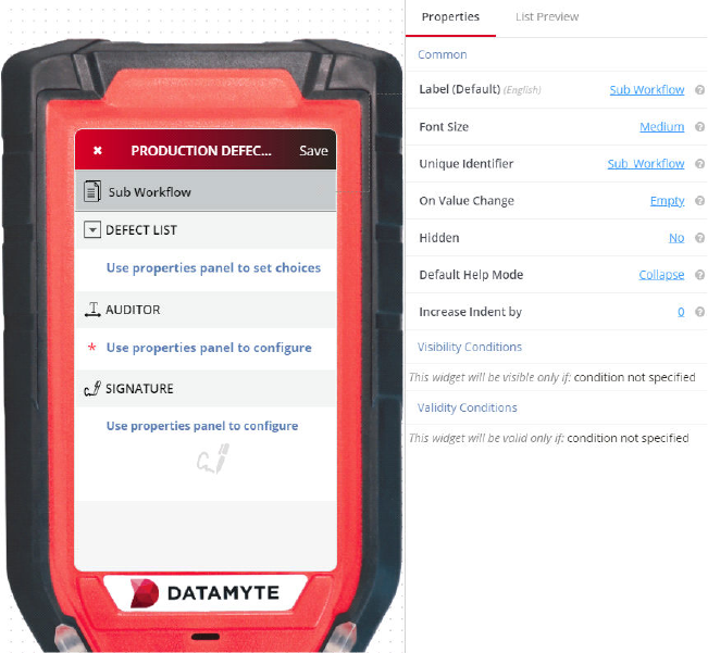
Sub Workflows: Sub Workflows allow Workflow Builder to make a lengthy and a complex
workflow shorter by combining related inputs in a separate workflow. This makes it easy to
navigate to different widgets within such a workflow.
Power Features Used in the Workflow Builder
By using Parent-Child Relationships and Reference Relationships, the capabilities of the Workflow
Builder are enhanced and data from one workflow can be used in another workflow.
Parent-Child Relationships: Some objects have parent-child relationships with each other. These
objects are represented as workflows in the Workflow Builder and their relationship is modeled using
parent-child relationships. This type of relationship can be understood better using the example of an
Airport and its constituent runways. An airport is a parent workflow while a runway is a child workflow. So,
an Airport can contain zero or more runways. During the submission of a workflow, you can enforce the
allowed number of children using the validation feature inside the workflow.
Reference Relationships: One object can be associated with or referenced through another object. An
invoice, for example, can refer to a customer to whom the invoice is addressed.
Workflow Builder Overview
• Create an App
• Click Create Workflow—Type New Workflow name (this is the name users will access on
Revolution device or web)
• Click Create Workflow—Workflow Builder window displays (Optional—watch the tutorial by
clicking on the video icon in upper right).
• Workflow Builder window displays—this is your design workflow space.
• Left—displays two tabs: Widgets (basic widgets) and Advanced (advanced widgets); Middle—
displays Revolution mobile device and Right—displays Properties and List Preview.
• The widgets (boxes) on the left are dragged with your mouse cursor and dropped to the
Revolution mobile device screen in the middle. The widget will display on the Revolution screen.
Add different widgets similar to your paper workflow.
• Set Properties of individual widget—select the widget and the Properties options for selected
widget display to the right of the screen. Example—drag Text Box to Revolution device. The field
“Required” displays in the Properties. Change the “Required” field to ‘Yes” to make this
mandatory. The field displays an asterisk.
• Click Advanced—optionally, drag and drop Advanced widgets and set Properties
• When all widgets have been added and properties set—click Save in the top right to save the
workflow
• Click Publish—top right to publish the workflow and begin using it to collect data on Revolution
devices and/or web.
Basic Workflow Widgets
Basic widgets can simply be dragged with the cursor and dropped to the digital mobile screen in the
middle pane. To display the properties related to the specific widget—click on the widget in the digital
mobile screen and the specific widget properties will be displayed in the right pane. Widgets can be
added and used more than once; i.e., you can add multiple Text Box widgets to your Workflow by simply
dragging and dropping to the digital mobile screen. IMPORTANT NOTE—One Text Box Widget or Choice
List Widget is required per Workflow.
Text Box Widget and Variants
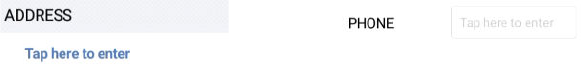
If you want your workflow to contain text, email, whole numbers, decimal number, address or phone
number, drag (left pane) the Text Box or one of it’s variant widgets to the middle pane and drop it. Use
the Text Box widget (or corresponding variant) in your workflow for plain text, address, phone number, e-
mail address, description, numeric, etc. Workflows can contain more than one Text Box widget.
Textbox Widget—Properties
Click on the Text Box placed on the middle screen (Revolution device) to display the Properties in the
right pane.
Input Type (This automatically changes according to the selected textbox
variant widget)
Input Type default value is Plain Text. Use the Input Type property in the right pane to allow specific input
while filling out the workflow. Example—if you want to add a text box to your workflow for a phone
number, you set the Input Type to ‘Phone.’ Note—Input Type options include Plain Text, Email, Numeric,
Decimal, Address, Phone, etc.
Multiline
Multiline default value is No. Use the Multiline property in the right pane to allow input in the textbox to be
constrained to one line or contain more than one line. Example—if your Input Type selected is ‘Address’
in your workflow, you may use ‘Multiline’ set to Yes as addresses contain more than one line. Note—
Multiline options include No and Yes.
Minimum Length & Maximum Length
Minimum Length default value is 0. Maximum Length (optional) default value is 1000. Use Minimum
Length and Maximum Length property to set the character limit of the Text Box. Note—it is not required to
specify both minimum and maximum conditions together. Example—the character limit for input type
Address can be between minimum 10 and maximum 100. You can set the Maximum Length to 100 only
(leaving minimum at 0).
Case
Case (optional) default value is Empty. Use the Case property to convert your text input to specified
format if required. Example—if you want input text to be converted to capitals select Case “Capital” from
drop down list. Note—Case options include Capital, Small or Title.

Default Text
Default Text (optional) default value is Empty. Use the Default Text property to add default text for a
particular placeholder of the text box. Example—Input Type is set to Email. Set the Default Text
“@gmail.com”. This saves time for the user—they add the initial part as @gmail.com already exists in the
field.
Widget Layout
Widget Layout default value is Two Line. Use the Widget Layout property to set the name (label) and
value to a single line or two lines. Example—Two Line layout displays the widget name (label) on one
line and the value (to be filled in) on a second line. One Line layout displays the widget name (label) and
the value to be filled in on a single line.
Two Line
One Line
Repopulate Value
Repopulate Value default value is No. Use the Repopulate Value property to automatically repopulate
(ditto) the previously submitted value. Example—Yes will remember the previously entered value and
automatically populate the field every time a new Workflow is opened for data collection (user can
manually change and this will become the new repopulate value); No will display the field blank every
time a new Workflow is opened for data collection.
Choices
Choices (Default) is optional and default value is Empty. Use the Choices property and enter each choice
on an individual line. The text field displays choice options to be selected as the input. Example—Don’t
Know: 999, Refused: 998 displays the choices for selection as Don’t Know or Refused. The text field
populates with 999 (Don’t Know) or 998 (Refused) based on choice selection.
Workflow Script (On Value Edit)
A callback function, which is defined in the workflow script for that workflow, can be indicated in this
property. The function gets triggered for every character change in the value of the text field, while the
value is being edited in the app. This property helps validate or update the workflow values immediately
as the text value is being updated.
Textbox Widget—Common Properties
Many widgets have common properties. Example—Label, Font Size, Place Holder, Required, Unique,
Unique Identifier, On Value Change, Hidden, Value Display Mode, Default Help Mode, Increase Indent
By, Visibility Conditions, Validity Conditions. Common properties appear at the bottom of the right pane
labeled
Common.
Label (Default)
Label default value is the name of the widget; i.e. Textbox. Select the Textbox widget. The right pane
(Common) displays Label (Default)—Textbox. Click on Textbox and delete the value. Type new value; i.e.
AUDITOR. The Label value will display AUDITOR on the Workflow Revolution device and in the right
pane Label. Optional—click on the Textbox label on Revolution device and edit the Label.
Font Size
Font Size default value is Medium. Use the Font Size property to set the font size. Example—use the
drop down list property to set font size to Small. Font size small will display textbox label, text instructions
(Tap here to enter), and the input value small. Note—Font Size options include Small, Medium (default)
and Large.
Place Holder
Place Holder default value for textbox is ‘Tap here to enter’. The instruction tells the user to tap here to
bring up the keypad to enter data. Place Holder property allows the user to customize their placeholder.
Example—Click here to enter data
Required
Required default value is No. Use the Required property to set to Yes (required) or No (not required).
Example—Text Box with Input Type Address may be required and a Text Box with Input Type Phone
may not be required (mandatory) when completing the Workflow. Note—A Required field(s) will display a
red asterisk (*) on the Workflow Input field on the device (Revolution device).
Unique
Unique default value is No. Use the Unique property to indicate if only unique values are to be accepted
by the user for this field. When submitting the workflow having a unique field, if any previous submission
exists with the same value for the unique field, the data submission is prevented with “Data sync failed”
message and includes Input Label and Value that already exists. Example—Data sync failed. The FIRST
NAME in DENISE already exists. CANCEL and RETRY are your options. Click CANCEL. Select Draft
data and click in the duplicate field and edit the value. The record can be resubmitted with a new (unique)
value.
Unique Identifier
Unique Identifier property is for reference purposes only. The user does NOT need to do anything with
this property. Every field requires a Unique Identifier. This defaults to the widget name; i.e., Textbox,
Textbox 2, Choice List, Choice List 2, etc. No two unique identifiers will be the same.
Example—If you have created the field ‘Address’ and set a visibility condition to say the ‘Address’ field
will be visible only if you have entered the ‘Phone Number’. If there are two fields that say ‘Phone
Number’—it will be difficult to set a visibility condition since both the fields have the same name. Both
these fields ‘Phone Number’ will have different unique identifiers. You can check the Unique Identifier and
then set the condition accordingly.
Custom ID
Custom ID default value is Empty. Custom ID property is for specifying the application specific ID for
using in Workflow Script and reporting.
On Value Change
On Value Change default value is Empty. Use the On Value Change property to set up the callback
function for change in the field’s value. The function must be defined in the Workflow Script for the
Workflow.
Hidden
Hidden default value is No. Use the Hidden property to make the field hidden from the end user in the
Workflow. Example—this feature can be used when a field's value is getting set from a source other than
user input, such as by a default value, by repopulating the field or from the Workflow Script. Hidden
options are No (default) or Yes.
Value Display Mode
Value Display Mode default value is Editable. Use the Value Display Mode to make the field editable or
read-only on Workflow. Value Display Mode options are Edit and Read Only.
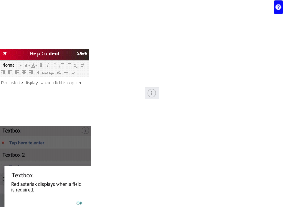
Default Help Mode
Default Help Mode default value is Collapse. Hover over and click on the blue question mark icon of
the selected widget; i.e. Textbox in the middle pane. Help Content dialog displays. Type in Help Content;
i.e., Red asterisk displays when a field is required. Click Save—upper right corner to save and close Help
Content dialog. Example—shown below.
Revolution device will display an informational icon when Help Content is available. On the
Revolution device, press the informational icon to display Help Content. Press OK to close the Help
Content dialog. Example—shown below.
Increase Indent By
Increase Indent By default value is 0. Use the Increase Indent By property to set up a hierarchical layout
of your Workflow. Use the up/down navigation arrows to increase the indentation of the widget compared
to other fields on the Workflow.
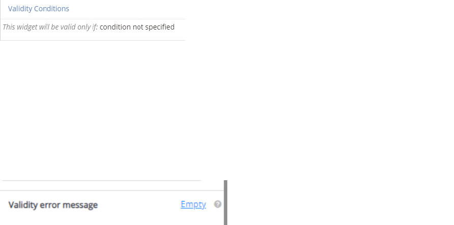
Validity Conditions
Validity Conditions default value is condition not specified. Validity Condition is the property used to
specify a validity condition. If you apply a validity condition, it implies that the field will only be submitted if
it satisfies the condition you have set. Otherwise it will show you the validation error message. Validity
condition can be set by specifying the condition - you can do that by clicking ‘condition not specified.’
Validity error message
The default value of the Validity error message is Empty. This field is mandatory if you set the validity
condition on the widget. This message will be displayed when the validity condition does not match with
the given input. You can write an error message that could be “This field is for experienced people only.”
Validations can help you to control the type of input during the filling of a workflow by the user. You can
also customize an error message that you want to display by typing the message in ‘Validity Error
Message.’
Visibility Conditions
Visibility Condition in the property for the text box is used to specify a condition. If you apply any visibility
condition, it implies that the text box will only be visible if it satisfies the condition that you have set.
Visibility condition can be set by specifying the condition - you can do that by clicking ‘condition not
specified.’ For example, you might create a text box ‘Describe Your Last Job’, which will be only visible if
the user enters ‘Yes’ in the earlier field ‘Have you got job experience?’ Otherwise, it would be invalid and
show an error message.
Add a new Visibility Condition:
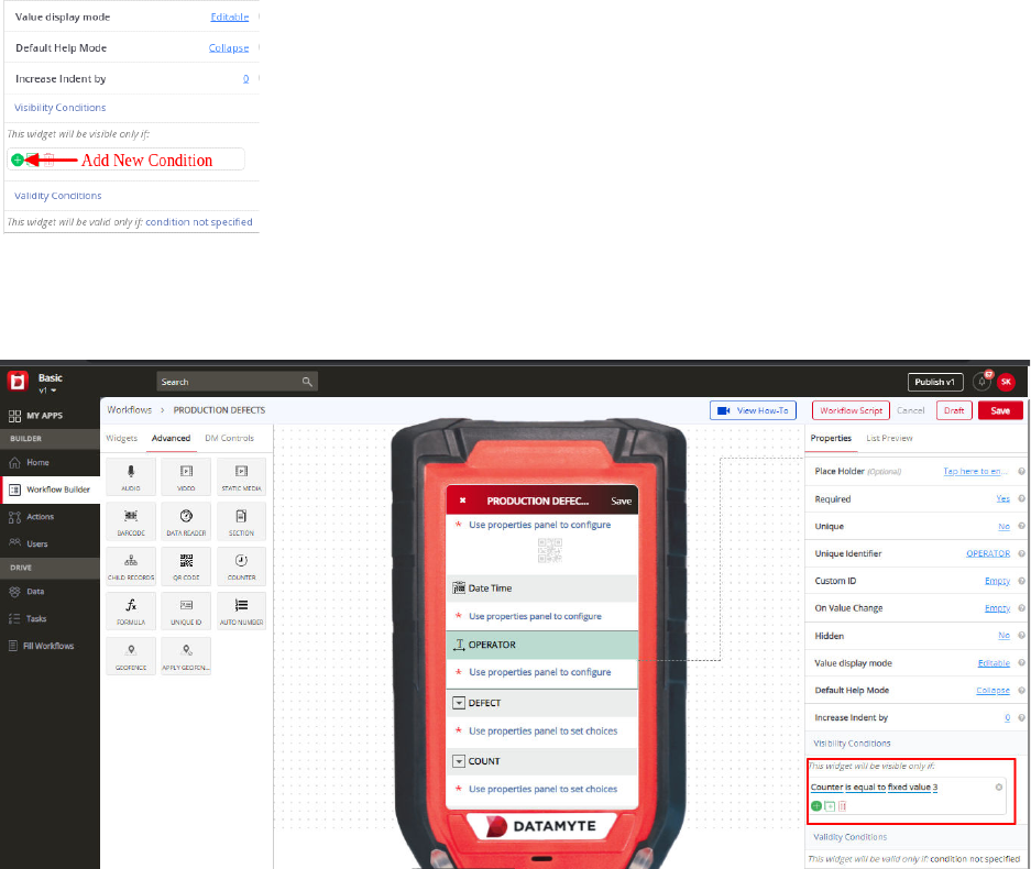
Set up the condition by selecting the fields and their expected values to make the curr
ent field visible:
Choice List Widget
Choice List widget can be used to create a list of options for the end user to choose from while
completing the workflow. Example— you might want to create a choice list for Gender—Female, Male,
Not Specified. To use Choice List widget in your workflow, drag the widget from the left pane and drop it
to the middle pane. Workflows can contain more than one Choice List widget.
Choice List Widget—Properties
Data Source
Data Source default value is Fixed List. Use the Data Source property options---Fixed List, Reference
List, Grid List, Image Fixed List or Choice API. Select Fixed List and use Choices to create a choice list.
Select Reference List and use the Reference to drop down list to select a previously created list. Select
Grid List and user “Edit the Grid” property to create a choice list. Select Image choice list and Upload
Choice(s) to create a choice list. Select Choice API and use the API URL to point to a web site that
contains your list, Method, Username, Password and Field Map to map the data.
Choices
Choices (Default) values are Choice 1, Choice 2, and Choice 3. Use the Choices property to add a “Fixed
List”. Example—Data Source is set to Fixed List. Add choices for Shift; i.e., First, Second, Third,
Rotation. Use a return to place each choice on an individual line. Example—Data Source is set to
Reference List. Reference to property displays a drop down list of previously created lists. Select the list
to be ‘referenced’. Example — Data Source is set to Image Fixed List. Upload Choice(s) of image file
with it’s Text & value. Example — Data Source is set to Grid List. Edit the Grid with the choices for Shift
i.e. First, Second, Third, Rotation.
Unit
Unit is optional and the default value is Empty. Use the Unit property to better define your choice list.
Example—if you create a choice list of annual incomes, you can use the Unit to specify ‘dollars’ for a
better understanding.
Multiple Selection
Multiple Selection default value is No. Use the Multiple Selection property to allow the user to select one
or more choices when filling out the workflow. Example—Multiple Selection set to Yes. When filling out
the workflow, the user can select multiple selections from the choice list. A choice list displaying electronic
appliances you own may include—refrigerator, microwave, washer, dryer, computer, etc. Multiple
Selection set to yes allows selecting more than one choice. Note—Multiple Selection options include No
and Yes.
Allow Barcode/QR Code Search
Allow barcode or QR code scan for search option in the Revolution device.
Repopulate Value
Repopulate Value default value is No. Use the Repopulate Value property to automatically repopulate
(ditto) the previously submitted value. Example—Yes will remember the previously entered value and
automatically populate the field every time a new Workflow is opened for data collection (user can
manually change and this will become the new repopulate value); No will display the field blank every
time a new Workflow is opened for data collection.
Widget Layout
Widget Layout default value is Two Line. Use the Widget Layout property to set the name (label) and
value to a single line or two lines. Example—Two Line layout displays the widget name (label) on one
line and the value (to be filled in) on a second line. One Line layout displays the widget name (label) and
the value to be filled in on a single line.
Two Line
One Line
Adding Reference
Adding Reference default value is No. Use the Adding Reference property to allow adding reference in
the reference list.
Example—No will not allow you to add the reference in the reference choice list; Yes
will allow you to add the reference record in the list. Use the Plus button to add the reference.
Display Values?
Display Values default value is First column. Use the Display value property to select the choice display in
the revolution device.
Example— First column will show you the first column of the Grid list and you can
select the choices from them; All column will show you the all column from the grid list defined in the
workflow in workflow builder.
Is Status
”Is Status” the default value is Yes. Use is status to specify whether this field will be available for setting
as list view status or not.
Example—Yes will specify that this field will be available for setting as list view
status; No will specify that this field will not be available for setting as list view status.
Choice List Widget—Common Properties
Choice List Common Properties include—Label, Font Size, Place Holder, Required, Unique, Unique
Identifier, On Value Change, Hidden, Value Display Mode, Default Help Mode, Increase Indent By,
Visibility Conditions and Validity Conditions. Reference Text Box Widget—Common Properties for
definitions and examples.
Group Header Widget
Group Header widget can be used to create a text header to divide your workflow into sections. This can
be useful when you have a long workflow. Dividing your workflow using the Group Header widget allows
you to add relevant fields to a section for better understanding and flow. Workflows can contain more than
one Group Header widget.
Group Header Widget—Properties
Header Title
Header Title default value is Group Header (the name of the widget). Use the Header Title property in the
right pane to name the section on your workflow. Example—Personal Information or Marketing Questions
and add the relevant fields under that Header Title in your workflow.
Sticky Group
Sticky Group default value is No. Sticky Group property in the right pane drop down list options include
Yes or No. Allows Group Headers to stick at top.
Subtype (For Label use the “Group Label” widget)
Subtype default value is Label. Subtype property in the right pane can be set to Label—does not allow
sections to collapse on the workflow when collecting data or Header—does allow you to collapse sections
on the workflow. The gray triangle denotes if information is displayed or collapsed. Examples—shown
below.
Group Header Widget—Common Properties
Group Header Common Properties include—Label, Font Size, Required, Unique Identifier, On Value
Change, Hidden, Value Display Mode, Default Help Mode, Increase Indent By, and Visibility Conditions.
Reference Text Box Widget—Common Properties for definitions and examples.
Group Label Widget
A Group Header Widget variant. Has most of the same Properties as it, but does not expand or contract.
Photo Widget
Photo Widget can be used to add a photo or image to your workflow. Drag and drop the Photo widget
from the left pane to the middle pane on the Revolution device. Photo widget will allow the user to capture
images using the Revolution camera or you can pick an image from a photo gallery/library.
Photo Widget—Properties
Generate Public URL for Accessing Photos
Generate Public URL for Accessing Photos default value is ‘Yes’. The Generate Public URL for
Accessing Photos property is a drop down list. Options include Yes or No. Set the property to Yes if you
want to view the image if you export the data to Excel. Set the property to No if when data is exported to
Excel you do NOT want the image to be displayed. Example—Generate Public URL for Accessing
Photos is set to Yes. When you export the data to Excel spreadsheet, the image will be exported with the
data. Generate Public URL for Accessing Photos is set to No. When you export the data to Excel
spreadsheet, the image will not be visible with the data.
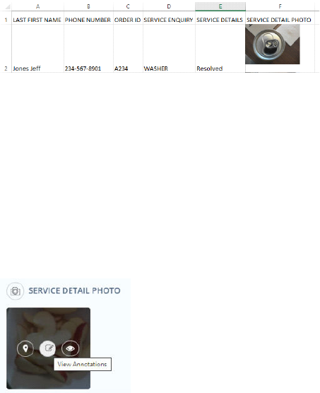
Include Note
A note can be associated with every annotation (shape) drawn on an image. By default, the annotation
asks for a note right after it is drawn on the image. The Include Note property can be disabled to not ask
the user to add notes for every annotation drawn. If disabled, the note section does not appear after
drawing the shape, but still a note can be added later when a shape is selected by clicking on it.
To view annotations and notes on photo, select image in Data and click View Annotations icon—Example
shown below.
Photo Widget—Common Properties
Photo Widget
Common Properties include—Label, Font Size, Required, Unique Identifier, On Value
Change, Hidden, Value Display Mode, Default Help Mode, Increase Indent By, Visibility Conditions and
Validity Conditions. Reference Text Box Widget—Common Properties for definitions and examples.
Photo Widget—Revolution Device
DATAMYTE Digital Clipboard using onboard camera on the Revolution Device to capture
images. The end user collecting data in the workflow can capture one or more pictures, add
annotations, and notes. Data collection is more effective when you have an image of the
problem.
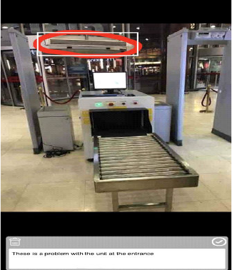
STEPS:
• Open Camera (Photo Widget)—Revolution Device
• Take picture
• Tap picture to annotate
• Draw on picture
• Add Notes (workflow Notes set to Yes)
Document Widget
Document Widget can be used to attach a document to your workflow during data collection. The end
user selects the document on the Revolution Device to be attached and submitted with data. Additionally,
you can enable the document to be viewable when you export the data to Excel.
Document Widget—Properties
Generate Public URL for Accessing Documents
Generate Public URL for Accessing Documents default value is ‘Yes’. The drop down list options include
Yes or No. If the property is set to ‘Yes’—the document is visible when exporting data to Excel. If the
property is set to ‘No’, the document will not be visible when the data is exported.
Allowed File Type
Allowed File Type default value is PDF. The Document Widget also allow the following file type:
• doc
• xls
• pptx
• html
• docx
• xlsx
• odt
• pdf
• ppt
• txt
By default, only PDF documents are allowed. The allowed types can be decided at the time of designing
the workflow and many or all of the above types can be set for this widget. The allowed file types can be
specified as a comma separated list of the above types. Example— pdf,txt,docx
File Size Limit
File Size Limit default value is 0. The File Size Limit can be specified in MB for the document to be
uploaded. Example—if the File Size Limit property is set to 5.5, the app user will be able to upload the
document with the size less than 5MB while filling in the workflow from the mobile device.
Document Widget—Common Properties
Document Widget
Common Properties include—Label, Font Size, Place Holder, Required, Unique
Identifier, On Value Change, Hidden, Value Display Mode, Default Help Mode, Increase Indent By,
Visibility Conditions and Validity Conditions. Reference Text Box Widget—Common Properties for
definitions and examples
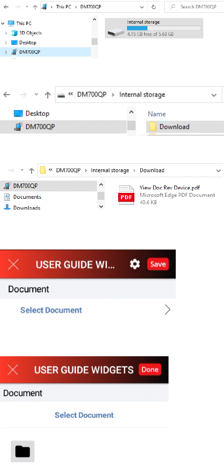
Document Widget—Revolution Device
• Add Document Widget to your workflow, publish workflow and load on device
• Connect Revolution Device to your computer via USB cable
• Use File Explorer—Browse to DM700QP > Internal storage
• Select Internal storage > Browse to Folder > Download
• Drag and drop your select *.PDF file to Download folder
• Select your Workflow on Revolution Device with Document Widget
• Click Select Document >
• Click black file folder
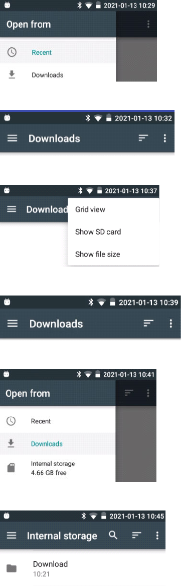
• Click Downloads
• Click on ellipse (three dots on the right of the screen)
• Click on Show SD card
• Click Downloads menu (three lines on the left)
• Click Open from > Internal storage
• Internal storage > Select Download folder
• Select Document; i.e. view Doc Rev Device pdf
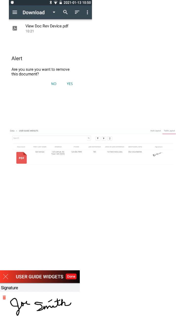
• Click red X in the circle to remove the selected document. Dialog displays asking you to confirm you
want to remove the document. Click NO. Dialog closed.
• Click ‘Done’ to save the selected document to be attached to workflow data.
• Complete workflow and submit data. Example—below displays submitted data to Digital Clipboard
with PDF document attached.
Signature Widget
Signature widget can be used to allow your workflow to contain an electronic signature. Drag and drop
the Signature Widget to the center pane Revolution device. This may add more authenticity to your
workflow.
Signature Widget—Properties
Note
Note (Optional) default value is Empty. Use Note to add Signature Note.
To change the name Signature—use ‘Label’ in the Common property section. To make Signature
required—use the ‘Required’ property in the Common properties section and ‘Yes’ from the drop down
list. Revolution device uses a touch screen to collect the electronic signature.
Signature Widget--Common Properties
Signature Widget Common Properties include—Label, Font Size, Place Holder, Required, Unique
Identifier, On Value Change, Hidden, Value Display Mode, Default Help Mode, Increase Indent By,
Visibility Conditions and Validity Conditions. Reference Text Box Widget—Common Properties for
definitions and examples.
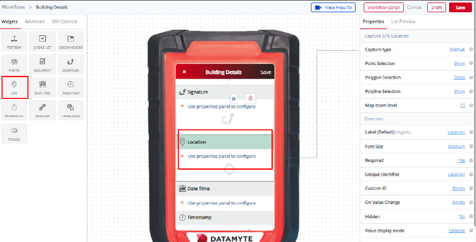
GPS Widget
GPS widget is used to collect GPS information. The GPS Widget has 3 different tools—Point Selection,
Polygon Selection and Polyline Selection to capture GPS values. GPS Widget is supported only on
tablets or phones. The GPS Widget is disabled on the Revolution.
GPS Widget—Properties
Capture Type
Capture Type default value is Manual. Use the Capture Type property in the right pane drop down list to
specify Manual, On Tap or On Submit. Property definitions are listed below for each setting.

Manual—if you set Manual,
when completing the workflow
on a mobile device, the user will
be able to pick a location on the
map displayed.
On Tap—if you set On Tap,
when completing the workflow
on the mobile device, the user
can just tap to fetch the real-
time location through the mobile
device.
On Submit—if you set On
Submit, the location will be
fetched only when the workflow
has been submitted. Example—
a user may complete the
workflow at one location;
however, if they submit the
workflow from a different
location, the locations where the
workflow was submitted will be
the location captured with the
data.
Point Selection
Point Selection default value is Show. Point Selection displays a drop down list—Show or Hide. Select
Point Selection property drop down list to enable (Show) or disable (hide) this property.
Polygon Selection
Polygon Selection default value is Show. Polygon Selection displays a drop down list—Show or Hide. A
location can be captured in the shape of a polygon. Select Polygon Selection property drop down list to
enable (Show) or disable (Hide) this property tool on a map.
Polyline Selection
Polyline Selection default value is Show. Polyline Selection displays a drop down list—Show or Hide. A
location can be selected in the shape of a polyline to capture and showcase a linear area like a road.
Select Polyline Selection property drop down list to enable (Show) or disable (Hide) this property tool on a
map.
Map Zoom Level
Map Zoom Level default value is 15. Map Zoom Level default value can be set between 0-22. Zero being
the maximum zoom out showing the world map when this field is opened on mobile phone or tablet
device. Twenty-Two is the maximum zoom level considering the user’s current location fetched from the
device.
GPS Widget—Common Properties
GPS Widget
Common Properties include—Label, Font Size, Required, Unique Identifier, On Value
Change, Hidden, Value Display Mode, Default Help Mode, Increase Indent By, and Validity Conditions.
Reference Text Box Widget—Common Properties for definitions and examples
Date Time Widget
Date Time widget can be used to capture date and time during data collection on the mobile device
workflow. To use the Date Time widget in your workflow, drag the widget from the left pane and drop it to
the middle pane. Options available include Date time both (default), Date, Time, or Date Range.
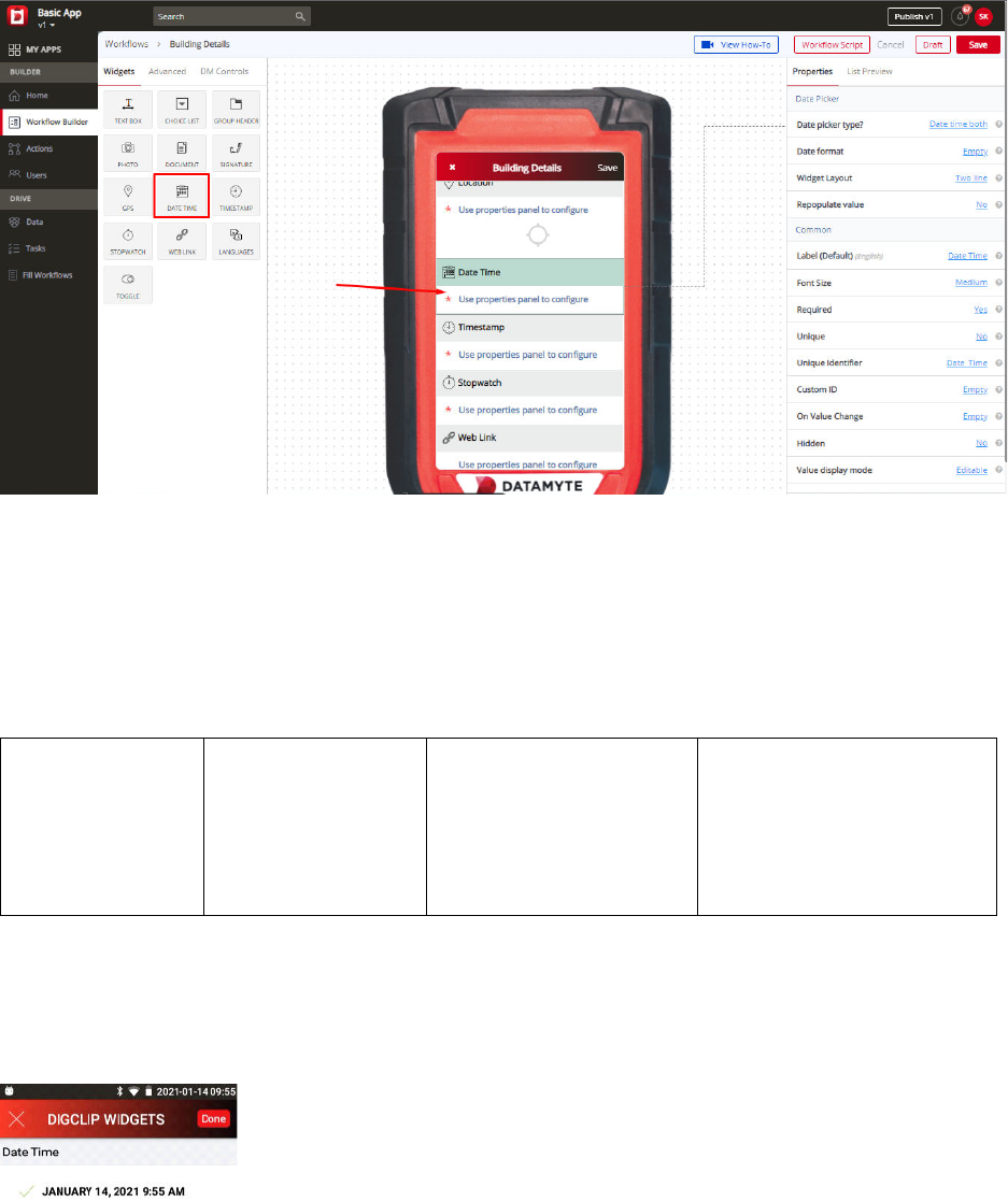
Date Time Widget—Properties
Date Picker Type
Date Picker Type default value is Date time both. Date Picker Type property allows different types of input
during data collection on your workflow. The four types are Date, Time, Date Time Both and Date Range.
Date—Select Date
to allow you to
choose a date
only when you
complete your
workflow.
Time—Select Time
to allow you to
choose time only
when you complete
your workflow.
Date Time Both—Select
Date Time Both to allow
you to choose both date
and time when you
complete your workflow.
Date Range—Select Date
Range to allow you to select
a date range (from a
particular date—to a
particular date) when
completing your workflow.
Date Format
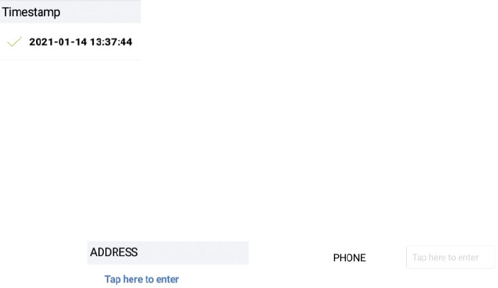
Date Format default value is Empty. Date Format property can be customized to display the date in the
specified format to the user. The default date format in Month, Day, Year, Hour, Minutes AM (PM).
Example—January 14, 2021 9:55 AM
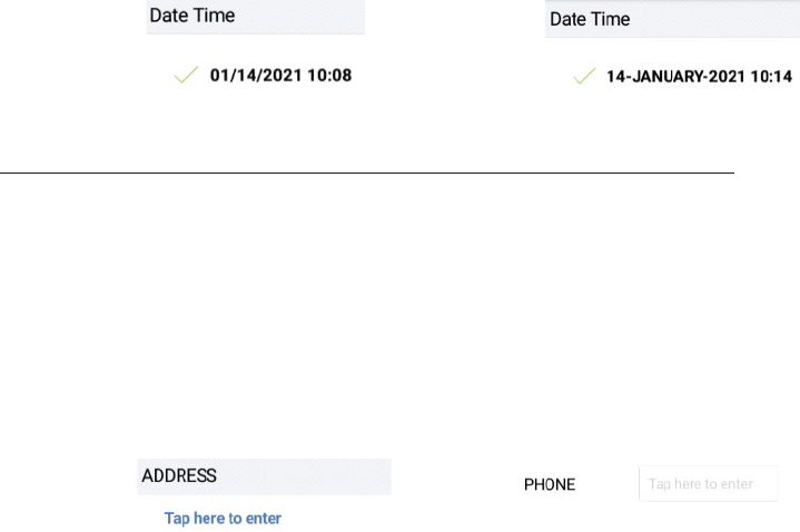
Additional Example—Date Format property set to MM/dd/yyyy HH:mm—displays 01/14/2021 10:08. Date
Format property set to dd-MMMM-yyyy H:mm—displays 14-JANUARY-2021 10:14
For more details on date format patterns, you can refer to the link below:
https://help.gooddata.com/cloudconnect/manual/date-and-time-format.html
Widget Layout
Widget Layout default value is Two Line. Use the Widget Layout property to set the name (label) and
value to a single line or two lines. Example—Two Line layout displays the widget name (label) on one
line and the value (to be filled in) on a second line. One Line layout displays the widget name (label) and
the value to be filled in on a single line.
Two Line
One Line
Repopulate Value
Repopulate Value default value is No. Use the Repopulate Value property to automatically repopulate
(ditto) the previously submitted value. Example—Yes will remember the previously entered value and
automatically populate the field every time a new Workflow is opened for data collection (user can
manually change and this will become the new repopulate value); No will display the field blank every
time a new Workflow is opened for data collection.
Date Time Widget—Common Properties
Date Time Widget
Common Properties include—Label, Font Size, Required, Unique, Unique Identifier,
On Value Change, Hidden, Value Display Mode, Default Help Mode, Increase Indent By, Visibility
Conditions and Validity Conditions. Reference Text Box Widget—Common Properties for definitions
and examples
Visibility Conditions Example—you might create a Date Time Field ‘Inspection End Date’ which will be
only visible if the user chooses the ‘Yes’ option in the earlier choice list ‘Did Inspection End on a Different
Date from That of a Start Date?’ Visibility conditions can help you control the type of input during the filling
of a workflow by the user.
Validity Conditions Example—you might create a field ‘Inspection End Date’ which will be only valid if
the user enters ‘Yes’ in the earlier field ‘Did the inspection last for more than a day?’ Otherwise, it would
be invalid and show an error message. Validations can help you control the type of input during the filling
of a workflow by the user. You can also customize an error message that you want to display by typing
the message in ‘Validity Error Message.’ This message will be displayed when the validity condition does
not match with the given input. The error message could be “This field is applicable only if the inspection
ends on a different date.”
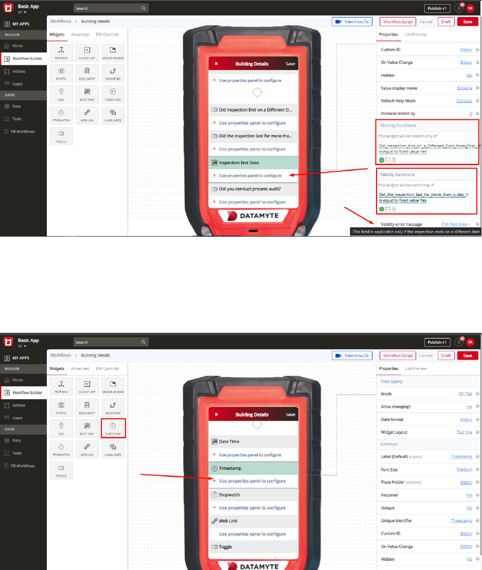
Timestamp Widget
If you want your workflow to have a Timestamp, then you can drag the widget from the left panel to the
digital mobile screen in the middle. Timestamp, if used while filling the workflow, will capture the exact
time of that particular moment - not just hours and minutes, but also seconds.
Timestamp Widget—Properties
Mode
Mode default value is On Tap. Mode property displays a drop down list and includes On Open, On Tap,
and On Submit. On Open—the Timestamp value is automatically populated when the workflow is opened
to be completed. The Timestamp field is visible in the app when it is set to take the value on open. On
Tap—the Timestamp value gets set when the user taps on the Timestamp field in the workflow during
data collection. On Submit—the Timestamp widget is not visible in the workflow. Even if the device is
offline and a workflow record is completed, the Timestamp record is when the record is submitted.
Allow Changing
Allow Changing default value is No. Allow Changing property displays a drop down list and includes No
and Yes. Allow Changing property set to No—allows the user to change the field one time. Allow
Changing property set to Yes—allows the user to change the field multiple times.
Date Format
Date Format default value is Empty. Date Format property can be customized to display the date in the
specified format to the user. Example—default displays as shown below:
Widget Layout
Widget Layout default value is Two Line. Use the Widget Layout property to set the name (label) and
value to a single line or two lines. Example—Two Line layout displays the widget name (label) on one
line and the value (to be filled in) on a second line. One Line layout displays the widget name (label) and
the value to be filled in on a single line.
Two Line
One Line
Time Stamp Widget—Common Properties
Date Time Widget Common Properties include—Label, Font Size, Place Holder, Required, Unique,
Unique Identifier, On Value Change, Hidden, Value Display Mode, Default Help Mode, Increase Indent
By, Visibility Conditions and Validity Conditions. Reference Text Box Widget—Common Properties for
definitions and examples.
Visibility Conditions Example—you might create a Timestamp which will be only visible if the user
chooses the ‘Yes’ option in the earlier choice list ‘Has the data collection process completed?’ Visibility
conditions can help you control the type of input during the filling of a workflow by the user.
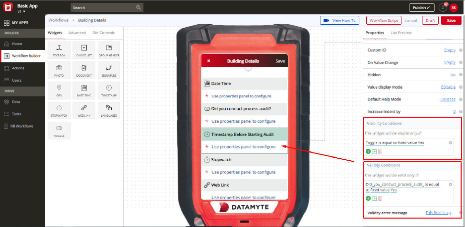
Validity Conditions Example—you might create a field ‘Timestamp Before Starting Audit’ which will be
only valid if the user enters ‘Yes’ in the earlier field ‘Did you conduct process audit?’ Otherwise, it would
be invalid and show an error message. Validations can help you control the type of input during the filling
of a workflow by the user. You can also customize an error message that you want to display by typing
the message in ‘Validity Error Message.’ This message will be displayed when the validity condition does
not match with the given input. The error message could be “This field is applicable only when the
process audit is conducted.”
Stopwatch Widget
If you want your workflow to contain a stopwatch, drag (left pane) the Stopwatch widget to the middle
pane and drop it. Use the stopwatch to track the time it takes to perform a particular activity when
completing the workflow.
Stopwatch Widget—Properties
Allow Pausing
Allow Pausing default value is No. Use the Allow Pausing property in the right pane to allow the
Stopwatch on your workflow to be paused. Allow Pausing property displays a drop down list with options
Yes or No. If Allow Pausing is set to No—the Stopwatch, once started cannot be paused. If Allow Pausing
is set to Yes—you can pause and resume the stopwatch when completing your workflow. Example—you
can create Stopwatch before starting a new section on the workflow every time a different process like
Inspection, Audit, etc.
Stopwatch Widget—Common Properties
Stopwatch Widget
Common Properties include—Label, Font Size, Required, Unique, Unique Identifier,
On Value Change, Hidden, Value Display Mode, Default Help Mode, Increase Indent By, Visibility
Conditions and Validity Conditions. Reference Text Box Widget—Common Properties for definitions
and examples
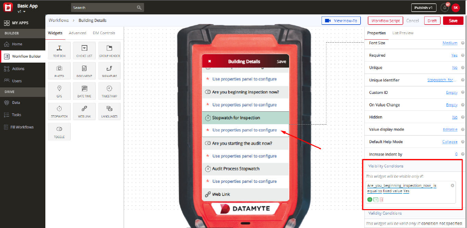
Visibility Condition Example—you might create a Field ‘Stopwatch for Inspection’ which will be only
visible if the user chooses the ‘Yes’ option in the previous choice list ‘Are you beginning inspection now?’
Visibility conditions can help you control the type of input during the filling of a workflow by the user.
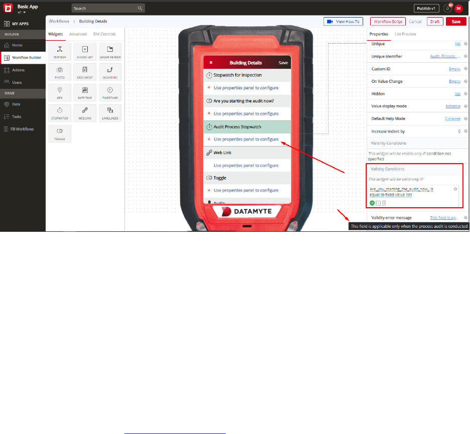
Validity Condition Example—you might create a field ‘Audit Process Stopwatch’ which will be only valid
if the user enters ‘Yes’ in the earlier field ‘Are you starting the audit now?’ Otherwise, it would be invalid
and show an error message. Validations can help you control the type of input during the filling of a
workflow by the user. You can also customize an error message that you want to display by typing the
message in ‘Validity Error Message.’ This message will be displayed when the validity condition does not
match with the given input.
Web Link Widget
Web Link widget can be used to allow your workflow to contain links. Drag and drop the Web Link widget
from the left pane to the middle pane. Web Link widget allows you to insert import links to the workflow
and can be referenced by the user when completing the workflow. Important Note—Web Link cannot be
edited or changed when completing the workflow. It is added to the workflow for reference only.
Example—your mobile workflow may contain a line to your company’s website at the end of the workflow.
Web Link Widget—Properties
Target URL
Target URL default value is http://www.google.com. Add your exact URL in the Target URL property in
the right pane. It can be your website link or any other link to your document, library, etc.
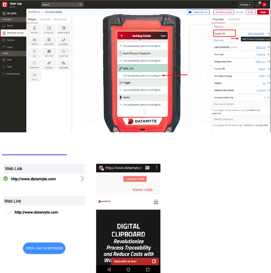
Example—http://www.datamyte.com displays as Web Link in workflow. Click on link
(
http://www.datamyte.com. Click on OPEN LINK IN BROWSER. Website displays as shown below.
Web Link Widget—Common Properties
Web Link Widget
Common Properties include—Label, Font Size, Unique Identifier, On Value Change,
Hidden, Default Help Mode, Increase Indent By, Visibility Conditions and Validity Conditions. Reference
Text Box Widget—Common Properties for definitions and examples
Visibility Conditions Example—you might create a ‘Website Link’ which will be only visible if the user
chooses the ‘Yes’ option in the earlier choice list ‘Do you want a website link?’
Validity Conditions Example—you might create a web link which will be only valid if the user enters
‘Yes’ in the earlier choice field ‘Do you stay in the USA?’ Otherwise, it would be invalid and show an error
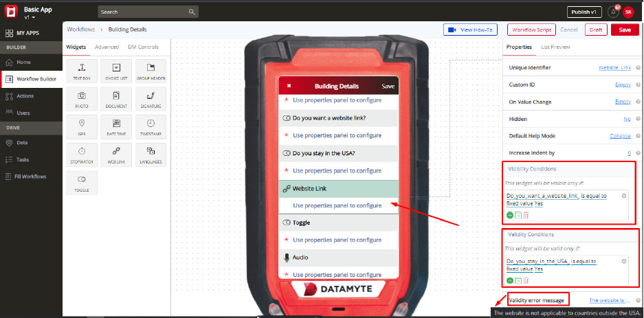
message. Validations can help you control the type of input during the filling of a workflow by the user.
You can also customize an error message that you want to display by typing the message in ‘Validity
Error Message.’ This message will be displayed when the validity condition does not match with the given
input. The error message could be “The website is not applicable to countries outside the USA.”
Languages Widget
If you want your workflow to contain Languages, drag (left pane) the Languages widget to the middle
pane and drop.
The list of available languages for your workflow are configured on the App Settings page.
Click on My Apps, select the app you want to set up additional languages, and then select the App
Settings page. The Enabled language control on the page shows the currently selected languages.
Click the Edit button to make changes. If the desired language is not in the list control, contact the
system administrator to get additional languages added to the database.
Languages Widget—Properties
Repopulate Value
Repopulate default value is No. Repopulate Value displays a drop down list with No and Yes options. Use
the Repopulate Value property set to Yes to automatically repopulate (ditto) the previously selected
language when completing subsequent workflow records.
Default Language
Default Language default value is English. If the desired language is not in the list control, contact
the system administrator to get additional languages added to the database.
Languages Widget—Common Properties
Languages Widget
Common Properties include—Label, Font Size, Required, Unique Identifier, On Value
Change, Hidden, Value Display Mode, Default Help Mode, Increase Indent By, Visibility Conditions and
Validity Conditions. Reference Text Box Widget—Common Properties for definitions and examples
Toggle Widget
Use the Toggle widget in your workflow to create Yes or No options. To include Toggle widget, drag
Toggle (left pane) to the middle pane and drop. A Toggle in your workflow is similar to the Choice List
widget. The main difference is the Toggle widget contains only two options—Yes and No.
Toggle Widget—Properties
Default Value
Default Value default value is No. Default Value property displays a drop down list and includes No or
Yes. Example—you might create a toggle for a question like ‘Are you from California?’ The user while
filling the workflow will select either Yes or No.
Toggle Widget—Common Properties
Toggle Widget Common Properties include—Label, Font Size, Required, Unique Identifier, On Value
Change, Hidden, Value Display Mode, Default Help Mode, Increase Indent By, Visibility Conditions and
Validity Conditions. Reference Text Box Widget—Common Properties for definitions and examples
Visibility Conditions Example—you might create a Toggle ‘Are you from California?’ which will be only
visible if the user chooses the ‘Yes’ option in the earlier choice list ‘Are you from the USA?’ Visibility
conditions can help you control the type of input during the filling of a workflow by the user.
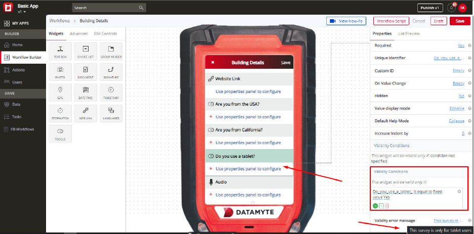
Validity Condition Example—you might create a Toggle ‘Do you use a tablet?’ which will be only valid if
the user enters ‘Yes’ in the same field. Otherwise, it would be invalid and show an error message: “This
survey is only for tablet users.” Validations can help you control the type of input during the filling of a
workflow by the user. You can also customize an error message that you want to display by typing the
message in ‘Validity Error Message.’ This message will be displayed when the validity condition does not
match with the given input.
Advanced Workflow Widgets
On the left panel, you can see the ‘Advanced’ option besides ‘Widgets.’ Advanced stands for advanced
widgets that you can use in your workflow. Just as the basic widgets, you can drag these widgets and
drop them on the digital mobile screen in the middle. All of the widgets will have some properties, which
are explained here.
Audio Widget
Using Audio features, your workflow can capture audio. To add an audio widget in your workflow, you can
simply drag the widget from the left panel and drop it to the middle screen.
For example, the Audio widget can be added to your workflow for ‘customer feedback,’ where instead of
typing the entire feedback, you can just record the customer’s voice. While filling out the workflow, the
audio can be either recorded live or an audio file can be browsed and selected.
Audio Widget—Properties
Label
You can change the name of the ‘Audio’ using a label. It is ‘Audio’ by default. On the right panel, go to the
label section and you can type the required text that you want. The same name will appear on the
workflow. For example—you might create an audio for ‘Customer Feedback’ in your workflow.
Required
You can use this property to make ‘Audio’ mandatory to be filled. Some fields in your workflow might be
mandatory, while some might not be. For example, ‘Audio’ can be set to ‘Yes’ in the required property
when you want to make the field mandatory. So, while filling out a workflow, the user will have to
compulsorily capture or choose an audio file, without which the workflow wouldn’t be submitted.
Unique Identifier
Every field will have a unique identifier. No two unique identifiers for fields will be the same. Please note
that ‘Unique Identifier’ property is just for reference purpose only. The user need not have to do anything
to this property, it can be referred to when there are fields created with the same names. When you
create two fields with the same names, it might get confusing when you are setting a condition and you
wouldn’t know which field is which.
For example—if you have created a field ‘address’ - and set a visibility condition to it saying the ‘address’
field will be only visible if you have entered the ‘Phone number.’ But if there are two fields that say ‘Phone
Number’ - it will be difficult to set a visibility condition since both the fields have the same name. Both of
these fields ‘Phone Number’ will have different unique identifiers. You can check the unique identifier and
then set the condition accordingly.
Visibility Conditions
Visibility Condition in the property for the ‘Audio’ is used to specify a condition. If you apply any visibility
condition, it implies that the ‘Audio’ field will only be visible if it satisfies the condition that you have set.
Visibility condition can be set by specifying the condition - you can do that by clicking ‘condition not
specified.’
For example—you might create an audio field ‘Customer Feedback’ which will be only visible if the user
chooses the ‘Yes’ option in the earlier choice list ‘Did you record an audio for customer feedback?’
Validity Conditions
Validity Condition in the property for the ‘Audio’ is used to specify a condition. If you set any validity
condition, it implies that the ‘Audio’ will only be valid if it satisfies the condition that you have set. Validity
condition can be set by specifying the condition - you can do that by clicking ‘condition not specified.’
For example—You might create an audio field ‘Customer Feedback’ which will be only valid if the user
enters ‘Yes’ in the earlier choice field ‘Did you record customer feedback?’ Otherwise, it would be invalid
and show an error message.
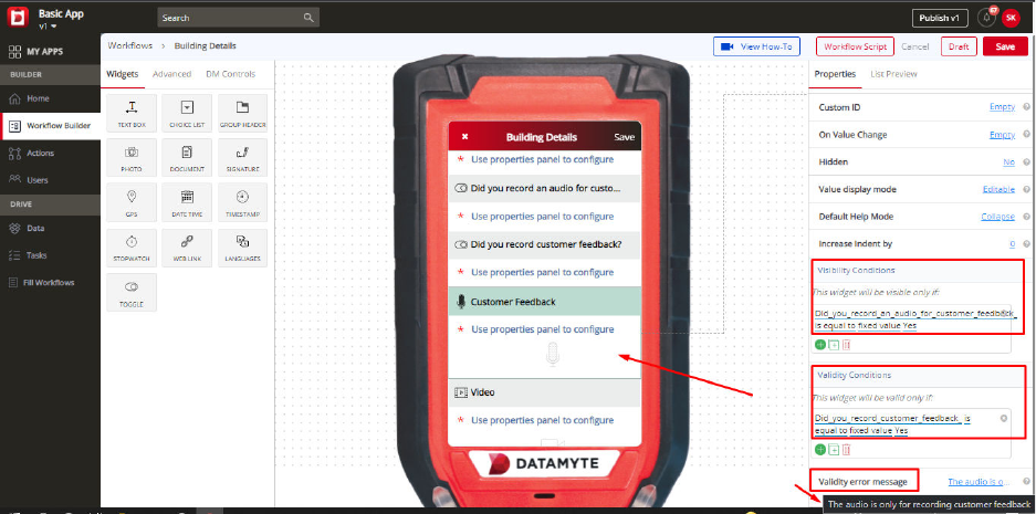
Validations can help you control the type of input during the filling of a workflow by the user.
You can also customize an error message that you want to display by typing the message in ‘Validity
Error Message.’ This message will be displayed when the validity condition does not match with the given
input. The error message could be “The audio is only for recording customer feedback.”
Video Widget
Using the Video feature, your workflow can capture video. To add a Video widget in your workflow, you
can simply drag the widget from the left panel and drop it to the middle screen.
For example, Video widget can be added to your workflow for ‘Employee Testimonial,’ where instead of
typing the entire testimonial, you can just record the employee testimonial. While filling out the workflow,
the video can be either recorded live or a video file can be browsed and added.
Video Widget—Properties
Label
You can change the name of the ‘Video’ using a label. It is ‘Video’ by default. On the right panel, go to the
label section and you can type the required text that you want. The same name will appear on the
workflow. For example—you might create a video field for ‘Employee Testimonial’ in your workflow.
Required
You can use this property to make ‘Video’ mandatory to be filled. Some fields in your workflow might be
mandatory, while some might not be.
For example, ‘Video’ can be set to ‘Yes’ in the required property when you want to make the field
mandatory. So, while filling out a workflow, the user will have to compulsorily capture or choose a video
file, without which the workflow wouldn’t be submitted.
Unique Identifier
Every field will have a unique identifier. No two unique identifiers for fields will be the same. Please note
that ‘Unique Identifier’ property is just for reference purpose only. The user need not have to do anything
to this property, it can be referred to when there are fields created with the same names. When you
create two fields with the same names, it might get confusing when you are setting a condition and you
wouldn’t know which field is which.
For example—if you have created a field ‘address’ - and set a visibility condition to it saying the ‘address’
field will be only visible if you have entered the ‘Phone number.’ But if there are two fields that say ‘Phone
Number’ - it will be difficult to set a visibility condition since both the fields have the same name. Both of
these fields ‘Phone Number’ will have different unique identifiers. You can check the unique identifier and
then set the condition accordingly.
Visibility Conditions
Visibility Condition in the property for the ‘Video’ is used to specify a condition. If you apply any visibility
condition, it implies that the ‘Video’ field will only be visible if it satisfies the condition that you have set.
Visibility condition can be set by specifying the condition - you can do that by clicking ‘condition not
specified.’
For example—you might create a video field ‘Employee Testimonial’ which will be only visible if the user
chooses the ‘Yes’ option in the earlier choice list “Is the employee ready for a testimonial?”
Validity Conditions
Validity Condition in the property for the ‘Video’ is used to specify a condition. If you set any validity
condition, it implies that the ‘Video’ will only be valid if it satisfies the condition that you have set. Validity
condition can be set by specifying the condition - you can do that by clicking ‘condition not specified.’
For example—you might create a video field ‘Employee Testimonial’ which will be only valid if the user
enters ‘Yes’ in the earlier choice field ‘Are you an Employee?’ Otherwise, it would be invalid and show an
error message. Validations can help you control the type of input during the filling of a workflow by the
user. You can also customize an error message that you want to display by typing the message in
‘Validity Error Message.’ This message will be displayed when the validity condition does not match with
the given input. The error message could be “This is for Employee testimonial only.”
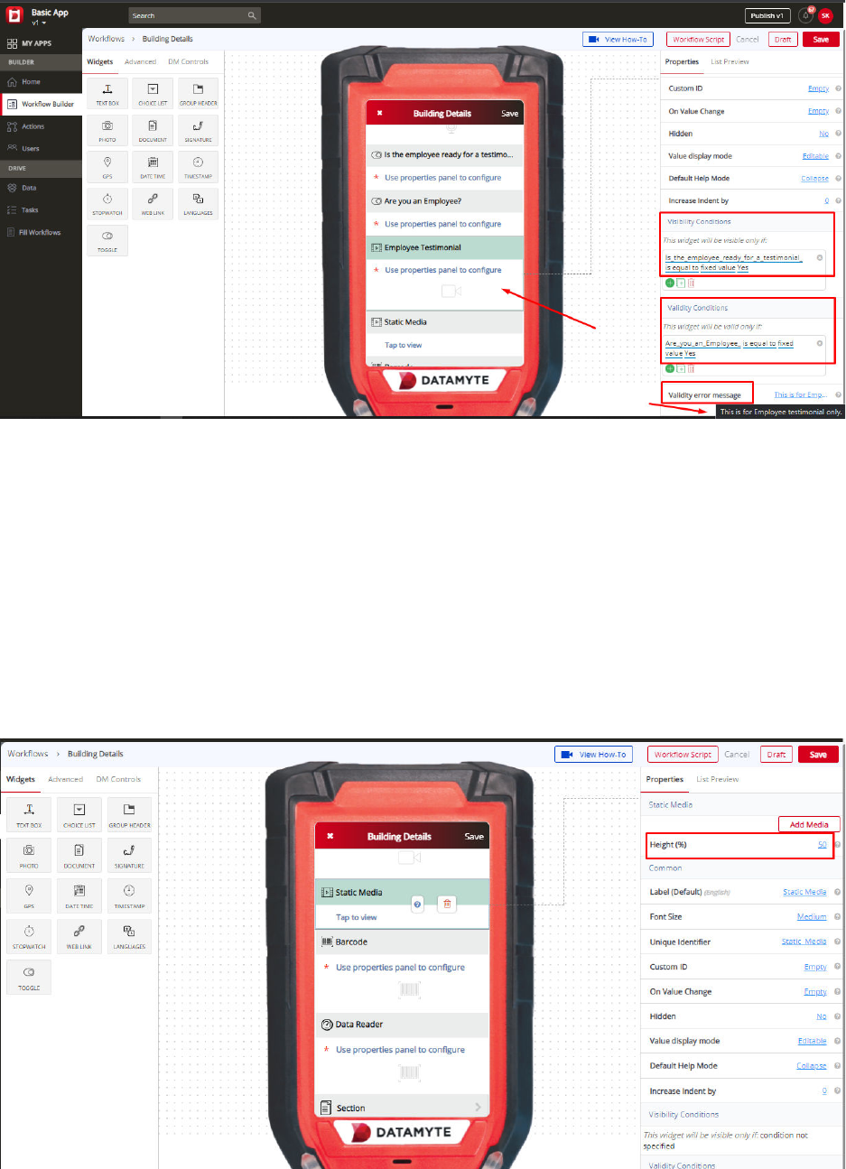
Static Media Widget
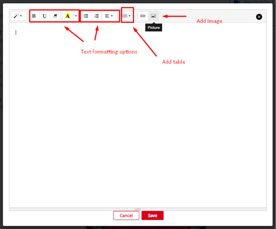
The Static Media widget allows you to compose an embedded static media document containing pictures,
text and links. To modify the contents of this static media document, click on the ‘Add Media‘ button in the
properties panel on the right. This will display the editor you use to compose your static media document.
Static Media Widget—Properties
Height
Use the height property to set a percentage of the workflow that the static media will use.
Label
You can change the name of the ‘Static Media’ using a label. It is ‘Static Media’ by default. On the right
panel, go to the label section and you can type the required text that you want. The same name will
appear on the workflow.
Add Media
You can add the media to the ‘Static Media’ using the Add Media property. It is Empty by default. On the
right panel, go to the Add Media button and you can see the rich text editor. Refer to the image below:
Barcode Widget
Barcode widget can be added to your workflow for allowing data capture through scanning of the
barcode. When you scan a particular barcode, the information relating to that product/object can be
fetched easily - without having to fill those details. To add Barcode to your workflow, just drag the widget
from the left panel to the digital mobile screen in the middle.

Barcode Widget—Properties
Text Editable
The property allows the app user to edit the barcode value with free text while filling the workflow.
Widget Layout
Widget Layout default value is Two Line. Use the Widget Layout property to set the name (label) and
value to a single line or two lines. Example—Two Line layout displays the widget name (label) on one
line and the value (to be filled in) on a second line. One Line layout displays the widget name (label) and
the value to be filled in on a single line.
Two Line
One Line
Scan QR Codes?
Allow the app user to also scan QR codes along with the bar codes in the scanner widget.
Device Profiles
The barcode widget supports the built-in camera as well as the external barcode reader devices to scan a
code. To enable an external device support, the device's configuration needs to be added to the widget
properties while designing the workflow.
Default Device Profile
If multiple barcode readers are available and configured in the device profiles, one of the profiles needs to
be set as the default, which gets automatically activated when this widget is visited while filling the
workflow on a mobile device.
Repopulate Value
Repopulate Value default value is No. Use the Repopulate Value property to automatically repopulate
(ditto) the previously submitted value. Example—Yes will remember the previously entered value and
automatically populate the field every time a new Workflow is opened for data collection (user can
manually change and this will become the new repopulate value); No will display the field blank every
time a new Workflow is opened for data collection.
Auto Scan
Auto Scan default value is Yes. Use the Auto Scan property to automatically Scan the barcode.
Example—Yes will automatically scan the barcode once you place the scanner in front of it.; No will give
you the scan button on the revolution device and once you click on that scan button then only the scanner
will scan the Barcode.
Label
You can change the name of the ‘Barcode’ using a label. It is ‘Barcode’ by default. On the right panel, go
to the label section and you can type the required text that you want. The same name will appear on the
workflow. For example—you might create a field ‘Machine Barcode’ to scan a particular code on the
machine.
Required
You can use this property to make ‘Barcode’ mandatory to be filled. Some fields in your workflow might
be mandatory, while some might not be. For example, ‘Barcode’ can be set to ‘Yes’ in the required
property when you want to make the field mandatory. So, while filling out a workflow, the user will have to
compulsorily choose to fill the Barcode field, without which the workflow will not be submitted.
Unique
This property indicates that only unique values are to be accepted by the user for this field. While
submitting the workflow having a unique field, if any previous submission exists with the same value for
the unique field, the data submission is prevented with an error displayed to the user saying that the value
for the set unique field already exists.
The duplicate values can be updated by the user after getting the error on the mobile device, and the
record can be resubmitted with a new value.
Unique Identifier
Every field will have a unique identifier. No two unique identifiers for fields will be the same. Please note
that ‘Unique Identifier’ property is just for reference purpose only. The user need not have to do anything
to this property, it can be referred to when there are fields created with the same names. When you
create two fields with the same names, it might get confusing when you are setting a condition and you
wouldn’t know which field is which.
For example—if you have created a field ‘address’ - and set a visibility condition to it saying the ‘address’
field will be only visible if you have entered the ‘Phone number.’ But if there are two fields that say ‘Phone
Number’ - it will be difficult to set a visibility condition since both the fields have the same name. Both of
these fields ‘Phone Number’ will have different unique identifiers. You can check the unique identifier and
then set the condition accordingly.
Visibility Conditions
Visibility Condition in the property for the ‘Barcode’ is used to specify a condition. If you apply any visibility
condition, it implies that the ‘Barcode’ field will only be visible if it satisfies the condition that you have set.
Visibility condition can be set by specifying the condition - you can do that by clicking ‘condition not
specified.’
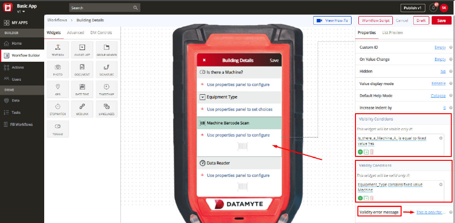
For example—you might create a field ‘Machine Barcode Scan’ which will be only visible if the user
chooses the ‘Yes’ option in the earlier choice list ‘Is there a Machine?”
Validity conditions
Validity Condition in the property for the ‘Barcode’ is used to specify a condition. If you set any validity
condition, it implies that the ‘Barcode’ will only be valid if it satisfies the condition that you have set.
Validity condition can be set by specifying the condition - you can do that by clicking ‘condition not
specified.’
For example—you might create a Barcode ‘Machine Barcode’ which will be only valid if the user chooses
‘Machine’ in the earlier choice list from the workflow. Otherwise, it would be invalid and show an error
message. Validations can help you control the type of input during the filling of a workflow by the user.
You can also customize an error message that you want to display by typing the message in ‘Validity
Error Message.’ This message will be displayed when the validity condition does not match with the given
input. The error message could be “This is only for Machine Barcodes.”
Data Reader Widget
The ‘Data Reader’ widget is designed to integrate with the gagging application on the Revolution. The
setup and characteristic names that have been configured in the DataMetrics TranSend application are
loaded onto the Revolution device for the gaging application. The Digital Clipboard application can then
issue requests to the gaging application to complete the taking of measurements for the requested setup
and characteristics.
Upon completion of taking the requested measurements, the measurement value for a single
characteristic is returned along with an in spec or out of spec indicator. If a request is made to get
readings for all characteristics for a setup then the measurement value returned is empty and the in
specification or out of specification indicator is the status for all the characteristics.
The ‘Data Reader’ widget is only valid when being used with the Revolution. For tablets and phones this
widget will be disabled.
Data Reader Widget—Properties
Setup Name
The Setup Name property is used to set the name of the DataMetrics TranSend setup that you are going
to get a data reading from.
Characteristic Name
The Characteristic Name property is used to set the name of the DataMetrics TranSend characteristic that
belongs to the specified Setup Name that you are going to get a data reading from.
If the Characteristic Name is empty, all characteristics for the specified Setup Name will be collected.
Label
You can change the name of the ‘Data Reader’ widget using a label. It is ‘Data Reader’ by default. On the
right panel, go to the label section and you can type the required text that you want. The same name will
appear on the workflow.
Section Widget
Section can be used to create workflow within your main workflow. A Section can help you break longer
workflows into shorter ones. To add a ‘Section’ feature in your workflow, just drag the Section widget from
the left panel to the digital mobile screen in the middle. For example, your inspection workflow can have
sections such as ‘Premise A,’ ‘Premise B,’ etc.
Section Widget—Properties
Label
You can change the name of the ‘Section’ using a label property. It is “Section” by default. On the right
panel, go to the label section and you can type the required text that you want. The same name will
appear on the workflow. For example, you can keep the label of your Section as ‘Premise A.’
Unique Identifier
Every field will have a unique identifier. No two unique identifiers for fields will be the same. Please note
that ‘Unique Identifier’ property is just for reference purpose only. The user need not have to do anything
to this property, it can be referred to when there are fields created with the same names. When you
create two fields with the same names, it might get confusing when you are setting a condition and you
wouldn’t know which field is which.
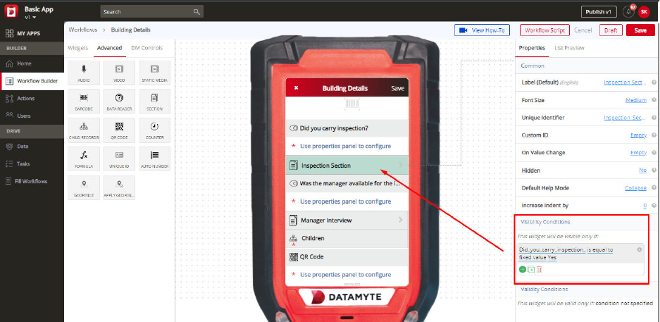
For example—if you have created a field ‘address’ - and set a visibility condition to it saying the ‘address’
field will be only visible if you have entered the ‘Phone number.’ But if there are two fields that say ‘Phone
Number’ - it will be difficult to set a visibility condition since both the fields have the same name. Both of
these fields ‘Phone Number’ will have different unique identifiers. You can check the unique identifier and
then set the condition accordingly.
Visibility Conditions
Visibility Condition in the property for the ‘Section’ is used to specify a condition. If you apply any visibility
condition, it implies that the ‘Section’ will only be visible if it satisfies the condition that you have set.
Visibility condition can be set by specifying the condition - you can do that by clicking ‘condition not
specified.’
For example—you might create a Section ‘Inspection Section’ which will be only visible if the user
chooses the ‘Yes’ option in the previous choice list ‘Did you carry inspection?’ Visibility conditions can
help you control the type of input during the filling of a workflow by the user.
Validity Conditions
Validity Condition in the property for the ‘Section’ is used to specify a condition. If you set any validity
condition, it implies that the ‘Section’ will only be valid if it satisfies the condition that you have set. Validity
condition can be set by specifying the condition - you can do that by clicking ‘condition not specified.’
For example—you might create a Section ’Manager Interview’ which will be only valid if the user enters
‘Yes’ in the earlier field ‘Was the manager available for the interview?’ Otherwise, it would be invalid and
show an error message. Validations can help you control the type of input during the filling of a workflow
by the user. You can also customize an error message that you want to display by typing the message in
‘Validity Error Message.’ This message will be displayed when the validity condition does not match with
the given input. The error message could be “To be filled only when the manager is available for an
interview.”
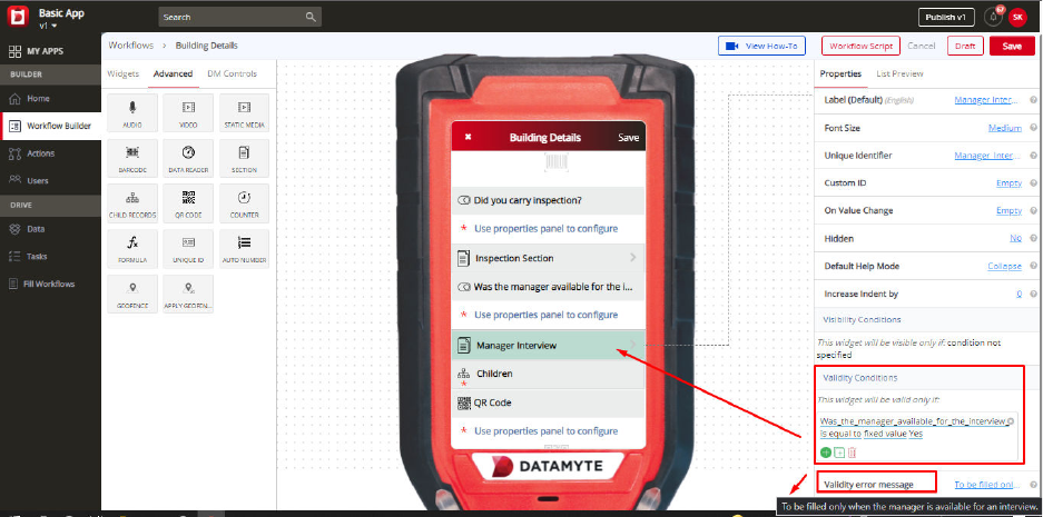
Child Records Widget
Child Records widget can help you to add different workflows in your single workflow.
For example—if you have created a workflow ‘Floor details’ earlier, then you can use that ‘Floor details’
workflow in your main workflow ‘Building Details.’ Here, your child workflow is ‘Floor Details’ & ‘Building
Details’ is the parent workflow. When you design a ‘Building Details’ workflow, you don’t have to create
fields multiple times like floor 1-meter information, floor 2-meter information, floor 3-meter information,
floor 1 AC information, floor 2 AC information, floor 3 AC information etc. Just create a child workflow
once, and you can add multiple records. (for floor 1, floor 2, etc.)
Child workflow can cut the repetitive fields - all you have to do is create child workflow only once and add
that in the main workflow. Using one child record workflow in your main workflow, you can add multiple
entries. (Like multiple students’ information, etc.) So, while filling up the workflow, the user can just keep
on adding floor details in the parent workflow without having to create multiple fields. Before using a child
workflow in the main workflow, you will have to create one. Once you create that, go to the digital mobile
screen in the middle - on the top of the screen, you will find the name of the workflow. If you click that, the
properties on the right panel will show Parent Workflow. You can set the parent workflow here - which will
be ‘Building Details.’
Now you have created a child workflow (Floor Details), and also set its parent workflow (Building Details).
When you are designing the primary workflow, you can drag the ‘Child Records widget from the left panel
and drop that to the digital mobile screen in the middle.
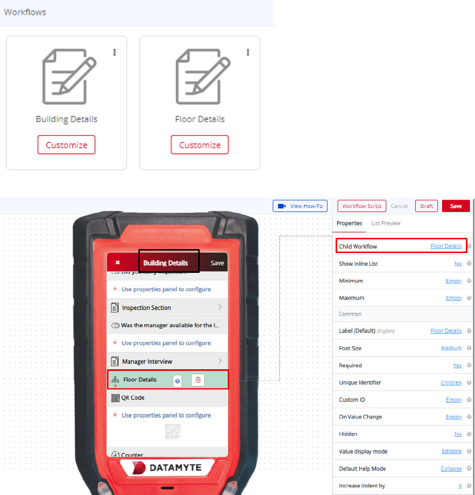
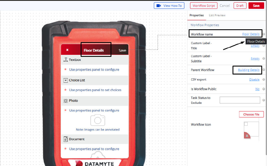
Child Records Widget—Properties
Child Workflow
You can set the child workflow by using this property. Just select the workflow that you have created as a
child workflow. For example, you can set ‘Floor Details’ as the child workflow. Your current workflow
‘Building Details’ will be the main/primary workflow.
Show Inline list
Default value of the Show inline list is – No. You can use this property to allow or deny child workflow to
show record inline. If you set the Show Inline List as “No” then the child workflow can not show the
records inline, you need to click on child records widget to see the child records and If you set the Show
Inline List as “Yes'' then the child workflow can show the records inline, on the same screen below child
records widget.
Minimum
Default value of Minimum is – Empty. You can see the minimum count of the child record to be filled with
the child records widget using Minimum property. Example– If you set the minimum as “2” then you can
not submit the child records less than 2.
Maximum
Default value of Maximum is – Empty. You can see the maximum count of the child record to be filled with
the child records widget using Minimum property. Example– If you set the maximum as “3” then you can
fill the maximum 3 child records and once you reach the maximum limit of child records then the “add
child” button will get disabled.
Label
You can change the name of the ‘Child Records’ using a label property. It is ‘Children’ by default. On the
right panel, go to the label section and you can type the required text that you want. The same name will
appear on the workflow. For example, you can keep the label of your Child Workflow as ‘Floor Details.’
Required
You can use this property to make that ‘Child Records’ mandatory to be filled. Some fields in your
workflow might be mandatory, while some might not be.
For example, ‘Child Records’ field can be set to ‘Yes’ in the required property when you want to make the
field mandatory. So, while filling out a workflow, the user will have to compulsorily add details in the Child
Workflow while filling the mobile workflow, without which the workflow wouldn’t be submitted.
Unique Identifier
Every field will have a unique identifier. No two unique identifiers for fields will be the same. Please note
that ‘Unique Identifier’ property is just for reference purpose only. The user need not have to do anything
to this property, it can be referred to when there are fields created with the same names. When you
create two fields with the same names, it might get confusing when you are setting a condition and you
wouldn’t know which field is which.
For example—if you have created a field ‘address’ - and set a visibility condition to it saying the ‘address’
field will be only visible if you have entered the ‘Phone number.’ But if there are two fields that say ‘Phone
Number’ - it will be difficult to set a visibility condition since both the fields have the same name. Both of
these fields ‘Phone Number’ will have different unique identifiers. You can check the unique identifier and
then set the condition accordingly.
Visibility Conditions
Visibility Condition in the property for the ‘Child Workflow’ is used to specify a condition. If you apply any
visibility condition, it implies that the ‘Child Records’ will only be visible if it satisfies the condition that you
have set. Visibility condition can be set by specifying the condition - you can do that by clicking ‘condition
not specified.’
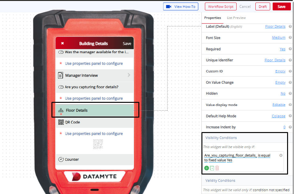
For example—you might create a child record ‘Floor Details’ which will be only visible if the user chooses
the ‘Yes’ option in the previous choice list ‘Are you capturing floor details?’ Visibility conditions can help
you control the type of input during the filling of a workflow by the user.
Validity Conditions
Validity Condition in the property for the ‘Child Records’ is used to specify a condition. If you set any
validity condition, it implies that the ‘Child Records’ will only be valid if it satisfies the condition that you
have set. Validity condition can be set by specifying the condition - you can do that by clicking ‘condition
not specified.’ For example, You might create a child record of ‘Student attendance’ which will be only
valid if the user enters ‘Student attendance’ in the earlier choice list ‘Choose Attendance.’ Otherwise, it
would be invalid and show an error message. Validations can help you control the type of input during the
filling of a workflow by the user. You can also customize an error message that you want to display by
typing the message in ‘Validity Error Message.’
This message will be displayed when the validity condition does not match with the given input.
The error message could be “This is for student attendance only.”
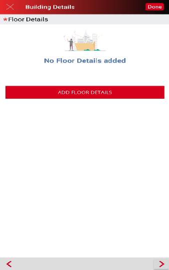
QR Code Widget
QR Code widget can be added to your workflow for allowing data capture through scanning of the QR
Code. When you scan a particular QR Code, the information relating to that product/object can be fetched
easily - without the user having to fill in those details. To add QR Code to your workflow, just drag the
widget from the left panel to the digital mobile screen in the middle.
QR Code Widget—Properties
Label
You can change the name of the ‘QR Code’ using a label. It is ‘QR Code’ by default. On the right panel,
go to the label section and you can type the required text that you want. The same name will appear on
the workflow.
For example—you can create a QR Code field for products and name it as ‘Electronic Equipment QR
Code.
Required
You can use this property to make ‘QR Code’ mandatory to be filled. Some fields in your workflow might
be mandatory, while some might not be.
For example, ‘QR Code’ can be set to ‘Yes’ in the required property when you want to make the field
mandatory. So, while filling out a workflow, the user will have to compulsorily choose to fill the QR Code
field, without which the workflow will not be submitted.
Unique Identifier
Every field will have a unique identifier. No two unique identifiers for fields will be the same. Please note
that ‘Unique Identifier’ property is just for reference purpose only. The user need not have to do anything
to this property, it can be referred to when there are fields created with the same names. When you
create two fields with the same names, it might get confusing when you are setting a condition and you
wouldn’t know which field is which.
For example—If you have created a field ‘address’ - and set a visibility condition to it saying the ‘address’
field will be only visible if you have entered the ‘Phone number.’ But if there are two fields that say ‘Phone
Number’ - it will be difficult to set a visibility condition since both the fields have the same name. Both of
these fields ‘Phone Number’ will have different unique identifiers. You can check the unique identifier and
then set the condition accordingly.
Repopulate Value
Repopulate Value default value is No. Use the Repopulate Value property to automatically repopulate
(ditto) the previously submitted value. Example—Yes will remember the previously entered value and
automatically populate the field every time a new Workflow is opened for data collection (user can
manually change and this will become the new repopulate value); No will display the field blank every
time a new Workflow is opened for data collection.
Auto Scan
Auto Scan default value is Yes. Use the Auto Scan property to automatically Scan the QR code.
Example—Yes will automatically scan the QR code once you place the scanner in front of it.; No will give
you the scan button on the revolution device and once you click on that scan button then only the scanner
will scan the QR code.
Visibility Conditions
Visibility Condition in the property for the ‘QR Code’ is used to specify a condition. If you apply any
visibility condition, it implies that the ‘QR Code’ field will only be visible if it satisfies the condition that you
have set. Visibility condition can be set by specifying the condition - you can do that by clicking ‘condition
not specified.’
For example—you might create a field ‘Product QR Code Scan’ which will be only visible if the user
chooses the ‘Yes’ option in the earlier choice list ‘Are the Products available for the scan?’
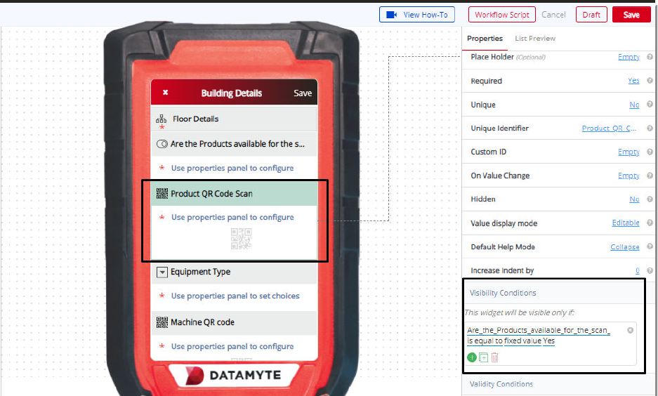
Validity conditions
Validity Condition in the property for the ‘QR Code’ is used to specify a condition. If you set any validity
condition, it implies that the ‘QR Code’ will only be valid if it satisfies the condition that you have set.
Validity condition can be set by specifying the condition - you can do that by clicking ‘condition not
specified.’
For example—you might create a field ‘Machine QR code’ which will be only valid if the user chooses
‘Machine’ in the earlier choice list from the workflow. Otherwise, it would be invalid and show an error
message. Validations can help you control the type of input during the filling of a workflow by the user.
You can also customize an error message that you want to display by typing the message in ‘Validity
Error Message.’ This message will be displayed when the validity condition does not match with the given
input.
The error message could be “This is only for Machine QR code.”
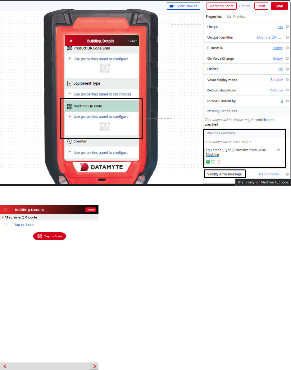
Counter Widget
A counter can keep a tally of any item or objects. It comes along with ‘+’ ‘-’ and ‘reset’ buttons, which
makes counting easy on workflows. You can either add, subtract or reset the counter button while filling
the workflow. For example, if you have multiple objects to inspect while collecting data, all you have to do
is, keep on clicking ‘+’ each time you come across a new object. To add ‘Counter’ to your workflow, drag
it from the left panel and drop it to the digital mobile screen in the middle.
Counter Widget—Properties
Unit
By using Unit property, you can mention the unit that you want to have in your counter. It could be
anything. For example, it can be ‘Defects’ found out during an inspection process
Label
You can change the name of the ‘Counter’ using a label property. It is ‘Counter’ by default. On the right
panel, go to the label section and you can type the required text that you want. The same name will
appear on the workflow. For example, you can keep the label of your Counter as ‘No. of fire extinguishers
in the area.’
Required
You can use this property to make that ‘Counter’ mandatory to be filled. Some fields in your workflow
might be mandatory, while some might not be.
For example, ‘Counter’ field can be set to ‘Yes’ in the required property when you want to make the field
mandatory. So, while filling out a workflow, the user will have to compulsorily add the counter while filling
the mobile workflow, without which the workflow wouldn’t be submitted.
Unique Identifier
Every field will have a unique identifier. No two unique identifiers for fields will be the same. Please note
that ‘Unique Identifier’ property is just for reference purpose only. The user need not have to do anything
to this property, it can be referred to when there are fields created with the same names. When you
create two fields with the same names, it might get confusing when you are setting a condition and you
wouldn’t know which field is which.
For example—if you have created a field ‘address’ - and set a visibility condition to it saying the ‘address’
field will be only visible if you have entered the ‘Phone number.’ But if there are two fields that say ‘Phone
Number’ - it will be difficult to set a visibility condition since both the fields have the same name. Both of
these fields ‘Phone Number’ will have different unique identifiers. You can check the unique identifier and
then set the condition accordingly.
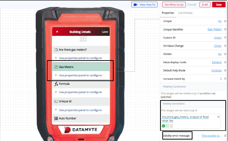
Visibility Conditions
Visibility Condition in the property for the ‘Counter’ is used to specify a condition. If you apply any visibility
condition, it implies that the ‘Counter’ field will only be visible if it satisfies the condition that you have set.
Visibility condition can be set by specifying the condition - you can do that by clicking ‘condition not
specified.’
For example—you might create a Field ‘Fire Extinguisher Count’ which will be only visible if the user
chooses the ‘Yes’ option in the previous choice list ‘Are there fire extinguishers in the premises?’ Visibility
conditions can help you control the type of input during the filling of a workflow by the user.
Validity Conditions
Validity Condition in the property for the ‘Counter’ is used to specify a condition. If you set any validity
condition, it implies that the ‘Counter’ will only be valid if it satisfies the condition that you have set.
Validity condition can be set by specifying the condition - you can do that by clicking ‘condition not
specified.’
For example—you might create a field ‘Gas Meters’ which will be only valid if the user enters ‘Yes’ in the
earlier field ‘Are there gas meters?’ Otherwise, it would be invalid and show an error message.
Validations can help you control the type of input during the filling of a workflow by the user. You can also
customize an error message that you want to display by typing the message in ‘Validity Error Message.’
This message will be displayed when the validity condition does not match with the given input.
The error message could be “This counter is only for gas meters.”
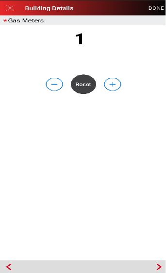
Formula Widget
Drag the ‘Formula’ widget from the left panel and drop it to the middle digital mobile screen to include
formulas in your workflow. Formula widget can be used in your workflow to include operations that can
make computation easy. Operations like addition, subtraction, division, multiplication, can be easily
integrated as logic into your workflow.
The widget is used to set a dynamically calculated value to itself, based on the values (responses) of the
other fields. The value which is returned from the code, gets set to the formula field in the workflow. For
example, if you have created 3 text boxes to capture the number of fire extinguishers at 3 different
premises. You can then use a formula widget for a total number of fire extinguishers found at premise 1,
premise 2, and premise 3. Using a formula widget, you can add the inputs from 3 text boxes and get
‘Total number of fire extinguishers at all the premises.’
A few samples are described below to help the Workflow Builder understand the use of this widget.
Sample 1:
function compute(){
//enter code here
var sum = parseInt(Number_1) + parseInt(Number_2);
return sum;
}
Sample 2:
function compute(){
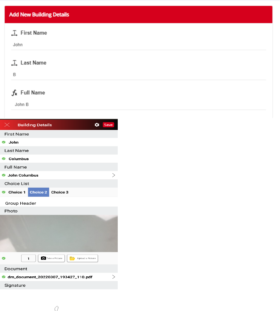
//enter code here
Full_Name_3 = First_Name + ' ' + Last_Name_2;
return Full_Name_3;
}
Sample 3:
function compute(){
//enter code here
if(parseInt(marks) > 40)
return “Pass”;
else
return “Fail”;
}
Output Type
Default value of the output type is — Text. You can use this property to set the output value type of
formula widget. There are two options of output type property. If you use Text then the formula widget will
return the text value; if you select the number then the formula widget will return the numeric value.
Unit
By using Unit property, you can mention the unit that you want to have in your formula output. It could be
anything. For example, it can be “Hours” required for an inspection process.
Label
You can change the name of the ‘Formula’ using a label property. It is ‘Formula’ by default. On the right
panel, go to the label section and you can type the required text that you want. The same name will
appear on the workflow. For example, you can keep the label of your ‘Formula’ as ‘Total No. of hours
required for the Inspection.’
Formula Widget—Common Properties
Formula Widget
Common Properties include—Label, Font Size, Required, Unique, Unique Identifier, On
Value Change, Hidden, Value Display Mode, Default Help Mode, Increase Indent By, Visibility Conditions
and Validity Conditions. Reference Text Box Widget—Common Properties for definitions and
examples.
Unique ID Widget
‘Unique ID’ for your workflow can enable generating unique numbers. You can use them to create
different serial numbers for workflows, sections, etc. To use this feature, just drag the widget from the left
panel to the digital mobile screen in the middle. While filling up the workflow, the user has to just tap on
the ‘Unique Id.’
Unique ID Widget—Properties
Prefix
Prefix property on the right panel will help you to include certain characters at the beginning of each
unique ID generated. These characters will be common to each ID generated. Click on ‘Empty’ besides
the prefix, and type the prefix that you need to have.
For example—if you are generating unique IDs for inspection workflow, then you can set the prefix as
‘Inspection Workflow.’ Every time a workflow is filled, the unique ID generated will have ‘Inspection
Workflow’ as a prefix. So, the unique ID created would be something like ‘Inspection Workflow
234vv7wewe”
Label
You can change the name of the ‘Unique ID’ using a label property. It is ‘Unique ID’ by default. On the
right panel, go to the label section and you can type the required text that you want. The same name will
appear on the workflow. For example, you can keep the label of your Unique ID as ‘Serial Number.’
Required
You can use this property to make that ‘Unique ID’ mandatory to be filled. Some fields in your workflow
might be mandatory, while some might not be.
For example, ‘Unique ID’ field can be set to ‘Yes’ in the required property when you want to make the field
mandatory. So, while filling out a workflow, the user will have to compulsorily add the Unique ID while
filling the mobile workflow, without which the workflow wouldn’t be submitted.
Unique Identifier
Every field will have a unique identifier. No two unique identifiers for fields will be the same. Please note
that ‘Unique Identifier’ property is just for reference purpose only. The user need not have to do anything
to this property, it can be referred to when there are fields created with the same names. When you
create two fields with the same names, it might get confusing when you are setting a condition and you
wouldn’t know which field is which.
For example—if you have created a field ‘address’ - and set a visibility condition to it saying the ‘address’
field will be only visible if you have entered the ‘Phone number.’ But if there are two fields that say ‘Phone
Number’ - it will be difficult to set a visibility condition since both the fields have the same name. Both of
these fields ‘Phone Number’ will have different unique identifiers. You can check the unique identifier and
then set the condition accordingly.
Visibility Conditions
Visibility Condition in the property for the ‘Unique’ is used to specify a condition. If you apply any visibility
condition, it implies that the ‘Unique Id’ field will only be visible if it satisfies the condition that you have
set. Visibility condition can be set by specifying the condition - you can do that by clicking ‘condition not
specified.’
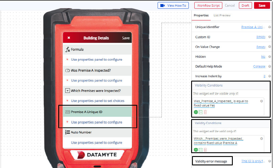
For example—you might create a Field ‘Premise A Unique ID’ which will be only visible if the user
chooses the ‘Yes’ option in the previous choice list ‘Was Premise A Inspected?’ Visibility conditions can
help you control the type of input during the filling of a workflow by the user.
Validity Conditions
Validity Condition in the property for the ‘Unique ID’ is used to specify a condition. If you set any validity
condition, it implies that the ‘Unique ID’ will only be valid if it satisfies the condition that you have set.
Validity condition can be set by specifying the condition - you can do that by clicking ‘condition not
specified.’
For example—you might create a Unique ID field ‘Premise A Unique ID’ which will be only valid if the user
enters ‘Premise A’ in the earlier field ‘Which Premises were Inspected?’ Otherwise, it would be invalid
and show an error message.
Validations can help you control the type of input during the filling of a workflow by the user. You can also
customize an error message that you want to display by typing the message in ‘Validity Error Message.’
This message will be displayed when the validity condition does not match with the given input.
The error message could be “This ID is only for Premise A.”
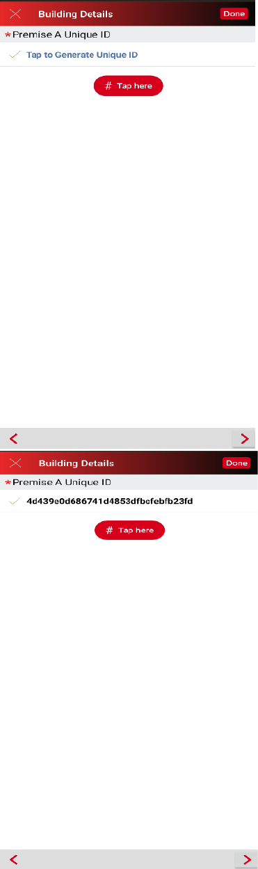
Auto Number Widget
The ‘Auto Number’ widget for your workflow can enable the automatic generation of unique numbers. You
can use them to create different serial numbers for workflows, sections, etc.
Auto Number Widget—Properties
Type
The Type property has two settings.
• Regular – Generates an incrementing number sequence.
• Custom – Allows the user to specify the template for generation of the number sequence.
Template
The Template property defines the template to use for generating numbers. This property is only
displayed when the Type property is set to Custom.
Prefix
The Prefix property on the right panel will help you to include certain characters at the beginning of each
auto generated number. These characters will be common to each number generated.
Postfix
The Postfix property on the right panel will help you to include certain characters at the end of each auto
generated number. These characters will be common to each number generated.
Length
The Length property on the right panel allows you to set the length of the auto generated number.
Label
You can change the name of the ‘Auto Number’ using a label property. It is ‘Auto Number’ by default. For
example, you can keep the label of your Auto Number as ‘Serial Number.’
Auto Number Widget—Common Properties
Auto Number Widget
Common Properties include—Label, Font Size, Required, Unique, Unique
Identifier, On Value Change, Hidden, Value Display Mode, Default Help Mode, Increase Indent By,
Visibility Conditions and Validity Conditions. Reference Text Box Widget—Common Properties for
definitions and examples.
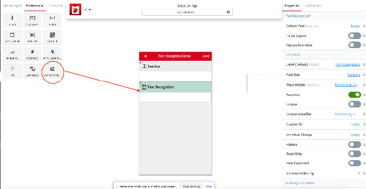
Text Recognition Widget
Text Recognition widget can be added to your workflow for allowing data recognize from image. When the
users select or capture a particular image, it will process the image and extract the text from that particular
image - without the user having to fill in those details. Users can also edit the extracted text. To add Text
Recognition to your workflow, just drag the widget from the left panel to the digital mobile screen in the middle.
Text Recognition Widget—Properties
Default Text
Default Text (optional) default value is Empty. Use the Default Text property to add default text for a
particular placeholder of the widget. Example— Set the Default Text “Hello”.
1- Line Layout
1-Line Layout default value is No. Use the 1-Line Layout property to set the name (label) and value to a
single line or two lines. Example—Two Line layout displays the widget name (label) on one line and the
value (to be filled in) on a second line. One Line layout - Yes displays the widget name (label) and the
value to be filled in on a single line.
Repopulate Value
Repopulate Value default value is No. Use the Repopulate Value property to automatically repopulate
(ditto) the previously submitted value. Example—Yes will remember the previously entered value and
automatically populate the field every time a new Workflow is opened for data collection (user can
manually change and this will become the new repopulate value); No will display the field blank every
time a new Workflow is opened for data collection.
Text Recognition
Widget—Common Properties
Text Recognition Widget
Common Properties include—Label, Font Size, Required, Unique, Unique
Identifier, On Value Change, Hidden, Value Display Mode, Default Help Mode, Increase Indent By,
Visibility Conditions and Validity Conditions. Reference Text Box Widget—Common Properties for
definitions and examples.
User will open the particular workflow which has Text Recognition widget. User can see Text
Recognition widget which has OCR icon on right side of the widget. By clicking on this icon user can have
two options to choose image from Gallery or capture image from Camera. After getting the desired
image it’ll process the image to extract the text and will display the extracted text. User can edit this text
or retake the image if required.
Please refer the below images.
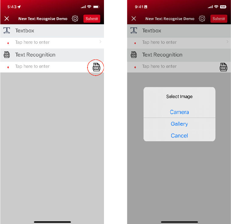
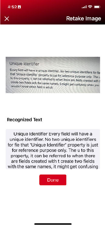
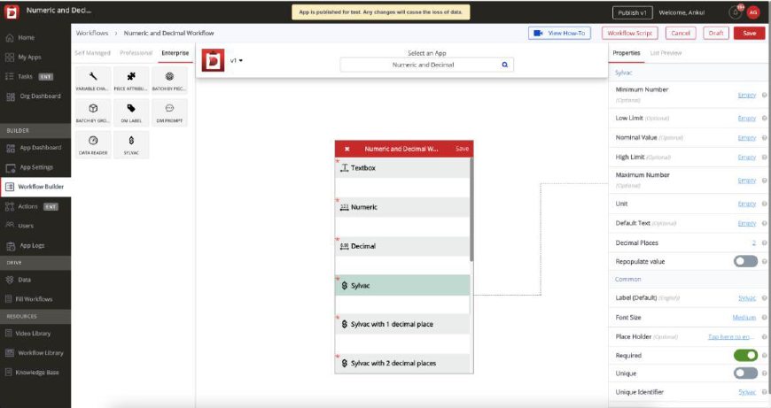
Sylvac Widget - iOS
User can add Sylvac widget to particular workflow. Also, can set property like Decimal Places ...etc.
Decimal Places (from 0-7, default 2)
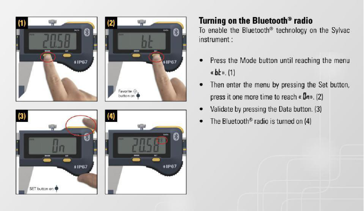
Note: iOS Device(iPhone/iPad) and Sylvac Device (Sylvac Calliper) Bluetooth must be ON.
Note: If Bluetooth Symbol is blinking that means it is ready to connect and after connected with any
device it will be stop blinking and be steady there.
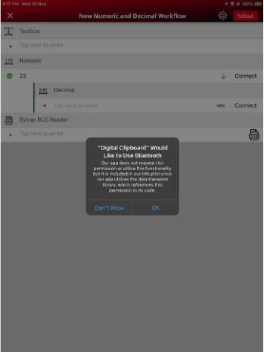
To get Sylvac Device data in Digital Clipboard App, follow the steps below.
1.
Now Open the Digital Clipboard App
2.
Choose your application and open the workflow. Allow the required permission like Bluetooth to
find nearby devices on Digital Clipboard App.
3.
Connect Sylvac device with Sylvac widget
a. If User has never used or connected to Sylvac device before with Digital Clipboard App.
i. User can see the “
Connect” button with Sylvac widget in red color.
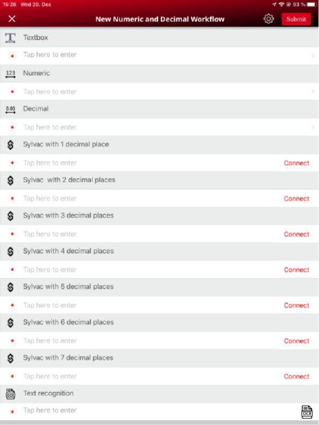
i.
Tap on “
Connect” button it will redirect to another screen where it will scan the available BLE devices
and listing all the devices with name and address.
Select Sylvac device of your choice (Most probably its name starts with “SY” e.g., SY295)
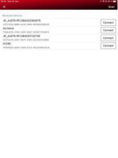
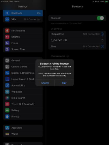
ii.
If Sylvac device is not paired, User must need to pair it with iPhone/iPad. This popup will prompt
once only. Pairing can be done within the application or out of the application (Settings). By tapping on
“Pair” user can pair the Sylvac device with mobile device. If it is already pair then it will skip this pairing
process. Once pairing is done user will redirect back to workflow screen.
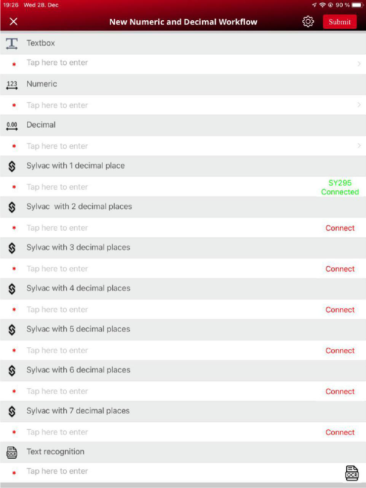
iii.
Once Device is paired, it will be automatically connected to that widget, User can see the status
along with device name to that Sylvac widget in green “
Connected SY295”
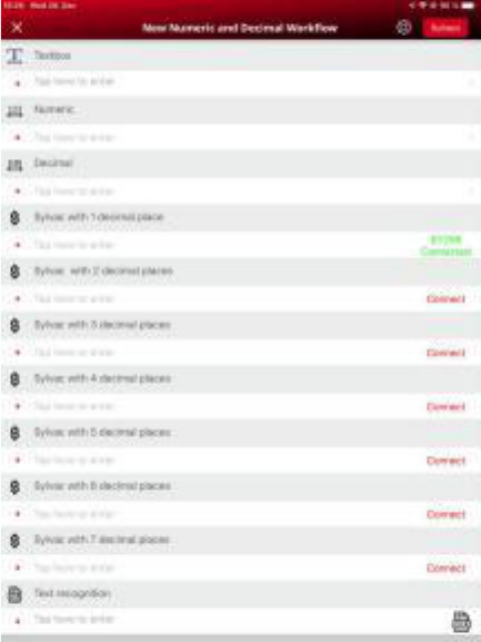
a.
If User has already connected or has used Sylvac device before, App will be automatically
connected to last connected device (If device is in range and paired and also device’s Bluetooth is on)
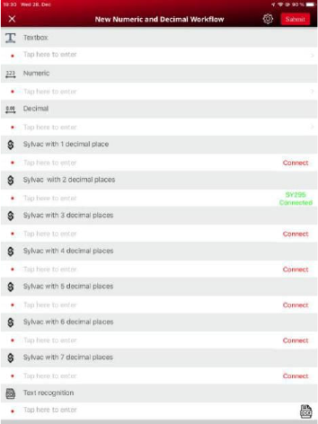
b.
If user change the focus to another Sylvac widget and device is already connected then status of
focused widget is getting changed from “Connect” to “Connected SY295”. Device will be attached to
that widget.
e.g., User open a workflow and first he/she will be connected and focused to the “Sylvac with 1
decimal places” (Refer the below left image). After that he/she will change the focus or select to “Sylvac
with 2 decimal places” (Refer the below right image). User can see first “Sylvac with 1 decimal places”
will be in connected status in green (“
Connected SY295”). After changed focus to next widget “Sylvac
with 2 decimal places”, the first widget state become a “
Connect” and focused widget which is “Sylvac
with 2 decimal places” state will become a “
Connected SY295”.
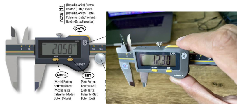
4.
Once Device is connected, user can take measurement and can push the Sylvac's device
measurement via tapping Data button easily. Measurement/Reading sent by device will be display in
focused widget with device attached.
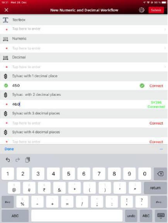
5.
Sylvac widget have properties like Minimum number, low limit, high limit, Maximum number,
decimal places same as Decimal widget and also behave or act similar to Decimal widget. Sylvac widget
is support 0 up 7 decimal places. After putting the measurement or read value to the Sylvac widget,
Sylvac widget will display the result based on the properties like minimum number, higher limit, low
limit, maximum number, decimal places. Please refer the below images and table to see how it behaves.
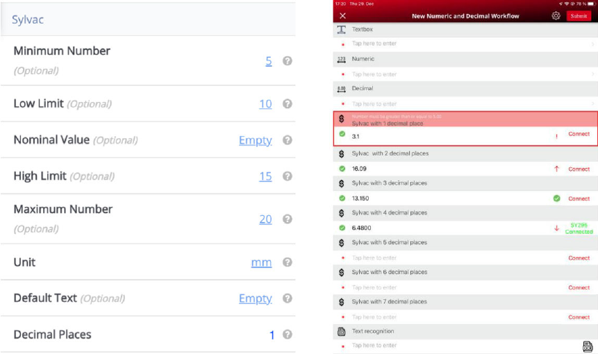
6.
User can disconnect Sylvac device by tapping on status “
Connected SY295”. User will navigate to
Bluetooth Devices screen and connect with any Sylvac device. Also, user can Scan other Sylvac device
7.
After disconnecting the device, User can connect to another device of same device by following
the connection step. (From step 3.)
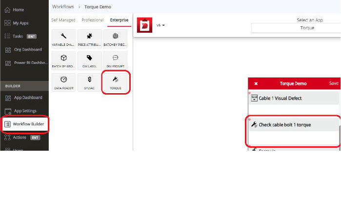
Torque Wrench Widget - Android
1.
The Torque Wrench widget was designed to enable torque data collection by establishing
communication interface between Digital Clipboard application and DataMyte wireless torque wrenches
(WLS)
2.
The user can add torque widget to any workflow by using Workflow Builder and Torque widget
3.
The user is required to set the Wrench Size parameter to correct size of the WLS torque wrench
to be able to establish communication with the gage
“Wrench Size”:
•
Default: 25
•
Supported torque wrench sizes: 1, 5, 10, 25, 75, 90, 150, 300, 500, 800, 1200
4.
The user shall select torque value calculation
algorithm.
“Wrench Algorithm”:
•
Default:"Restart"
•
"Restart"
•
"Set"

5.
The user shall use default or change remaining torque wrench configuration
parameters
“Wrench Unit”: (same as Numeric and Decimal)
•
Default: "Lb-ft"
•
Lb-ft (pound-foot),
•
Nm (newton meter),
•
Lb-in (pound-inch),
•
Kgfm (kilogram – force meter),
• Kgfcm (kilogram – force centimeter)
“Wrench Rotation”:
•
Default: "CW"
•
CW (clockwise)
• CCW (counterclockwise)
"Delta Slope": Between 1 and 99 [1, 99],
default is 60 “
Note: Required percentage change in the slope
of the torque curve in indicate breakaway point.
“Start Threshold”: Between 2 and 99 [2, 99],
default is 50
Note: A percentage of Low Limit (or of the
torque wrench size if Low Limit is not defined)
that signal rise above in order to consider a
valid signal. If the value is too high it may
mask the actual value. If the value is too low,
it will not mask the noisy portion of the
reading.
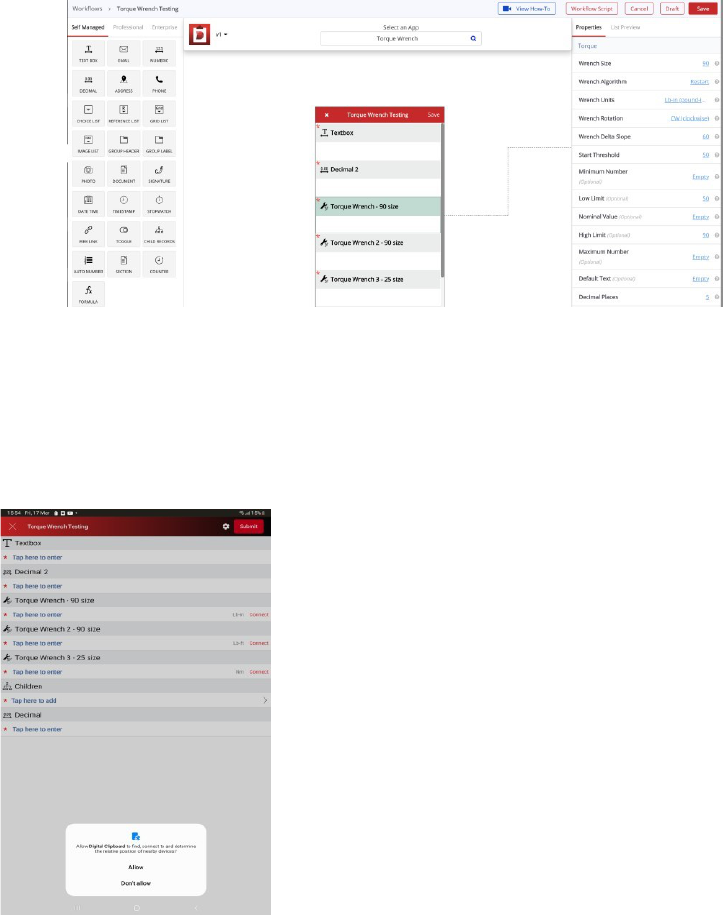
6.
The user shall save and publish an application.
7.
Open the DigitalClipBoard App on Android device.
8.
Choose your application and open the workflow. Allow the required permission to find the
nearby devices on DigitalClipBoard App.
9.
Pair the torque wrench with the mobile device. Put the torque wrench into discovery enabled
mode by performing the following steps:
•
Select and open Setting control on the Android device
•
Select Connections option
•
Select Bluetooth option (make sure that Bluetooth is enabled)
•
Click Scan if necessary
•
Remove previous pairing information from the torque wrench memory by pressing the upper
button on the torque wrench (power) 4 times. The communication top left led shall blink.
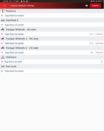
•
Press top and bottom torque wrench buttons at the same time to switch the torque wrench to
the discovery enabled mode.
•
Select WLS wrench in the Available deices list
•
Type 1234 in the Bluetooth pairing request dialog
10.
Connect Torque wrench device with Torque wrench widget
a.
If User has never used or connected to Torque wrench device before with DigitalClipBoard App.
•
User can see the “
Connect” button with Torque wrench widget in red color.
•
Tap “
Connect” button to redirect to another screen where it will display paired devices based on
the size or user can scan the available Torque wrench devices based on the size and listing all the
devices based on the size with name and address. Select Torque wrench device of user choice. If the
device is not paired, then it will automatically first ask for pair. Once paired it will connect to that device.
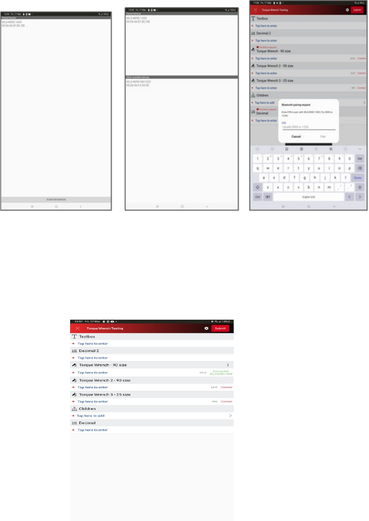
§
Device will be connected and attached to that widget. User can see the status with device name
to that Torque wrench widget in green “
Connected WLS-N090 1430”
b.
If User has already connected or used Torque wrench device before, App will automatically
connect to last connected device based on the size (If device is in range and paired and device’s
Bluetooth is on) when user is focused on torque wrench widget.
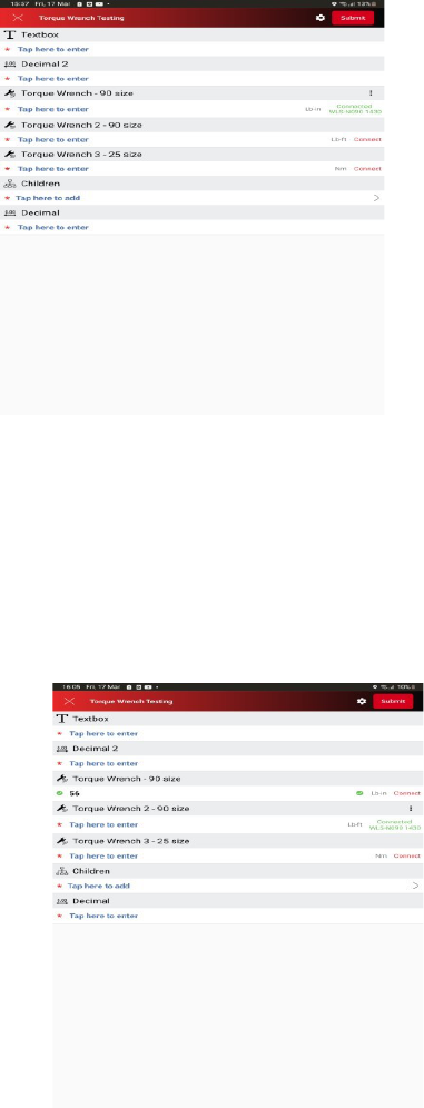
c.
If the user focuses on another Torque wrench widget of the same size or different size and the
device is already connected, then status of focused widget is changed from “
Connect” to “Connected
WLS-N090 1430
”. Device will be attached to that widget.
d.
If User focuses on another torque wrench widget with different size and device is not connected
before then user can connect to another device by following the connection from Step 9 above.
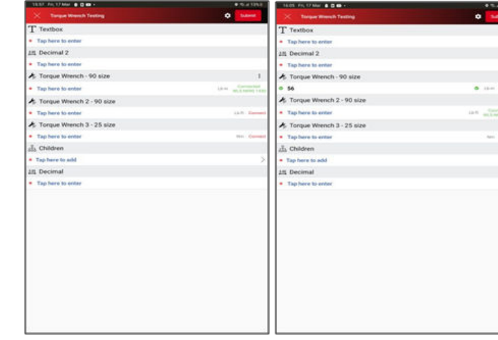
e.
When User opens a workflow and first he/she will be connected and focused to the “Torque
Wrench - 90 size” (Refer below left image). After that he/she will change the focus or select to “Torque
Wrench 2 - 90 size” (Refer the below right image). User can see first “Torque Wrench - 90 size” will be in
connected status in green (“
Connected WLS-N090 1430”). After changing focus to next widget “Torque
Wrench 2 - 90 size”, the first widget state becomes a “
Connect” and focused widget which is “Torque
Wrench 2 - 90 size” state will become a “
Connected WLS-N090 1430”.
11.
Once Device is connected, it will be automatically armed, and user can take reading. The reading
sent by device will be displayed in focused widget with device attached.
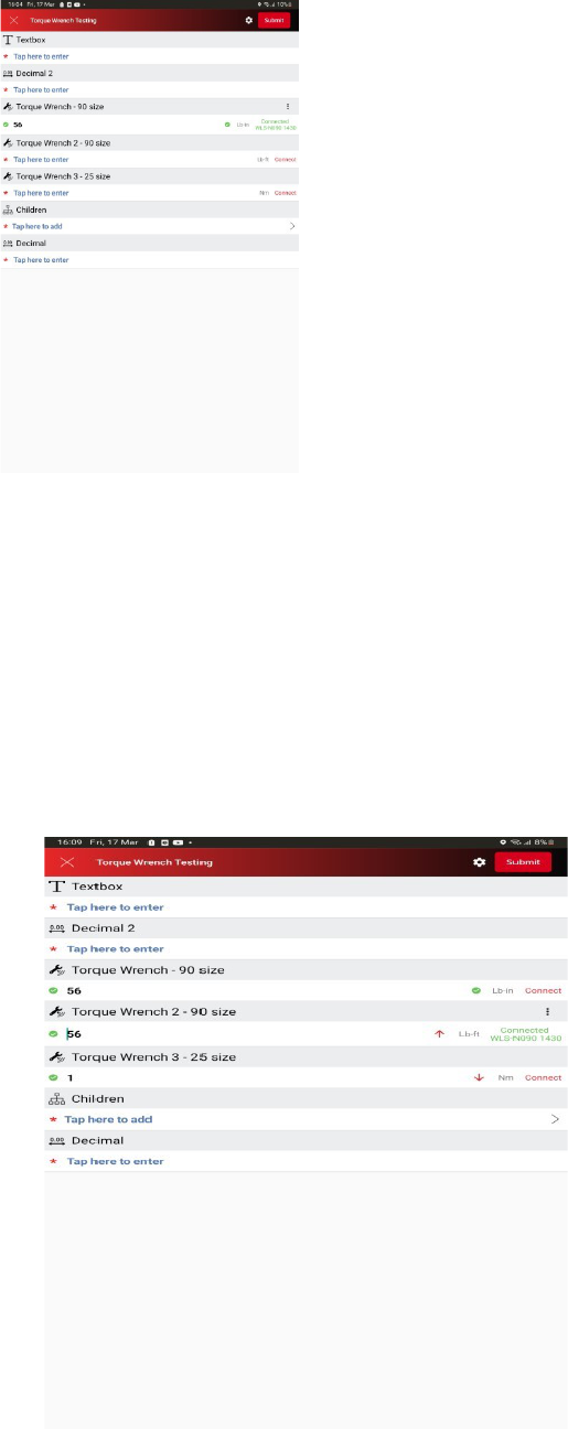
12.
Torque wrench widgets have properties like minimum number, low limit, high limit, maximum
number, decimal places same as Decimal widget and behave or act similar to Decimal widget. Torque
wrench widget support 0 up 7 decimal places. After putting the measurement or read value to the
Torque wrench widget, the Torque wrench widget will display the result based on the properties like
minimum number, higher limit, low limit, maximum number, decimal places. Please refer to the images
and table below to see how it behaves.
Nu
m.
Action
Result
Exception
1
The user selects Torque wrench
widget and input value between
high and low
limits
The Application shall display
green check mark
in the front of the data value
and play shot beep sound
•
If low limit value
does not exist, the input
value below the high
limit shall be considered
as inside of the limits.
•
If high limit
value does not exist, the
input value above low
limit shall be considered
as inside of the limits
•
If high and low
limit values do not exist,
the input value shall be
considered as inside of
the limits
2
The user selects Torque wrench
widget and input value above high
limit
The Application shall display
red
upward arrow
in the front of the data value
and play buzzer sound
•
If high limit
value does not exist, the
input value above low
limit shall be considered
as inside of the limits
•
If high and low
limit values do not exist,
the input value shall be
considered as inside of
the limits
3
The user selects Torque wrench
widget and input value below low
limit
The Application shall display
red
upward arrow
in the front of the data value
and play buzzer sound
•
If low limit value
does not exist, the input
value below the high
limit shall be considered
as inside of the limits.
•
If high and low
limit values do not exist,
the input value shall be
considered as inside of
the limits

4
The user selects Torque wrench
widget and input
value above
Maximum
Number value
The Application shall display
red
! in the front of the data
value, play buzzer sound and
message with above Maximum
value error description and ask
the user to reenter data
Maximum value is an
optional parameter
5
The user selects Torque wrench
widget and input value below
Minimal Number
value
The Application shall display
red
! in the front of the data
value, play buzzer sound and
message with below Minimal
value error description and ask
the user to reenter data
Minimal value is an
optional parameter
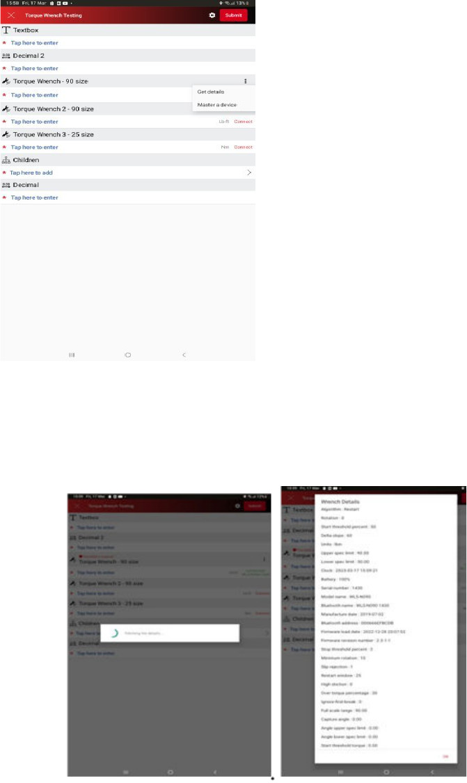
13.
Torque wrench widget has Option menu (by tapping on three dots) or right corner (once device
connected) to get details and mastering the torque wrench.
a.
User can get Torque wrench details by selecting “Get details”.
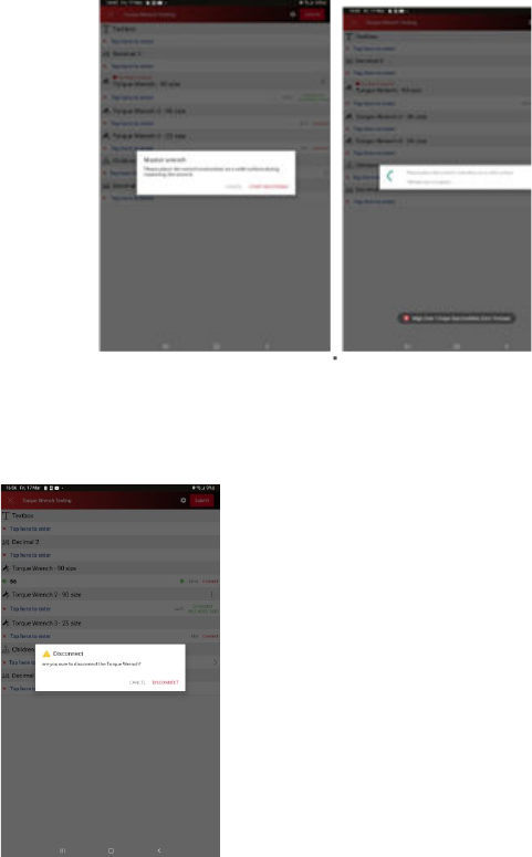
b.
User can master the torque wrench by selecting “Master a device”
14.
User can disconnect Torque wrench device by tapping on status “
Connected WLS-N090 1430”.
15.
After disconnecting the device, User can connect to another device or same device based on size
by following from the connection step 9 above.
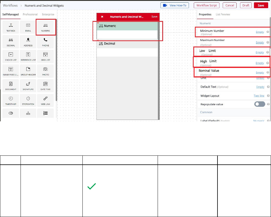
Torque Wrench Widget - iOS
For iOS, The Torque Wrench widget will work like Decimal widget. All attributes and behavior similar to
decimal widget.
Numeric – Decimal Widget
User can add Numeric or Decimal widget to particular workflow. Also, can set property like minimum
number , maximum number, low limit, high limit nominal value. User can put value for data collection as
per requirement by setting given properties.
!
!
Scenario!
Num.
Action
Result
Exception
Remarks
1
The user selects
numeric/decimal
widget and input
value between high
and low limits
The Application shall
display green check mark
in the front of the
data value and play shot
beep sound
-
If low limit
value does not exist,
the input value
below the high limit
shall be considered
Note:
Input value shall
be checked
against Minimal
and Maximal
Value parameters
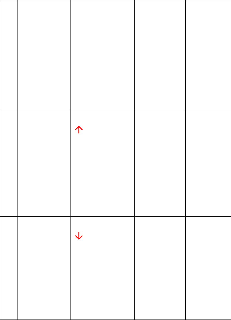
The input value shall be
serialized together with
current limits for future
upload. See JSON file
changes section
as inside of the
limits.
-
If high limit
value does not exist,
the input value
above low limit shall
be considered as
inside of the limits
-
If high and
low limit values do
not exist, the input
value shall be
considered as inside
of the limits
as well. See
separate
description
below.
2
The user selects
numeric/decimal
widget and input
value above high
limit
The Application shall
display red upward arrow
in the front of the
data value and play buzzer
sound
The input value shall be
locally serialized together
with current limits and
failure parameters for
future data upload and
serialization to the server
backend database. See
JSON collected data
schema changes section
-
If high limit
value does not exist,
the input value
above low limit shall
be considered as
inside of the limits
-
If high and
low limit values do
not exist, the input
value shall be
considered as inside
of the limits
Note:
Input value shall
be checked
against Minimal
and Maximal
Value parameters
as well. See
separate
description
below.
3
The user selects
numeric/decimal
widget and input
value below low limit
The Application shall
display red upward arrow
in the front of the
data value and play buzzer
sound
The input value shall be
locally serialized together
with current limits and
failure parameters for
future data upload and
serialization to the server
backend database. See
-
If low limit
value does not exist,
the input value
below the high limit
shall be considered
as inside of the
limits.
-
If high and
low limit values do
not exist, the input
value shall be
considered as inside
of the limits
Note:
Input value shall
be checked
against Minimal
and Maximal
Value parameters
as well. See
separate
description
below.
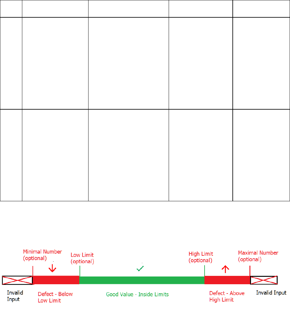
JSON collected data
schema changes section
4
The user selects
numeric/decimal
widget and input
value above
Maximum Number
value
The Application shall
display red
! in the front
of the data value, play
buzzer sound and
message with above
Maximum value error
description and ask the
user to reenter data
The input value shall not
be serialized.
Maximum value is
an optional
parameter
None
5
The user selects
numeric/decimal
widget and input
value below Minimal
Number value
The Application shall
display red
! in the front
of the data value, play
buzzer sound and
message with below
Minimal value error
description and ask the
user to reenter data
The input value shall not
be serialized.
Minimal value is an
optional parameter
None
Limits!Validation!Diagram!
!
Note: Other properties will work same as Text widget.
Workflow Script Feature
A workflow script can be used to perform dynamic operations/manipulations in the workflow, while filling
the workflow from the mobile device. A workflow script can have one or more simple JavaScript functions
written inside of it.
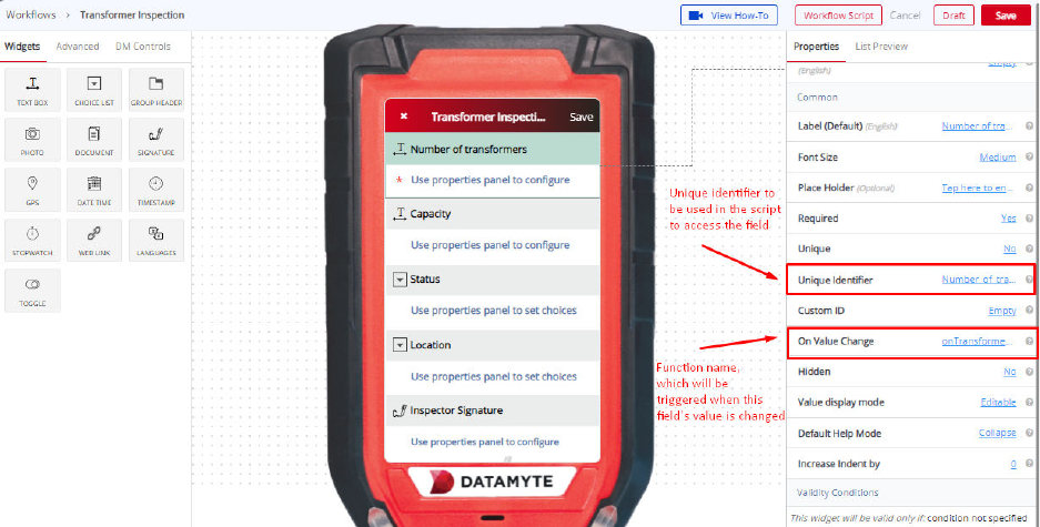
The functions need to be registered with the value change event of the fields in the workflow while
designing the workflow from the Workflow Builder.
Various actions, such as automatically changing field labels/values, showing error/warning alerts, based
on the values entered in the workflow, can be performed by writing in the workflow script functions, which
are registered with the callback.
Sample:
function onTransformerCntChange(ws){
Var number_of_transformers = getWidgetValue(ws,’number_of_transformers’);
if(number_of_transformers > 0){
ws.setWidgetPrompt(“working_transformers”,”Out of the
“+number_of_transformers+” transformer(s), how many are in working condition?”);
}
else{
ws.setWidgetValue(“working_transformers”,0);
}
ws.reloadUICell(“working_transformers”);
}
Other Workflow Functionalities
Drag & Drop
For all the widgets to be used or added in your workflow, you need to drag the widget from the left panel
and drag the same to the digital mobile screen in the middle.
Save
Save option helps you save the workflow that you have created. Once you save the workflow, it can be
published and used in real-time by users for data collection and other purposes.
To save any workflow, click the red button on the top right of your ‘Workflow Builder’ screen.
Draft
The Draft feature can help you to save the changes that you make in your workflow. But you cannot
publish a workflow which is in a ‘draft’ mode. You need to save the workflow to publish the workflow and
use it.
You will find the Draft option besides the ‘Save’ option at the top right of your ‘Workflow Builder’ screen.
Cancel
Using the Cancel option, you can remove all the unsaved changes done in your workflow.
Only the previous saved changes will remain.
You can find the ‘Cancel’ option on the top right screen of your Workflow Builder besides the ‘Draft’
option.
Workflow Properties
To access workflow properties, you will have to click the name of the workflow on the top of the digital
mobile screen in the middle of the Workflow Builder screen. Once you click the name of the workflow, the
properties will open on the right panel. There are some properties which open:
• Workflow Name: You can type the workflow name here to change the name of the workflow.
• Custom Label - Title: You can set the Custom title for the workflow. This is optional. The default
Custom Label - Title is the title you have configured in List Preview Title.
• Custom Label - Subtitle: You can set the Custom Subtitle for the workflow. This is optional. The
default Custom Label - Subtitle is the Subtitle you have configured in List Preview Subtitle.
• Parent Workflow: You can set a parent workflow to your existing by using this property.
• Is Workflow Public: You can enable Public URL for the workflow. Default value Is Workflow Public is
No. You can select Yes for Public Workflow and can set the Public URL in Public URL property.
• Workflow Icon: You can set the workflow icon by uploading the image file using the Workflow Icon
property.
Customize
If you click on the Workflow Builder from the menu on the left panel, a screen will appear with all your
workflows. Below each workflow, you will find a ‘Customize’ option. Use this option to open your existing
workflow, and then you can make changes into those workflows.
Delete
On each workflow that you have built, you can see three dots on the top right (On the Workflow Builder
screen). If you click on these dots, then you will find the Actions, Copy & Delete option appear. Delete
option will help you delete the workflow that you have chosen.
Actions
On each workflow that you have built, you can see three dots on the top right (On the Workflow Builder
screen). If you click on these dots, then you will find the Actions, Copy & Delete option appear. Actions
option will help you create the Action workflows on the workflow that you have chosen.
Copy
On each workflow that you have built, you can see three dots on the top right (On the Workflow Builder
screen). If you click on these dots, then you will find the Actions, Copy & Delete option appear. Copy
option will help you copy the workflow that you have chosen.
Publish App
You will find the Publish option on the topmost bar of the screen. Publish will help your workflows
available for use on mobile or web. Without publishing the app, you cannot make the workflow functional
or your new changes are not included in the workflow.
Publish for Test
If you are set to publish the workflow in the app that you have created, there will be two options that
emerge. Publish for Test will help you to check all the changes that you have made in the workflow. This
will allow you to fill up an actual workflow through mobile or web, and also submit the data. If the changes
don’t reflect the way you want, you can quickly go back and make new changes and Publish for Test until
it works the way you want.
Publish Version
Once you are done with all the changes, you can then hit ‘Publish Version.’ This means you can start
using the workflow on mobile after the version has been published. But, if you still have changes to make
in the workflow, then you will have to create a new version - and then make changes. This is the
difference between ‘Publish for Test’ and ‘Publish Version.’ You don’t need to create new versions of your
app to make changes in ‘Publish for Test.’ whereas after ‘Publish Version,’ you will have to create a new
version every time.
DATAMYTE Digital Clipboard Actions Designer
About Actions Designer
The Actions Designer is used to design sequences of actions. By using the drag and drop functionality,
steps are added and configured in the list of actions. By using Actions Designer, users can design multi-
step actions and connect the steps together in a chronological sequence. During the execution of the
actions, each step runs after the previous step is executed. Data collected by mobile workflow is first
validated and can be routed to the following entities using actions.
• One or more email recipients
• A PDF or a Word document
• Any of your existing software systems
• Third-party cloud software like CRM or Asset Management system
You can combine any number of above steps in any order. Data routing is finalized by configuring the
action and can be automatically routed to the specified entity mentioned above every time a mobile
workflow is submitted.
Action Use Cases (Generic)
Sequential Actions
Sequential actions are linear and progressive, and this type of action list goes from one task or process to
another and does not step back in the sequence. Used in manufacturing or a production line task.
State Machine Actions
State machine actions are more complex than sequential actions and may step back in the sequence if a
dependency dictates it. These actions go from one ‘state’ to another ‘state’. Used in software
development or in content creation.
Rules-driven Actions
Rules-driven actions are higher-level sequential actions in which the action progress is determined by the
rules. They use conditions to decide if expressions are ‘true’ or ‘false’ and the rules are modeled with the
‘if’, ‘then’ or ‘else’ expressions. Used in projects that have clear goals, but varying levels of specifications
or rules.
Types of Action Steps
User Step
A user step assigns a task to the user and involves the user filling a workflow and its submission. When
the task is assigned, the user gets a notification on their phone. When the user responds to the
notification, a mobile workflow is presented to them. This is one of the mobile workflows designed using
Workflow Builder. A user has the option of filling up the workflow and then submitting it. A user can also
reject the task of filling the workflow if the information is incomplete or for any other reason.
System Step
A system step is performed by the DATAMYTE Digital Clipboard platform. Typically, system steps are
executed instantaneously and the action proceeds to the next step. Examples of a system step are
sending an email, generating a document, performing custom processing among others.
Step by Step Tutorial on How Action Designer
Works
Custom Action
Custom Action allows you to customize the action associated with a workflow in your app. A custom
action is used to modify the app and the functions it performs as per your own business requirements or
use cases.
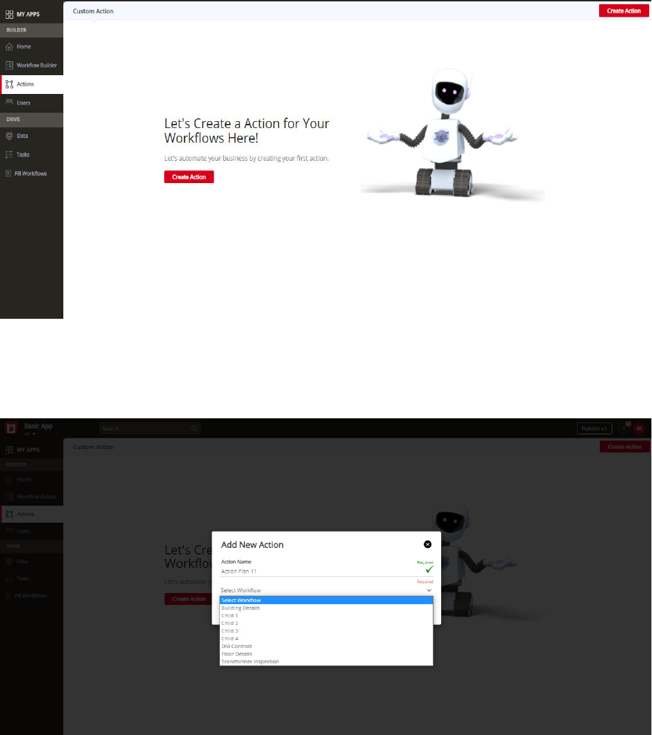
The process to Create a Custom Action
Step – 1: Go to the Actions section and click on the Create Action tab to create a new action
Step – 2: Select the particular workflow for the action and name the action
Please note that you can only create an action once you have created at least one workflow in the app
using the Workflow Builder. An action cannot be created if you don't have any workflow associated with
it.
Step – 3: You are ready to design a customized action
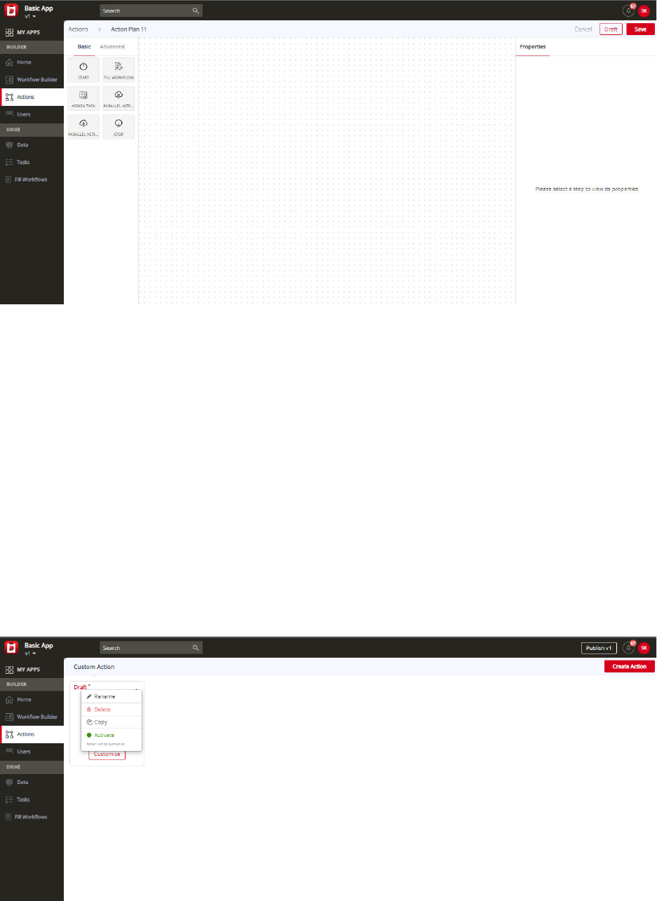
DATAMYTE Digital Clipboard actions designer allows users to design multi-step actions by dragging and
dropping action steps onto a designer canvas (dotted space represented in the middle of the screenshot
3) and then connecting the steps together in a chronological sequence.
Step – 4: Assign specific properties to the different widgets used in creating the list of actions and save
the actions
When the sequence of actions executes each step runs after the previous step is executed. Select basic
or advanced widgets for your actions and assign each widget specific properties in the right-hand side
panel of your action designer. Once you are done, click on the save tab and your customized actions
become active.
You can even deactivate your customized actions by clicking on the deactivate tab. This tab can be
accessed by going to the list of customized actions displayed. Status of the actions are displayed as
active or inactive. You can even delete an action by selecting the delete option displayed in screenshot 5
below.
Basic Action Widgets
Start Widget
The start widget triggers the start of the action events, like in the case of an asset or an action
workflow, the action starts when a new site is created with the asset workflow or when an
inspection is performed on a site, which relates to an action workflow.
Stop Widget
The stop widget is used to end the action events after all the processes in it have been
executed.
Advanced Action Widgets
Decision Widget
The decision widget is used to decide which path to go to based on a previous value entered in a
workflow. For example, in a workflow documenting medical test information of a respondent, if the
respondent indicates a positive response for a particular question, then a particular set of processes will
be executed in the list of actions. If the response is negative, then another set of processes will be
executed in the list of actions. The decision widget helps in determining which path needs to be chosen
and a particular path is executed depending on the response recorded.
Call Rest API Widget
This widget is used for calling a third-party API; like some third-party systems provide export rest API,
through which they access requests from any other source and this request has a certain format, and
data is received in this particular format and this data can be accessed and handled the way you want
once you accept the request.
Using the Call Rest API, the DATAMYTE Digital Clipboard platform can route data collected through the
workflows directly to the data management system of their customers, like a CRM system. For example, if
any customer is using our app for lead generation and they are capturing lead information from the
workflows created by the DATAMYTE Digital Clipboard platform, and they want the collected lead
information to go directly to their CRM instead of using the DATAMYTE Digital Clipboard Drive, we can
configure their API and the collected data will be sent directly to the system of their choice.
This is used mostly by established companies already having an existing system of data management,
and they don't want to shift to the DATAMYTE Digital Clipboard Drive, but just want a data collection tool.
So, in this scenario, we ask them to provide their API for the purpose of integrating their app and they can
get the data directly in their existing system. DATAMYTE Digital Clipboard uses standardized and globally
recognized call rest API systems and this enables us to integrate with any third-party system.

Third Party API Support
Data Collection
DATAMYTE Digital Clipboard mobile app works in-sync with the DATAMYTE Digital Clipboard server.
Your custom business app containing your workflows and actions to automate your business processes
are designed and developed using the DATAMYTE Digital Clipboard platform using simple drag and drop
features. Once the app is set up, it is published to the mobile devices and you can start using it right
away.
When you collect data using this app, the data gets synchronized with the DATAMYTE Digital Clipboard
server. This data can further be processed and analyzed to get real time business insights to make data-
driven decisions for your business.
API configuration
The third-party API configurations need to be integrated with the app after developing it using the
DATAMYTE Digital Clipboard platform. So, when the app is published, the server knows how it needs to
handle the data and which system it needs to integrate with.
App Data Export API format:
Url: ‘
https://your.domain.name/getAppData’
Method: POST
Authentication: Basic
Request header:
{
"content-length": "663",
"accept-encoding": "gzip, deflate",
"accept": "*/*",
"content-type": "application/json",
"authorization": "Basic dXNlcm5hbWU6cGFzc3dvcmQ="
}
Request Body:
{"customer_name": "[\"James Smith\"]", "inspection_remarks": "Everything looks good",
"comments": "This is a test report", "date": "2020-05-09", "part_serial_no": "P865"}
Broadcast Tasks to Roles on Web
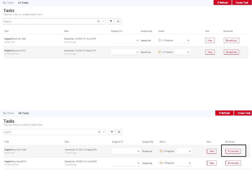
Broadcast Tasks to Role: The task will be broadcasted to the set of users (Role) so that the users from
that user group will be able to pick the task. Once any of the users pick the task then that task will be
unavailable for the rest of the users.
Broadcast option for task
Login with a set of credentials on Digital Clipboard on the web.
Select the app from the app list.
Click on the task tab located in the Drive section.
You will see the "My Tasks" section selected under the tasks tab.
Users will be able to see their own tasks in this section.
If the user is Admin User then he will be able to see the "All Tasks" section where Admin can see all the
tasks for that application.
Users will see the broadcast option for all "In-progress" tasks.
Click on Broadcast to see the below window:
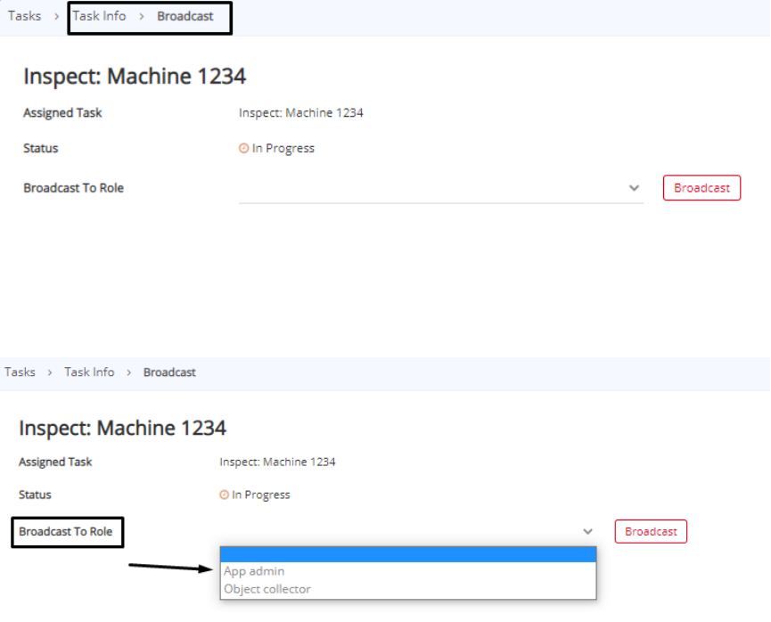
Select the role from the role list which will be visible after the selection of the "Broadcast To Role" option.
Refer to the image below:
The selected task will be broadcasted to the users with the selected role.
Users with the selected role will be able to see that task in the task list.
