
BODY OF KNOWLEDGE
Page | 1
Impactful Proposal Graphic Design
When used effectively, graphics increase your proposal’s clarity and persuasive power.
And also your win rate.
Nick Kolenda, author of Methods of Persuasion: How to Use Psychology to Influence Hu-
man Behavior, stated, “Reality is objective, but our perception of reality is subjective.” You can
help your reviewer improve both with clear, compelling, professional graphics. By leveraging
them, you enable decision-makers to review your solution intellectually and emotionally—vital
components in decision making.
To make the most of your proposal graphics, it is important to understand these key con-
cepts:
1. How do proposal graphics increase win rates?
2. What motivates your audience?
3. How do design and designers fit into the proposal process?
4. When and how should you create graphics? How do you evaluate them?
5. What are the types of proposal graphics?
6. What design principles and techniques should you know?
7. What are industry best practices for creating impactful graphics?
8. What tools and emerging technology can help you create graphics?
9. When and where should you bend design principles?
1.0 Proposal graphics increase win rates
Clear, compelling, audience-focused graphics (including covers)
improve win rates. They
convey
information to the audience in a more compelling and easily digestible manner, and
they help reach readers both intellectually and emotionally. They can also communicate faster
and improve reader recall.
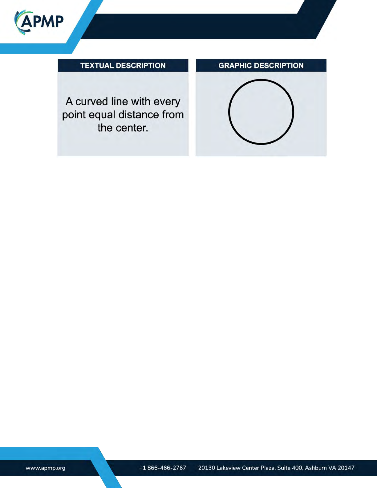
A 3M-sponsored study at the University of
Minnesota School of Management found that
presentations that use visual aids are 43 percent more persuasive than those that do not.
Visuals also improve reader recall and foster an accurate understanding of the material
you’re presenting. Figure 1-1 shows an example of this. Which approach makes it easier to un-
derstand what a circle is?
BODY OF KNOWLEDGE
Page | 2
(APMP_001) Figure 1-1. Graphics vs. Text. Graphics are often more understandable and improve recollection.
Effective graphics demonstrate professionalism and proficiency faster than words alone,
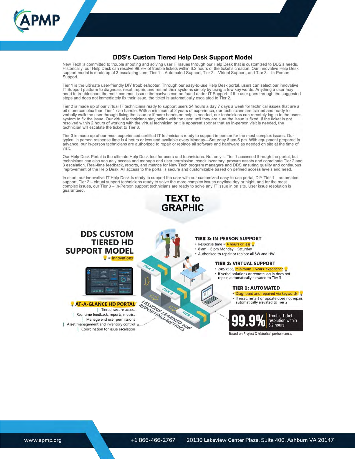
grab attention, and influence a reader’s decisions. Consider the example in Figure 1-2, which
shows the same story told both textually and visually. Do you notice any differences in how the
two presentations engage you? Help you comprehend the story? Make you feel?
Graphics, when done correctly, make it easier to review your proposal. They highlight the
most important and impactful parts of your solution. Visuals can quickly differentiate your offer-
ing, communicate the quality of your response and solution, and set the tone for your proposal.
Infographics like the one in Figure 1-2 can influence the mechanisms of rational thinking.
They can also create important emotional responses, like a sense of trust.
BODY OF KNOWLEDGE
Page | 3
(APMP_002) Figure 1-2. Text to Graphic. This image shows a text-only description compared with a
graphic depiction that includes edited text from the narrative.
Remember, however, that graphics are not necessarily better than text. Mike Parkinson ex-
plains in Billion Dollar Graphics that “the combination of graphics and words has a communica-
tive power that neither singularly possess. Without graphics, an idea may be lost in a sea of
words. Without words, a graphic may be lost to ambiguity.”
BODY OF KNOWLEDGE
Page | 4
Similarly, researcher J.R. Levin points out, “Pictures interact with text to produce levels of
comprehension and memory that can exceed what is produced by text alone.”
2.0 Graphics should reflect your customer’s motivations
To create persuasive content and a powerful message, you must know what motivates your
audience. In fact, proposal graphics that fail do so because they are created by the author for
the author—even though the author does not decide who wins. Uncover what motivates your
evaluator, decision-maker, or reviewer to demonstrate understanding and resonate with what
is important to them. By knowing your audience’s specific needs, goals, and pain points, you
will be able to align your solution with customer needs, highlight discriminators, and better vis-
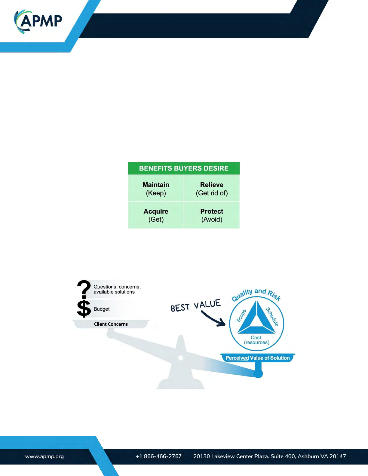
ualize persuasive proposal graphics. Figure 2-1 shows common benefits clients desire.
(APMP_003) Figure 2-1. Client Motivations. In general, clients typically seek four types of benefits, depending
on their perception of what is good, is bad, and should be in their possession.
Clients want a solution that meets their specific needs and answers their concerns. Their
perceived value of your solution must outweigh any constraints or lingering concerns they may
have. Winning solutions create perceived value across balanced scope, schedule, resource
(including cost), and quality considerations (Figure 2-2).
(APMP_004 Mel) Figure 2-2. Best Value. If a solution is seen as better than other options, it is perceived to be
the best value.
Your understanding of the customer should influence your graphic’s messaging, content,
and aesthetics. Use this understanding to create winning visuals. For example, if a customer is
BODY OF KNOWLEDGE
Page | 5
feeling financial pressure, they may not favor submissions that look (aesthetically) expensive.
The designer might adjust the style to avoid a bias against overpriced proposed solutions.
3.0 How design and designers fit into the proposal process
The entire proposal lifecycle benefits from creativity and visuals. Where the designer fits in
the process depends on their team’s maturity level, needs, and expectations.
Proposal environments range in their maturity level, from less to more mature.
Mature organizations have defined processes (e.g., conceptualization, rendering, track-
ing, editing), have clear roles and responsibilities, have access to trained designers, use higher-
end graphic design tools, and have graphic asset libraries. Graphics are often made early in the
process, sometimes before narrative is written. Mature organizations track graphic development
time and know the level of effort required to conceptualize, render, and edit graphics. This in-
formation allows proposal managers to effectively schedule graphic support, speed up produc-
tion, and lower development costs.
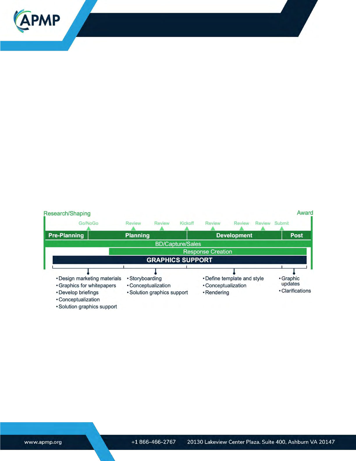
Figure 3-1 summarizes types of graphic support used during a more mature business de-
velopment (BD) process.
(APMP_005) Figure 3-1. Sample Business Development (BD) Lifecycle. Graphics support the entire BD
lifecycle.
Less mature organizations create graphics using an ad hoc approach, with whatever tools
and people are available. Often, graphics are created by the authors themselves. Sometimes,
graphics also lack defined messages. Older proposal graphics are reused due to resource
constraints rather than because they align with the current opportunity’s win themes, customer
needs, or defined messages. Graphics are often made late in the process and not early. Visu-
als may be found on the web and illegally reused without the original author’s consent. In the
least mature teams, graphics are aesthetically unappealing, inconsistent, and unprofessional.
BODY OF KNOWLEDGE
Page | 6
3.1 Roles and responsibilities
There are two primary graphic design roles in a proposal team: someone who conceptual-
izes graphics and someone who renders them. These roles work cooperatively and can be
done by the same person or different people, depending on the organization’s process, size of
the response, and an individual’s skillsets.
Figure 4.1-2 illustrates key deliverables in the conceptualization (steps 1 and 2) and render-
ing (step 3) process.
(APMP_008) Figure 4.1-3. Key Deliverables. When conceptualizing and rendering a graphic, begin with a summary
(action caption), create a mock design, then finalize it.
3.1.1 Conceptualizer’s role
The graphic conceptualizer turns words, data, and ideas into clear, compelling sketches or
mock-ups. The conceptualizer(s) ideally works across all sections to help align messaging and
concepts.
Concepting is usually done in two ways, by using the 1) Material Based method and/or 2)
Team Based method.
Method 1: Material Based
The conceptualizer reviews the latest version of any relevant material starting ideally as
early in the process as possible. The written materials may include DRFP/RFP/RFI/RFQ, web-
sites, white papers, briefings, videos, and the proposal itself if it has already been written. (It is
recommended to write the proposal narrative after the graphic concepts are developed.) The
conceptualizer may use this as an opportunity to identify content that would benefit from
graphics and start to conceive what the concepts may be. The basic steps of this process in-
clude:
1. Gather insights from related materials and, if already complete, the written response.
2. Read material relevant to the response, especially evaluation criteria, if any.
3. Highlight areas in the response that look like they should have a graphic. Key oppor-
tunities to look for include items that read as a process, text that mentions a solution
to a problem, or an important methodology.
4. If needed, meet with the section owner and/or team to review findings and get addi-
tional information such as benefits and discriminators.

BODY OF KNOWLEDGE
Page | 7
5. Create a summary of the graphic. The summary is the message of the graphic. It
should include a brief, one-sentence description of the benefits it’s intended to com-
municate, associated features, and relevant discriminators or proof points. A version
of the summary will be used as the graphic’s action caption (for written proposals) or
title (for an orals proposal).
6. Share sketches or mock-ups with the author and other stakeholders.
7. Iterate until the sketch is approved for rendering (see rendering steps).
8. Explain the sketch’s concepts to the renderer (unless the person who conceptual-
ized it will also render the graphic). This helps ensure compliance and aesthetic
alignment.
9. Review the graphic after rendering, if needed request revisions.
10. Submit the draft graphic for review.
Method 2: Team Based
When a team identifies a need for a graphic, the Conceptulizer works with the team (usu-
ally Subject Matter Experts) to develop the graphic based on a clearly defined objective.
The basic steps of this process include:
1. Hold a concept meeting with the author/SME to:
o Identify the objective and target audience of the graphic. What should the graphic
communicate? Does it respond to certain evaluation criteria? Where is it located
in the response?
o Develop a summary of the graphic. Create a summary of the graphic. The sum-
mary is the message of the graphic. It should include a brief, one-sentence de-
scription of the benefits it’s intended to communicate, associated features, and
relevant discriminators or proof points. A version of the summary will be used as
the graphic’s action caption (for written proposals) or title (for an orals proposal).
o Gather supporting information to explain the summary. What is the feature and
how/where does it offer benefits to the customer? Sometimes this information is
sent after the meeting, if the team needs time to do additional research.
2. Create a graphic sketch or mock-up showing the key information and benefits.
3. Share sketches or mock-ups with the author/SME.
4. Iterate until the sketch is approved for rendering (see rendering steps).
5. Explain the sketch’s concept to the renderer (unless the person who conceptualized
it will also render the graphic). This helps ensure compliance and aesthetic align-
ment.
6. Review the graphic after rendering, if needed request revisions.
7. Submit the draft graphic for review.

BODY OF KNOWLEDGE
Page | 8
3.1.2 Renderer’s role
A renderer illustrates professional, compliant graphics. Using design principles and tools,
they create graphics from the sketches or mock-ups the conceptualizer (e.g., a conceptual de-
signer, author, SME) made. A renderer is focused on aesthetics, compliance, and visual con-
sistency across graphics in the same response. This role is usually filled by one or more
graphic designers with proposal experience.
The basic steps of the rendering process include:
1. Review the submitted sketch or mock-up.
2. Ask the conceptualizer clarifying questions.
3. Ensure the graphic is logged with an identifier related to the response.
4. Make or use an approved template to create the proposal-ready graphic using the
sketch and summary.
5. Work with the conceptualizer to ensure that the graphic aligns with the summary, es-
pecially after large revisions to the graphic.
6. Make adjustments to realign the graphic to the summary.
7. Perform a quality check (QC) to identify any errors. Be sure to look for spelling and
style consistency. Ideally, the renderer should find someone else to perform the QC
check.
8. Make adjustments based on the QC.
9. Submit the completed graphic for review and insertion into the document.
10. Repeat steps as necessary before and after gate reviews.
To avoid unnecessary revisions, the designer needs to know when and how to create the
graphics and objectively review and iterate them.
4.0 When and how to create graphics and then objectively evaluate them
Proposal graphics are vital in three situations:
When your topic is complex: Graphics like diagrams, charts, and visuals communicate intrica-
cies more clearly than text alone. Network diagrams, quantitative charts, dashboard graphics,
Gantt charts, organizational charts, and process diagrams can all help you convey your mes-
sage clearly, and often in less page space.
When your information is critical to success: If key points are misunderstood or over-
looked, your proposal may seem deficient. Clear, compelling graphics increase favorable re-
views.
When you want to influence emotions: High-quality graphics positively impact the perceived
quality of your solution. They build needed trust.
Even the U.S. federal government sees the value in a well-designed proposal, as they
demonstrated with the following requirement, found in a request for proposal (RFP): “Offerors
are cautioned that the Government considers the overall form and substance of their proposal

BODY OF KNOWLEDGE
Page | 9
to represent the general quality of work expected to be performed under this contract. Accord-
ingly, it will be considered throughout the review and scoring/evaluation process.”
Create your messaging and concepts early, before you write the proposal. While this may
seem counterintuitive, doing so provides a shared vision and messaging up front. It can also
reveal gaps that need to be addressed early. You can also use conceptualized/draft graphics
and their titles/action captions as a storyboarding tool, helping you write and define your pro-
posal content.
Once you’ve chosen which messages can become graphics, follow these four steps:
1. Summarize: Summarize your graphic in one sentence. This becomes the title (for an
orals proposal) or action caption (for a written proposal) and can help you define what
you want to say before you draft the graphic. Keep this message as succinct as possi-
ble to improve understanding and recall. The conceptualizer, author, or SME does this.
2. Explain: Provide details that support your one-sentence summary.
3. Visualize: Turn the summary and explanation into a visual concept.
4. Render: Turn the concept into a professional, compliant graphic.
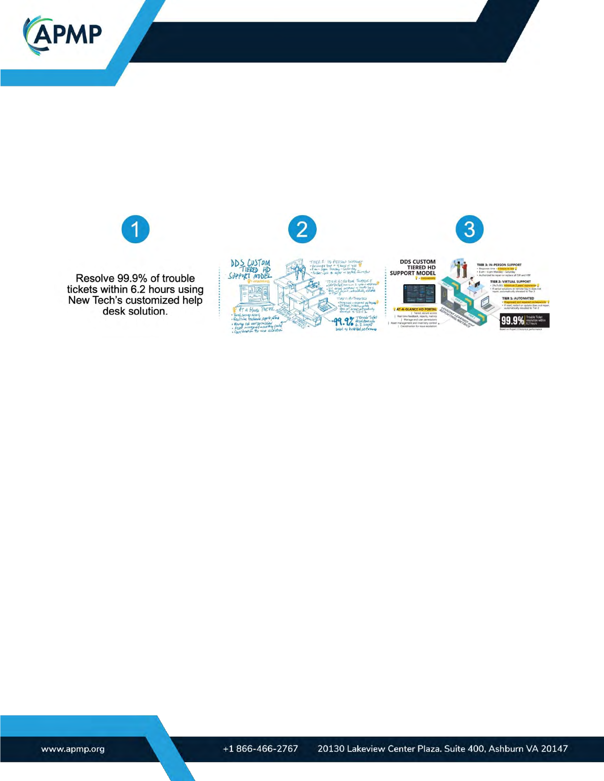
1. Summarize: Create your graphic’s message.
Your graphic should have a title (for an orals proposal) or action caption (for a written pro-
posal) that summarizes the key message in one sentence. The title or action caption guides a
graphic’s content.
Follow these tips to create a strong, persuasive action caption and graphic:
• To influence, motivate, or persuade your audience, include a benefit (or another mo-
tivator) and how it’s achieved (or avoided).
• Succinct, customer-focused captions communicate most effectively and result in bet-
ter graphics. To paraphrase Einstein, those who cannot explain simply do not fully
understand. When writing, make sure your message aligns with the proficiency level
of every possible reviewer.
• Avoid listing more than three benefits, which could dilute or complicate your mes-
sage.
• Imply obvious benefits rather than stating them outright. For example, no need to list
“risk mitigation” on a process about mitigating risk.
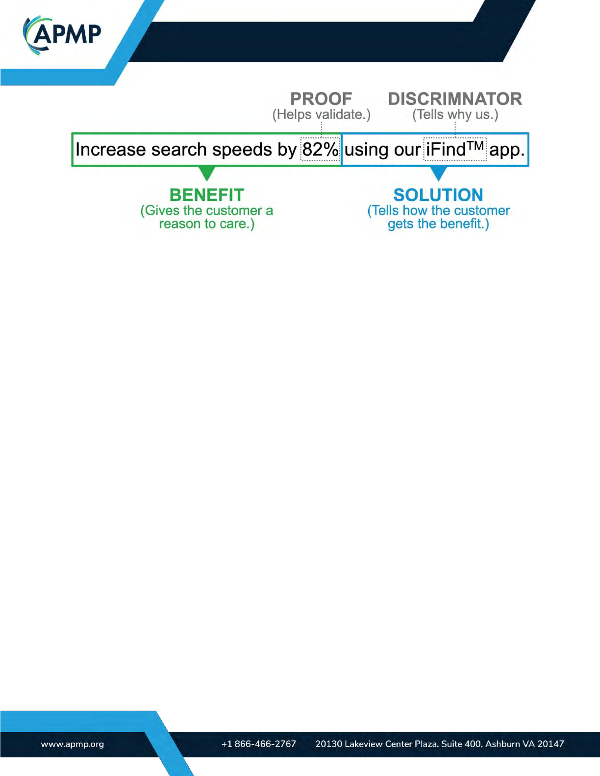
• When applicable, include proof and discriminators in the caption. Figure 4.1-1 is an
example of a benefit-driven action caption with quantitative evidence.
• Never conceptualize or render a graphic before the one-sentence summary is writ-
ten.
BODY OF KNOWLEDGE
Page | 10
(APMP_006) Figure 4.1-1. Graphic Summary. A customer-focused, benefit-driven summary improves the
persuasive power of your graphic and proposal; the summary becomes the title or action caption.
2. Explain: Provide the details that prove the summary.
Developing a concept of your graphic often involves input from SMEs and/or research.
Your explanation should help answer the following questions:
a. What message is the graphic trying to convey?
b. Does any part of the content shown in the graphic differentiate your solution over
what others will propose?
c. Does the graphic give the audience a reason to care?
d. Are there proof points or evidence?
e. If the graphic involves data, are there metrics for the information shown? If yes,
what are they?
f. How much space can this graphic use?
g. Where will this graphic be used in the proposal document and other delivera-
bles?
3. Visualize: Turn the summary and explanation into a visual concept.
Using the summary and explanation, create a graphic concept sketch or mock-up showing
the key information and benefits using whatever tool is easiest for you (pen and paper, Power-
Point, etc.). Aesthetics are not important at this point. This step is all about capturing the infor-
mation visually in a succinct manner that can enhance the reviewers understanding of key fea-
tures, benefits, and discriminators.
The conceptual mock-up is then reviewed (and iterated when needed) before its rendered
to avoid aesthetic biases influencing feedback on the message, content, and concept.
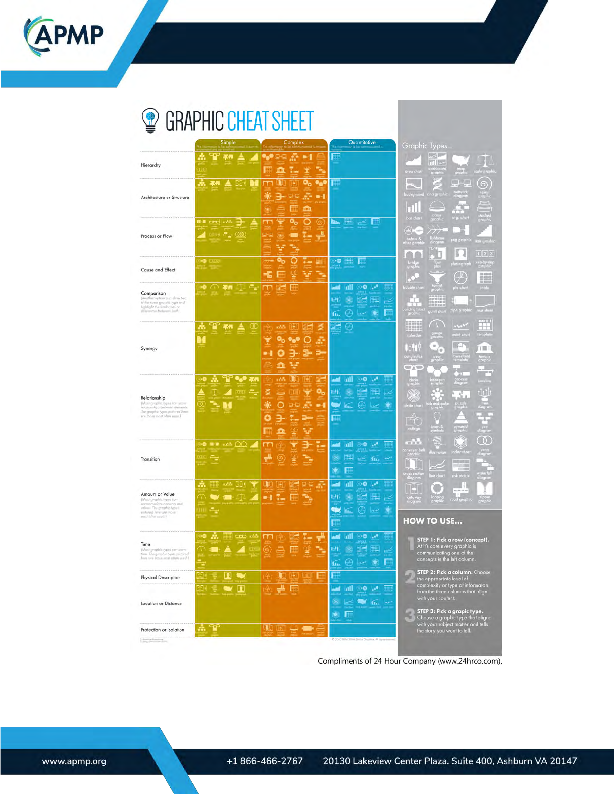
Established organizations follow a systematic process to select the most suitable graphic
type. A case in point is Mike Parkinson of 24 Hour Company, who employs a matrixed ap-
proach to rapidly sift through potential graphic types. He chooses a graphic type, conceptual-
izes graphic options through sketches or mock-ups, and once approved, proceeds to the last

BODY OF KNOWLEDGE
Page | 11
step, render the graphic. Figure 4.1-2 is Mike’s "Graphic Cheat Sheet" he uses to assist in
choosing appropriate graphic types.
4. Render: Turn the concept into a professional, compliant graphic.
Once the concept is approved, professionally render a compliant graphic. Use the render-
ing tool (like Adobe Illustrator or PowerPoint) and style (defined and approved before render-
ing) most appropriate for the type of response submission.
Each aesthetic choice should be purposeful. Consider the following two examples:
• Are you building brand awareness? If yes, then use your organization’s brand stand-
ards to grow mindshare.
• What is your audience’s age demographic? Older demographics tend to associate
photorealism with higher quality, while younger audiences often associate simplified
design with higher quality.
By combining your organizational goals with the expectations of your audience, you can
make more effective aesthetic choices.
BODY OF KNOWLEDGE
Page | 12
(APMP_007) Figure 4.1-2. Graphic Cheat Sheet. Mike Parkinson’s Graphic Cheat Sheet helps choose a graphic
type based on the message.
BODY OF KNOWLEDGE
Page | 13
4.2 Objectively validate your graphics
Seek validation at every step in the graphic development process and at every milestone.
For instance, when a title or action caption has been composed, determine whether it aligns
with the RFP’s stipulations and is oriented toward the customer. After formulating a conceptual
design, verify that it unambiguously delivers the desired message prior to the rendering pro-
cess.
When assessing the success of your graphic, ask these questions:
Goal: Does this graphic meet the requirements of the response? Does it answer a crucial cus-
tomer question, provide information the customer has requested, or emphasize a significant
reason why the customer should choose you over a competitor? If not, your graphic can be im-
proved.
Content: Without the title or action caption can the audience easily comprehend the mes-
sage? Is all the content within the graphic pertinent to the title or action caption? If your answer
is no to either of these questions, your graphic could be misleading or it could be overlooked.
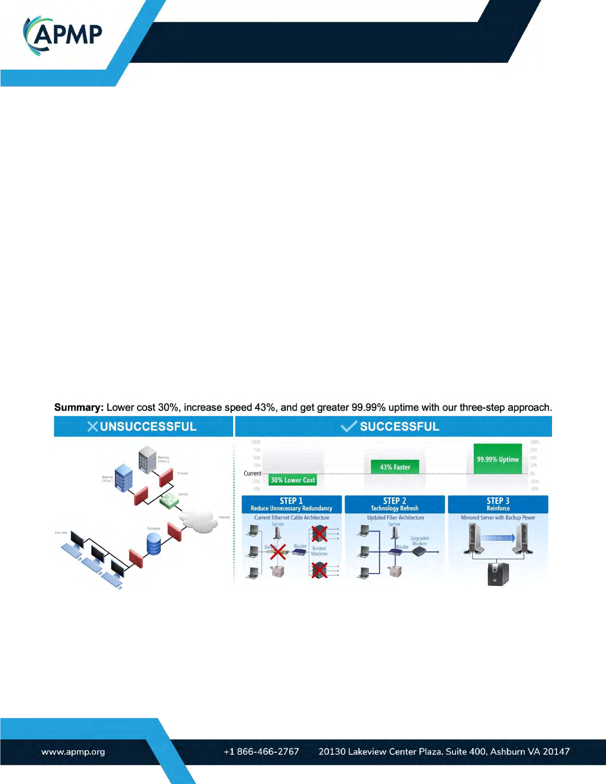
Figure 4.2-1 presents the action caption (at the top) and compares two alternatives. The
graphic on the left fails to align with the action caption, while the one on the right is more suc-
cessful.
Aesthetics: Does every aesthetic decision have a purpose? What message does the style of
the graphic communicate? Is it consistent with the rest of the graphics in the response? If the
answers to any of these questions is no, then your graphic will lower your chances of success.
(APMP_009) Figure 4.2-1. Aligned Summary. Graphic content must be clear even in the absence of a summary
(action caption). The graphic on the right shows the summary more clearly than the one on the left.
Seek feedback from outside the proposal team. If someone unfamiliar with your solution
can understand your graphic, it’s a strong indication that the graphic can be understood by a
broad audience.

BODY OF KNOWLEDGE
Page | 14
5.0 Types of proposal graphics
There are two broad categories of proposal graphics:
1) Traditional proposal graphics, which are the graphics commonly used in documents
2) Multimedia focused graphics such as animations, web deliverables and videos
In general, traditional graphics are used in both federal and commercial proposals. Multi-
media graphics are used more often in the commercial space, where there are fewer RFP-
driven requirements.
Traditional proposal graphics fall within several categories. Below are some of the more
common groupings of graphics and best practices to consider when using them:
Quantitative graphics: These data-driven visuals help your audience review metrics-based
information easily. Common examples include pie charts, line graphs, and bar charts. It is best
to emphasize the conclusion or trend you want the reader to make based on the data.
Process flows and timelines: This style of visual shows steps over time, interdependencies,
and parallel activities. To avoid cluttered graphics, simplify the information and use grouping,
hierarchy, and alignment to make it easy to follow. Be sure that the process flows in the direc-
tion your audience reads. For example, if your reviewers read from left to right, you want your
depiction of the process to flow in the same direction. Make it intuitive to evaluate.
Comparison charts: This style of graphic contrasts two or more elements of information such
as a before (current) state and after (desired) state. Examples include bridge and scale
graphics. Designers often emphasize the differences between the states and make the desired
state more aesthetically appealing.
Hierarchical graphics: These graphics show a ranked flow or order of an organization or
product line. Pyramid and stair graphics can clearly show hierarchy.
Schematics: This type of diagram is used to illustrate parts of a system.
Maps: Most typically, these are geographic in nature. They are used to show locations or de-
pict steps through space and time.
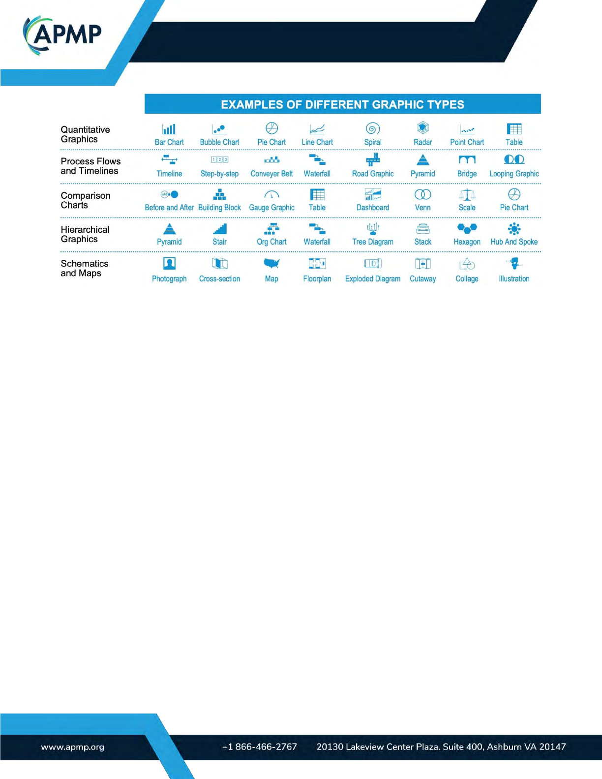
See Figure 5-1 for some types of graphics that can be used in each of the categories listed
above.
BODY OF KNOWLEDGE
Page | 15
(APMP_010) Figure 5-1. Sample Graphic Types. The table shows some of the graphic types used in proposals.
Common multimedia graphics include:
Web-based deliverables: Web-based deliverables include documents, videos, or other sup-
porting materials delivered over a virtual platform. Examples include microsites, spark pages,
and Adobe experience manager sites. Key considerations are data security and how the deliv-
erable will be accessed.
Videos: Videos can bring motion into designs, elevating your proposals. Considerations with
video include: 1) production time and logistics, 2) file size, and 3) video hosting. Due to the
large file size of videos, including them can slow the performance of the files in which they are
embedded. To overcome this challenge, many designers use third-party hosting platforms.
However, this raises concerns about data security and accessibility, especially in terms of a
reader's willingness to click on a web link.
Interactivity (animations and non-linear navigation): Adding animations (like GIFs and
movement in PowerPoint) and interactivity (such as navigation bars), is predominantly seen in
presentation files. When using any form of interactivity, think about how the client will access
the information. Unless animations are presented during a live meeting, you will likely need to
share a type of presentation file with the client. This can create problems if the customer is not
familiar with their use (such as a PowerPoint Show .ppsx file). Navigation should include clear
actions for the reader to follow, so be sure to label and highlight all hyperlinks, fields, and but-
tons clearly. A best practice for non-linear navigation is to use hyperlinks wherever possible to
ensure compatibility across all systems and to eliminate the need for special software or plug-
ins to use your files.
6.0 Design principles and techniques
To be seen as professional, all graphic types and use cases should follow basic design prin-
ciples. Design choices should guide readers through your graphics, improve comprehension,

BODY OF KNOWLEDGE
Page | 16
and build trust. Avoid design choices that are inconsistent with your audience, message, or
subject matter.
There are many design principles and techniques, but the six most commonly used by pro-
posal graphic renderers are:
Color: Color and contrast (which can also be perceived as color) are often the first elements that
people notice. Color has subject and culturally specific meaning and can influence mood. Hence,
every color choice should be intentional and serve a purpose. For example, if your aim is to establish
your company’s brand, use your company’s colors. If your objective is to cultivate trust, consider us-
ing your customer’s colors. Settle on a color palette before rendering graphics, and avoid deviations.
A shift in color can lead readers to infer a change in meaning. If the meaning is unclear, reviewers
may become confused.
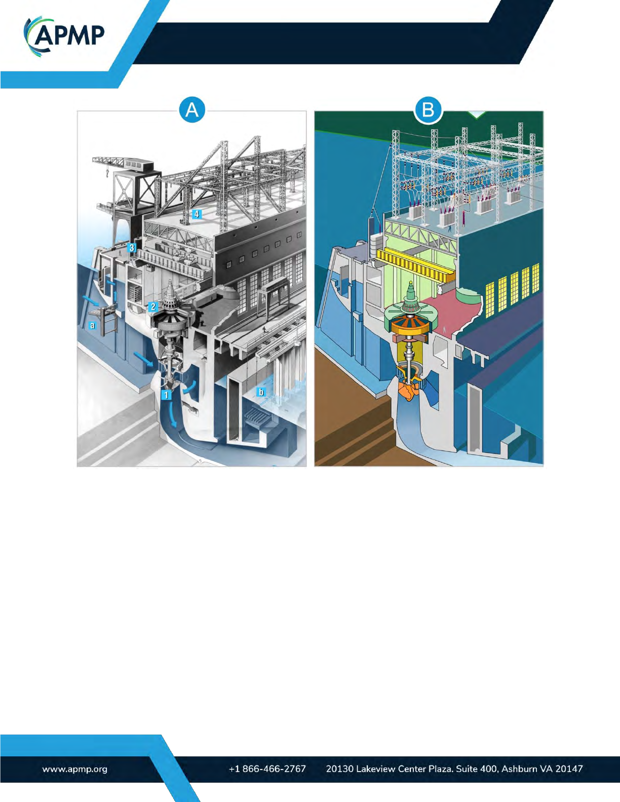
Style: The style of your graphics plays a significant role in understanding and conveys sub-
stantial information about your company and solution. Figure 6-1 illustrates the same subject
matter designed in two contrasting styles. Style A leans toward photorealism, while Style B
adopts a more simplified aesthetic. The style of your graphics also conveys your company’s
culture and approach to customer service, problem-solving, and other responsibilities. For in-
stance, well designed graphics communicates that your company is professional and capable.
Conversely, aesthetically unappealing or unprofessional graphics can suggest that you, your
solution, and your company may lack professionalism and be the inferior choice.
BODY OF KNOWLEDGE
Page | 17
(APMP_011) Figure 6-1. Understanding Graphic Style. Aesthetic style affects perception and understanding.
(Bonneville Generator graphic developed by U.S. Amy Corps of Engineers) (images.usace.army.mil)
Consistency: Aesthetic consistency (achieved through color, style, lines, and fonts) conveys
that your team is in sync. Since consistency requires extra planning and effort, it showcases
the dedication you put into crafting the proposed solution and reflects your company’s commit-
ment and professionalism. Creating and using templates aid in maintaining this consistency.
(For more on this, see the section on templates within the best practice section.)
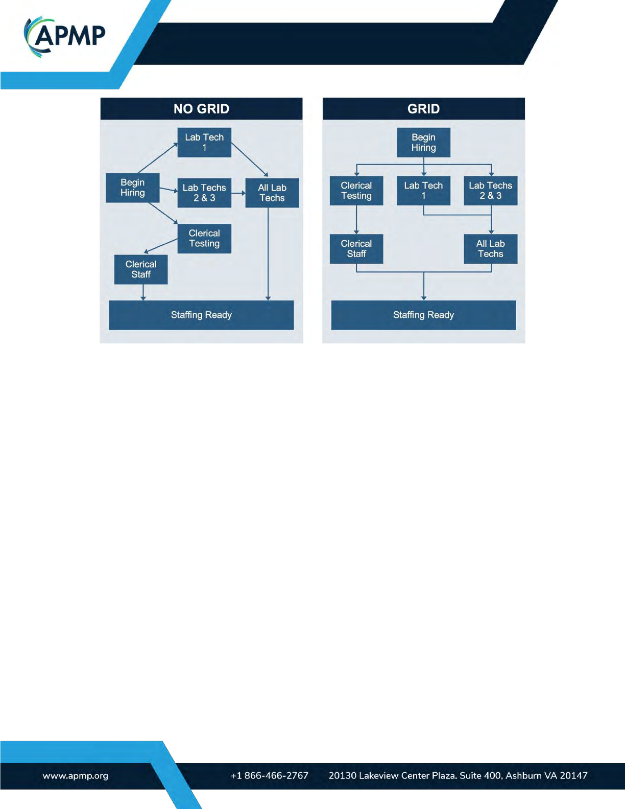
Grid: Most successful graphics use an invisible grid. Use a grid to ensure your graphic ele-
ments are evenly spaced, orderly, and straightforward. Figure 6-2 illustrates the difference be-
tween a graphic that uses a grid and one that does not. (For more information on how to use
grids, refer to Basics Design 07: Grids, Second Edition by Gavin Ambrose and Paul Harris.)
BODY OF KNOWLEDGE
Page | 18
(APMP_012) Figure 6-2. Designing Graphics Using a Grid. Using a grid improves comprehension and
understanding by adding visual order.
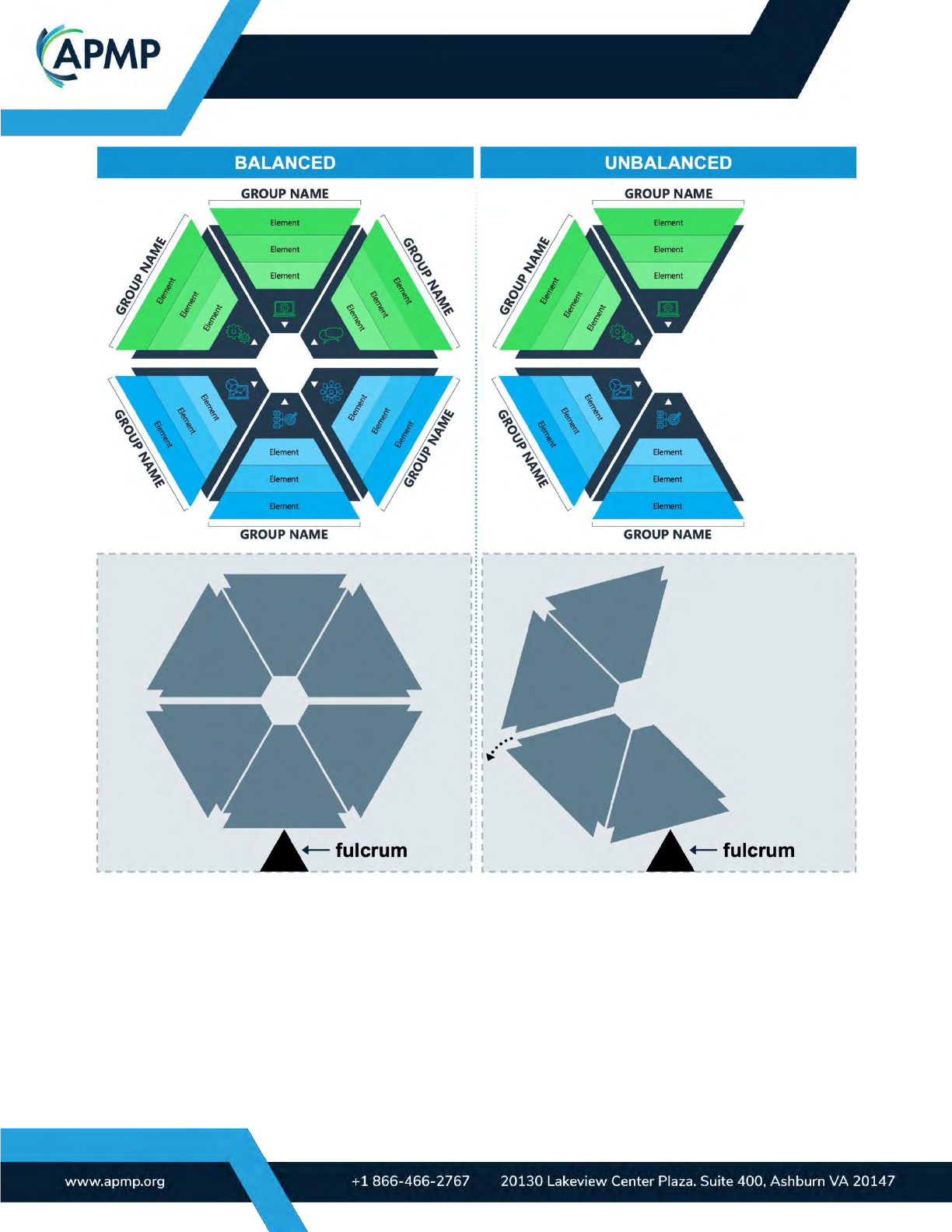
Balance: Balanced graphics project a sense of stability and harmony, while unbalanced ones
can evoke feelings of unease. Graphics achieve aesthetic balance when their left and right
sides, and to a lesser degree, top and bottom, appear to “weigh” similar amounts, fostering a
sense of equilibrium. Figure 6-3 exemplifies visual balance.
BODY OF KNOWLEDGE
Page | 19
(APMP_013) Figure 6-3. Designing Balanced Graphics. Visual balance impacts mood and perception; balanced
graphics can connote stability while imbalanced graphics show instability.
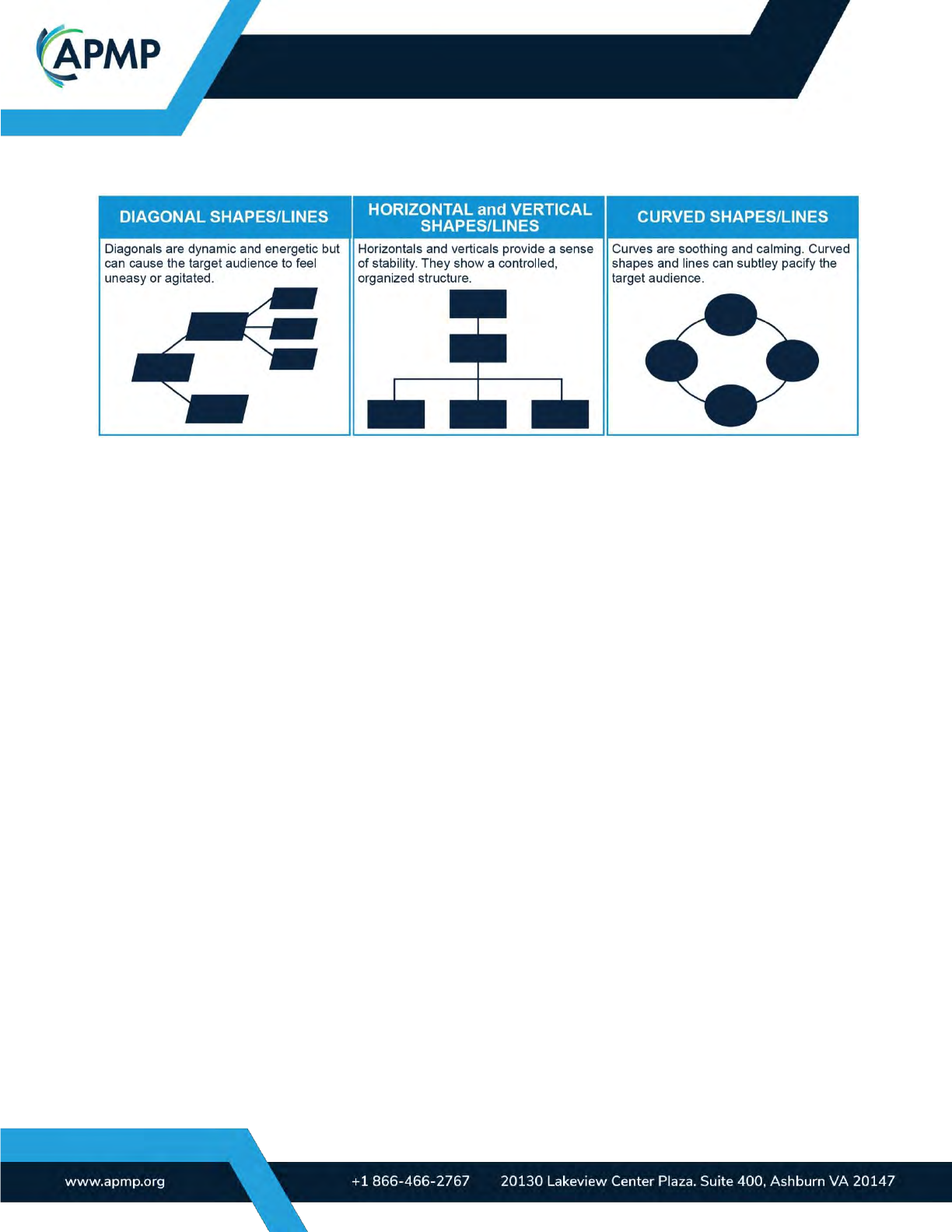
Shapes: Shapes and lines influence a reviewer’s perception and understanding. Diagonal
shapes and lines are more dynamic and energetic. However, excessive use may elicit feelings
of unease or agitation. Too many diagonal lines can even lead to a graphic appearing disor-
ganized and untidy, typically making it challenging to follow. Horizontal and vertical shapes and
lines convey a sense of stability, suggesting that the presented information is organized and
controlled. Curved shapes and lines (such as circles and ovals) are soothing and calming, of-
ten helping to ease your target audience. Consequently, curved, horizontal, and vertical
shapes and lines usually generate a positive impression. Figure 6-4 illustrates the impact of
BODY OF KNOWLEDGE
Page | 20
shapes on mood and perception.
(APMP_014) Figure 6-4. Using Shapes in Graphics. Shapes and lines impact mood and perception.
7.0 Industry best practices for creating impactful graphics
7.1 Templates
Templates help ensure consistency and compliance, reduce the need for
redesign, and
save time in the development process. Templates help give your graphics a unified look
and feel, which is expected of a mature organization and solution provider. Be sure the
visual vocabulary for repeated elements such as icons, symbols, and other imagery is de-
fined in the template.
Good templates include: a color palette, graphic style, icon and symbol style, arrow style,
font (typeface and size), line spacing, capitalization scheme, and the dimensions/resolutions to
use when creating graphics.
Your template should consider:
• The size of the graphic
• The medium in which it will be presented (e.g., printed page, projected, digital)
• How the team wants to be perceived by the client (e.g., modern, traditional)
• Branding concerns, such as using your company’s branding or the customer’s
• Special accessibility considerations (e.g., readers who are blind or have low vision,
graphics duplicated in black and white for review)
BODY OF KNOWLEDGE
Page | 21
7.2 File formats
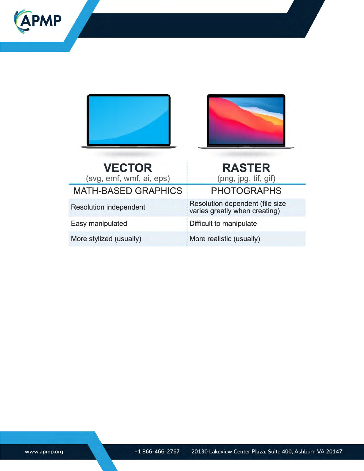
There are two primary formats of proposal graphics: vector and raster. Figure 7.2-1
summarizes the differences between the two. When to use these formats depends on style,
use, and submission type.
(APMP_016) Figure 7.2-1. Vector vs. Raster. This table compares vector images with raster images.
Vector graphics (e.g., SVG, EMF, WMF, AI) are resolution independent, meaning all ele-
ments can be scaled without sacrificing image quality. File sizes are typically smaller, and
graphics remain editable.
Raster graphics are flat, uneditable files (e.g., JPG, PNG, TIF, GIF) made up of pixels.
They are usually 150 to 300 dots per inch for print and a lower resolution for on screen use.
These files are resolution dependent, which means the final dimensions and presentation
medium must be known to ensure image integrity, legibility, and quality.
Some file formats, like JPG and PNG, allow for image compression. This reduces file size
by lowering image quality. If possible, heavy compression should be avoided.
To avoid font and file size issues, create graphics at the same dimensions as they will
appear in your proposal. For instance, if your proposal graphic will measure 6.5 inches (16.51
centimeters) in your proposal document, ensure that the original, rendered graphic has the
same dimensions. To know your font size, do not scale the graphic after it is placed into your
proposal. For example, if the graphic is scaled down, font size compliance is at risk.
7.3 Content management
Effective content management of graphic assets is crucial to ensure smooth collaboration,
easy access, and efficient workflows. Some best practices to consider are:

BODY OF KNOWLEDGE
Page | 22
Use a centralized content repository to store all proposal-related graphic assets: This
could be a shared network drive, cloud storage platform, or dedicated tool. If you’re using a
folder structure, it should be logical and straightforward for team members to navigate when
locating or accessing graphic assets.
Implement a clear file naming convention: Consistent asset naming can maintain clarity,
make assets easy to find, and reduce the risk of duplicate files. Use descriptive and significant
names that reflect the content, version, and purpose of each asset. Incorporating version num-
bers or dates can prevent confusion and ensure the latest assets are always available for use.
If you work on an international team, establish a preferred date format.
Implement version control to manage changes and revisions to graphics: Consider using
version control mechanisms to track updates, edits, and iterations, ensuring an audit trail of
any changes. Adopt a file naming and logging system that identifies the proposal, the graphic
number, and the version number (e.g., XYZprop_001_v2). Position the log number within the
graphic in a discreet location for future identification.
Include relevant metadata and tags to provide additional context to graphic assets: You
might consider adding information like the project name, date, keywords, purpose of content
(e.g., to raise awareness, to move the customer from the consideration to the decision stage,
or to influence decision-making), and descriptions. Metadata and tagging can significantly en-
hance searchability in a content repository.
Follow clear guidelines for graphics collaboration and approval workflows: Define roles
and responsibilities for team members, outlining who has permissions to edit, review, and ap-
prove graphic assets. Implement a process for requesting changes, providing feedback, and
documenting approvals to maintain a streamlined workflow.
Regularly back up graphic assets: Frequent backups prevent loss in the event of system
failures or accidental deletions. Different storage devices or cloud-based solutions can be used
for backing up or archiving assets. Implement a process to test the backup and recovery pro-
cess regularly to ensure its effectiveness.
Develop and maintain documentation or style guides: These resources provide specifica-
tions and standards for using graphics in proposals. They should include information on brand-
ing, color schemes, typography, image resolution, and file formats, ensuring consistency and
uniformity across your organization’s proposals.
Invest in training or knowledge-sharing sessions to help team members become profi-
cient in managing and using graphics: Offer resources and tutorials on using design soft-
ware, organizing assets, and adhering to best practices. Encourage team members to share
tips, techniques, and feedback to foster continuous improvement.
To improve your chances of winning, ensure your proposal is easy to review and evaluate by
implementing the following best practices:
• Avoid graphics that require the reviewer to rotate the document, such as shifting from
portrait to landscape.
• Include an action caption below your graphic.
BODY OF KNOWLEDGE
Page | 23
• Introduce your graphics with a unique identifier (e.g., Figure 1, Exhibit 1, Table 1) in the
body of your proposal for easy reference and tracking.
• Position your graphics close to the associated narrative for easier correlation.
7.4 Copyright law
If you do not have permission from the owner of an image, you are not legally allowed to use
that image in your proposal. Images are automatically protected under copyright law in nearly
every country, valid with or without a copyright notice. According to copyright law, the creator
of an image automatically holds the rights to that image upon its creation, and they may
choose to grant or withhold the right to reuse it.
Excluding cases where an image is classified as public domain or used in accordance with fair-
use laws, permission to use must be obtained from the owner, either for free or for a fee. For
instance, it is illegal to use a photograph or graphic found on the internet (i.e., a photograph
located during an internet search) if the usage rights have not been explicitly granted to you.
Conversely, it is legal to use photographs and graphics purchased from stock image websites
or websites that permit the right of reuse for commercial purposes (i.e., for profit).
When purchasing images, be sure to double-check that the images are licensed for com-
mercial use and NOT solely for “Editorial Use.”
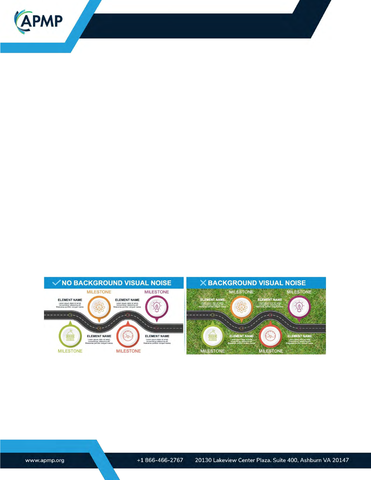
7.5 Visual noise and complexity
The purpose of nearly every proposal graphic is to clarify and explain. To efficiently do so,
avoid unnecessary graphic embellishments and visual noise (like textured backgrounds).
You should also aim to simplify your graphics to focus on a single message (your graphic’s
summary). The following graphics show the benefit of avoiding unnecessary visual noise.
(APMP_017) Figure 7.5-1. Visual Noise. The graphic with no background visual noise (left) is easier to read and
faster to understand.
BODY OF KNOWLEDGE
Page | 24
7.6 Accessibility and Inclusion
Accessibility
Proposal graphics should adhere to accessibility standards to ensure inclusivity and provide
equal access to information for all individuals, regardless of their abilities. Everyone perceives
the world differently. By making proposals accessible, a broader audience can understand
your offering.
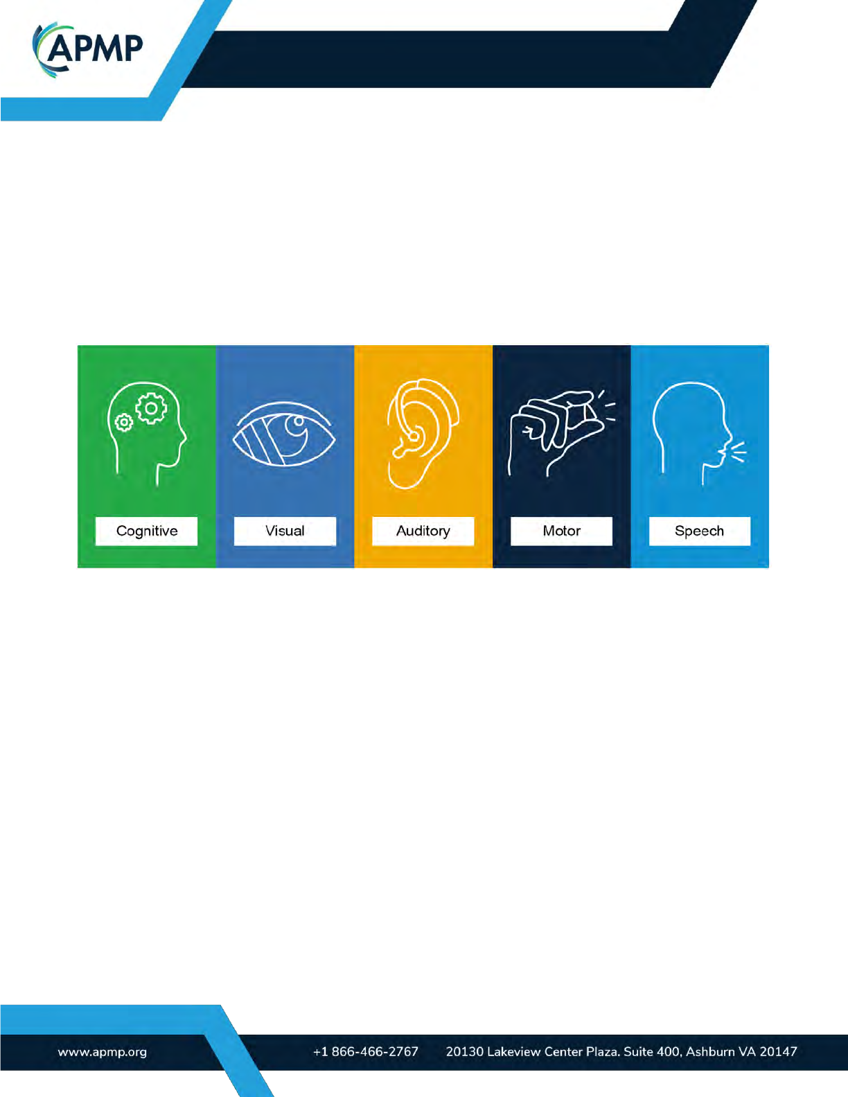
Figure 7.6-1 contains five variables that influence how we digest and process information.
These variables are central areas of focus to achieve higher levels of accessibility.
(APMP_018) Figure 7.6-1. Information Consumption Variables. Understanding the five high-level variables
that impact how we digest and process information helps you create more accessible proposal content.

BODY OF KNOWLEDGE
Page | 25
Here are several reasons why proposal graphics should adhere to accessibility standards:
1. Inclusive communication: Accessibility standards foster inclusive communication
by ensuring that the information conveyed through proposal graphics can be understood
by everyone. They enable people with disabilities, such as visual impairments or
cognitive disabilities, to perceive and comprehend the content effectively.
2. Compliance with regulations: Many countries, government agencies, and
organizations have legal requirements or guidelines in place to ensure accessibility in
various contexts, including digital content. Adhering to accessibility standards for
proposal graphics ensures compliance with these regulations, avoiding potential legal
issues or barriers to participation.
3. Equal opportunity: Accessible proposal graphics provide equal opportunities for
participation. By considering accessibility, you remove barriers that might otherwise
prevent individuals with disabilities from fully engaging with your content. It helps level
the playing field and ensures that everyone can access and understand the information
being presented.
4. Enhanced usability: Accessibility features, such as proper color contrast, clear
typography, and alternative text for images, not only benefit people with disabilities but
also improve usability for all users. Following accessibility standards results in clearer,
more legible graphics that are easier to comprehend and navigate, enhancing the user
experience for everyone.
5. Positive brand image: Demonstrating a commitment to accessibility reflects
positively on your brand or organization. It shows that you value inclusivity, diversity,
and equal access to information, which can enhance your reputation and foster goodwill
among a wider audience.
6. Future-proofing: By incorporating accessibility standards into your proposal
graphics, you future-proof your content. As technology evolves, accessibility will
continue to be an important consideration. By starting with accessible graphics, you can
adapt and update your content more easily as new accessibility features and guidelines
emerge.
Accessibility is a fundamental aspect of designing and presenting information in a way that
considers the needs of all users. By using accessibility standards for proposal graphics, you
ensure that your content is inclusive, compliant, and accessible to a broader audience.
The following is an evolving list of accessibility standards worth integrating into your process:
• WCAG (Web Accessibility Content Guidelines): https://www.w3.org/WAI/standards-
guidelines/wcag/; guidelines for fonts: https://www.w3.org/TR/WCAG21/#text-spacing
BODY OF KNOWLEDGE
Page | 26
• Creating accessible content in Adobe: https://www.gre.ac.uk/creating-inclusive-con-
tent/accessible-graphic-design (includes further links to support accessible design)
• Accessible graphic design handbook: https://www.rgd.ca/resources/accessibility/access
• US Government accessibility guidelines: https://accessibility.digital.gov/visual-design/get-
ting-started/
• Accessibility Dos and Don’ts (NHS, United Kingdom): https://accessibil-
ity.blog.gov.uk/2016/09/02/dos-and-donts-on-designing-for-accessibility/
• Adobe InDesign PDF guidance: https://www.doi.gov/sites/doi.gov/files/up-
loads/may_2019_section_508_compliance_event_-_indesign_accessibility.pdf
Use the following techniques to meet your accessibility and inclusivity goals:
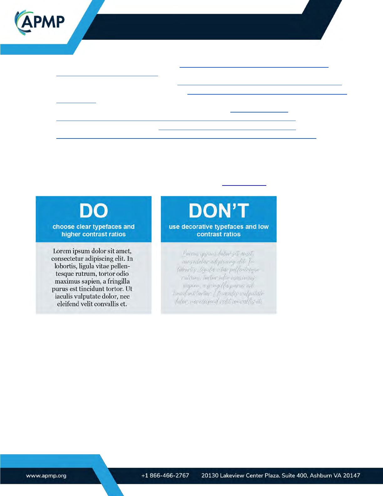
Make sure typography on graphics is clearly legible: Use legible fonts with the appropriate
contrast ratios. Avoid placing text in rotated, slanted, or vertical positions where possible. Lev-
erage resources for digital content accessibility (such as W3 resources).
(APMP_019) Figure 7.6-2. Legibility. This example shows the benefits of making your graphic text more
accessible; the text copy on the left is much easier to read because of font choice and the contrast ratio.
Don’t rely on color alone: In addition to color, use labels or icons to differentiate content. Use
color blindness checkers to avoid ambiguity between colors.
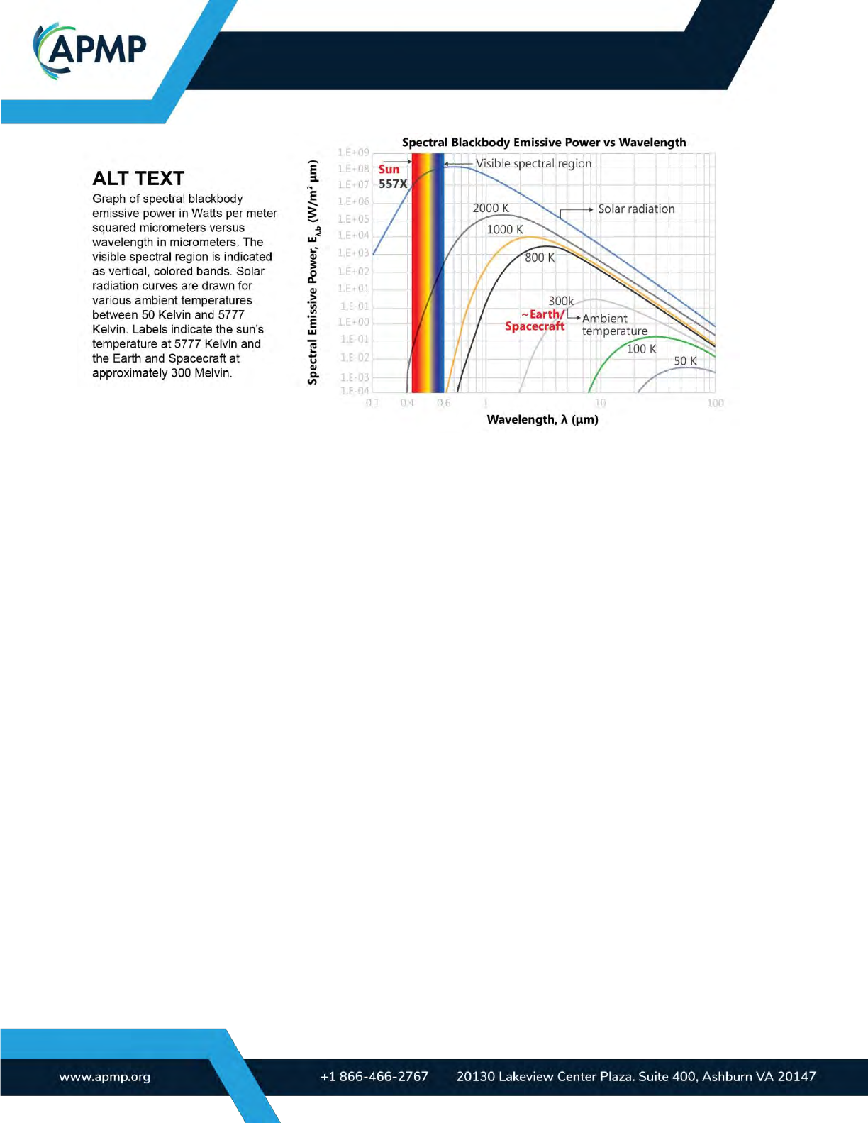
Apply alternative text (alt text) to images: Alt text differs from captions. Captions provide the
proposal message, whereas alt text can include detailed descriptions (especially for complex
graphics) for readers who may not be able to visually comprehend or see the graphic. It is usu-
ally hidden from view, but screen readers will share the alt text when engaged.
BODY OF KNOWLEDGE
Page | 27
(APMP_020) Figure 7.6-3. Alt Text. When applicable, include alt text that clearly explains your graphic. Ex-
ample concept courtesy of Johns Hopkins Writing School of Engineering.
Consider how assistive technologies like screen readers interpret graphics: Ensure content
and text within graphics is logically structured, especially when multiple graphics are used in
one space. Test the content with assistive technologies, such as Immersive Reader in Mi-
crosoft Word. Some tools, like Microsoft PowerPoint, include accessibility features like Read-
ing Order Pane, where content elements can be ordered for screen readers.
Export graphics to accessible formats like accessible PDFs: Accessible formats make it eas-
ier for assistive technologies to support users with accessibility needs. Prioritize semantic text
and character usage to make it easy for assistive technologies to decipher and express the
graphics.
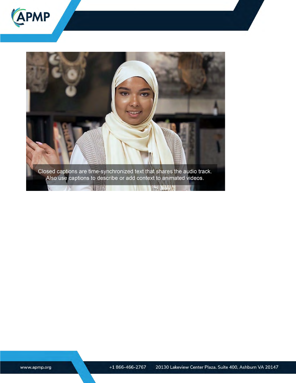
Ensure videos and animations are well captioned and contextualized: Providing closed cap-
tions and ensuring visual imagery is contextualized assists people who have hearing impair-
ments or disabilities or cognitive conditions that affect how they intake audial or visual infor-
mation.
BODY OF KNOWLEDGE
Page | 28
(APMP_021) Figure 7.6-4. Captioning. Include closed captions in your animation or videos to provide
information in an alternative format.
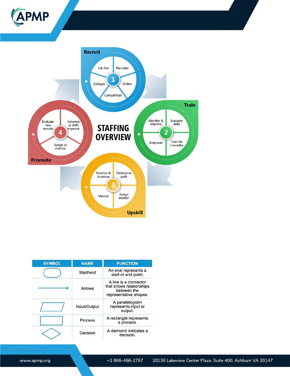
Ease cognitive load in graphic-heavy documents or pages: Easing cognitive load involves
grouping content to optimize legibility and clarify understanding. Break up the content into clear
sections with meaningful headings/captions. Design with hierarchy in mind, allowing readers to
navigate the content more easily. Use anchors within graphics to enable users to explore spe-
cific elements further. Grids help you align and distribute content for an easier-to-understand
graphic.
BODY OF KNOWLEDGE
Page | 29
(APMP_022) Figure 7.6-5. Using Groups and Hierarchy. This graphic uses groupings and shows that
each grouping is of similar value by using visual cues like color and shape.
Ensure consistency in graphic design to reduce confusion, distractions, and sensory
overload. Minimize the use of legends and cross-referencing to help ease cognitive
load. Avoid using acronyms or complex
text within graphics.
• Use familiar icons and symbols
that add context or value: Ensure icons
add value or aid understanding and
aren’t included just for aesthetic pur-
poses. Use a known visual vocabulary to
avoid confusion.
(APMP_023) Figure 7.6-6. Process Diagram
Symbols. These symbols may or may not be
intuitive for your audience. Use easy-to-

BODY OF KNOWLEDGE
Page | 30
understand icons and symbols to enhance communication.
Leverage effective data visualization: Allow the data and communication goals to dictate the
format and visual style rather than following aesthetic trends. Support visuals with brief de-
scriptions of the overall insights gathered by the charts to provide context. Clearly label data
and variables. Where possible, complement graphs with tables of information for screen reader
users.
Remember that accessibility considerations should be included in the conceptualization
and design stages. Making your proposal graphics accessible and inclusive broadens
stakeholder engagement, enhances credibility, aligns with modern compliance require-
ments and organizational priorities, and increases the likelihood of winning.
Inclusivity and cultural sensitivity
When creating proposal graphics, it is important to embrace inclusivity from a cultural per-
spective. Inclusivity goes beyond diversity in representation; it involves acknowledging and
respecting the cultural backgrounds, traditions, and beliefs of all individuals involved.
By incorporating cultural inclusivity into proposal graphics, organizations demonstrate their
commitment to equality and social value, foster a sense of belonging, and enhance their
reputations. This practice promotes fairness and encourages innovation and creativity by
incorporating diverse perspectives. As such, it is important to research your customer and
align graphics with their culture and preferences. Tips include:
Representation: Evaluators, reviewers, and decision-makers want to see them-
selves in received proposals. For this reason, reflect the prospect or customer’s
culture to avoid miscommunication or a worse offense. Ensure that proposal
graphics feature diverse individuals from various cultural backgrounds. Include
people of different races, ethnicities, genders, ages, and abilities to reflect the di-
versity of your audience and stakeholders.
Cultural symbols and imagery: Incorporate culturally significant symbols,
icons, or imagery that is relevant to the target audience. For example, if you are
proposing a project in a specific region, include landmarks, traditional attire, or
local art to create a connection and align with the cultural context.
Language considerations: If your proposal graphics include text, you could ac-
commodate multiple languages or provide translations to cater to a diverse audi-
ence. Avoid relying solely on English and consider incorporating translations or
captions in other languages as needed. Where only English text is used, ensure
language is simple and easy to understand.
Colors and design elements: Be mindful of cultural meanings associated with
colors and design elements. For example, red may symbolize luck and prosperity
in some cultures, while it can signify danger in others. Research cultural

BODY OF KNOWLEDGE
Page | 31
associations and preferences to ensure the appropriate use of colors and design
elements in your proposal graphics.
Research cultural sensitivities: Research cultural sensitivities of the target au-
dience or community you are presenting to. This will help you avoid inadvertently
using imagery that may be offensive or disrespectful. Respect cultural taboos, re-
ligious beliefs, and traditions to ensure your proposal graphics are culturally sen-
sitive. You may need to make politically aware design decisions, for example,
showing the right military uniform for a government agency.
Collaborate with diverse perspectives: Involve individuals from diverse cultural
backgrounds in the creation and review process of your proposal graphics. Seek
feedback and input from different stakeholders to ensure that the graphics are
inclusive, respectful, and representative of various perspectives.
By implementing these examples and considering cultural inclusivity in your proposal
graphics, you can create visuals that are sensitive, relatable, and appealing to a broad
range of audiences while building trust with your audience.
8.0 Tools and emerging technologies
There are many factors to weigh when choosing tools to develop winning proposal
graphics. Consider the following to help you invest in the right solution the first time.
8.1.1 Tools for conceptualizing graphics
There are numerous options to take into account when conceptualizing a graphic. Consider
the following factors before choosing:
• Conceptualization: The following factors will help you assess which tools work well
for your team:
− Preference and accessibility: Be mindful about which tools are preferred or ac-
cessible to other contributors and compatible with their locations, devices, and
skill levels.
− Flexibility: Consider if the tool is flexible enough to accommodate quick modifi-
cations and easy sharing.
− Collaboration features: Do you require collaboration features, such as com-
ments, version control, and real-time editing?
− Visualization: Consider if you need a tool that facilitates quick sketching, idea-
tion, and concept exploration. Can team members easily visualize their ideas
within the tool to foster effective collaboration?
• Approvals: Take into account whether you require features that enable exporting or
sharing high-quality visuals or mock-ups for presentations to stakeholders and deci-
sion-makers to ensure clear and effective communication of your design ideas.

BODY OF KNOWLEDGE
Page | 32
• Documentation and archival: Digital tools often provide built-in capabilities for sav-
ing revisions and organizing design files, facilitating easy access and reference in
the future. This helps maintain a clear record of the design evolution and allows the
team to revisit previous concepts if needed.
8.1.2 Tools for rendering graphics
While the rendering tools you use are based on your graphics requirements, think about the
following before deciding:
• Does the tool support your compatibility requirements, such as resolution, for-
mats, file types, and software integration?
Consider whether you are designing for digital, print, or both. Do you require vector or
raster graphics? Which export file types are needed? Do you want to include anima-
tions, dynamic visual effects, or interactive elements? Are the graphics suitable for the
content types you are producing (for example, integrating easily into your proposal or
presentation documents)?
• Does the tool support the desired qualities of the graphics you want to create?
Does your graphic need to be editable? Does the tool support the creation of the aes-
thetic or graphic style you want to achieve? Does the tool support accessibility features
you would like to include? Does the output quality of the tool meet your standards of
professionalism?
• Does the tool let you make efficient use of time?
You might be rendering complex graphics or large batches of graphics, depending on
your needs. Does the tool allow you to efficiently create, edit, and export your graphics
so you can meet project timelines or iterate your visuals if needed?
• As with conceptualization, you may require collaboration features to enable input,
feedback, or edits from multiple contributors
Can you easily share rendered graphics with team members or stakeholders? Do you
require real-time collaboration to ensure everyone is aligned on the final rendered
graphics?
• If you plan to edit the graphic for future use, consider the following questions:
− Is the tool available to any others who need to make edits?
− Would other contributors have the skills needed to use the tool, or would
they require training or guidance before making edits?
− Are you using a tool that allows you to easily transfer your design assets
and models for rendering, ensuring a smooth transition between conceptu-
alization and rendering stages?
While choosing the most suitable tools for conceptualizing and rendering graphics is based
on many factors, there are some common tools that are frequently used in bid and proposal
environments.
BODY OF KNOWLEDGE
Page | 33
It’s also important to note, based on your budgetary requirements, that some of these tools
require commercial licenses to use, while others offer free platforms. Some tools may even be
free to use but offer premium features that must be paid for.
Data security is also a factor in determining which tools to use within your organization and
has been considered in the selection of the following tool examples.
The following suggestions are based on their wide usage within the industry and are not
endorsed by APMP.
Adobe Creative
Cloud/Adobe
Suite
Adobe provides a wide range of design-focused applications, such as Photoshop,
Illustrator, InDesign, Acrobat, Premiere, After Effects, Animate, and more. These
tools require licenses for users to access them, although Adobe also offers bun-
dled licenses for access to multiple tools within the Adobe Creative Cloud platform.
Adobe’s suite of tools are often the first choice for many graphic designers due to
the high level of control over design features and wide application of use. The use
of InDesign, Illustrator, and Photoshop are particularly prevalent in the bid and pro-
posal industry. However, Adobe tools may not be familiar to the typical bid profes-
sional, and they often require users to undergo training to make use of their ad-
vanced functions.
Microsoft
365/Microsoft
Office
Microsoft offers a suite of tools that many users may be familiar with, such as
Word, PowerPoint, Excel, OneNote, Whiteboard, Teams, Visio, and more. While
Microsoft offers a free web-based platform to access many of these tools (Mi-
crosoft 365 Online), many features are only accessible within the licensed app ver-
sions of each tool; for the most flexibility in graphics design and creation, you may
want to opt for the licensed versions.
Many organizations will opt for Microsoft due to tool familiarity with users, cost-ef-
fectiveness for numerous users, and the flexibility of tool usage and application.
Although these tools offer many design options and useful features, experienced
designers may prefer tools that offer more control over graphic design elements,
such as Adobe’s tools.
Google Suite
(G Suite)/Google
Workspace
Google offers a suite of tools that users can choose for as a low-cost, user-friendly
option for graphics development, including Drive, Docs, Sheets, Slides, Jamboard,
and more. While these tools are free to use for noncommercial users, Google
Workspace offers businesses and enterprises several licensing options with more
security options and features based on an organization’s needs.
Google’s applications are web-based and are usually seen to provide better sup-
port for collaborative environments, as well as being relatively low-cost compared
with other platforms. However, while its tools are quite easy to use and require
very little training, the design features within its apps are also fairly limited from the
perspective of a more advanced graphic designer.
Table 8.1.2-1-1. Commonly Used Tools. These tools are commonly used in the proposal indus-
try to either conceptualize or render graphics.
BODY OF KNOWLEDGE
Page | 34
Many of the above suggested platforms can also be augmented with third-party apps, add-
ons and tools to expand their functionality. Users should select such tools with caution and
make themselves aware of any potential security risks or training requirements before imple-
menting third-party software within their existing IT environment.
8.2 Emerging technologies
The emergence of new technologies, like artificial intelligence (AI) and infographic builders,
offers bid professionals more ways to work more efficiently, conceptualize and develop ideas,
and create original and professional images.
AI tools such as Adobe’s integrated Firefly AI tool streamlines production. These tools
make it easier for proposal designers to quickly create, update, and evolve raster graphics. It’s
best to use AI tools prudently to avoid problems like copyright infringement or misrepresenta-
tion of information.
To mitigate copyright infringement risks when using AI generators, use tools that use verified
imagery data sources that have been vetted and approved for commercial usage. For exam-
ple, Adobe’s Firefly tool verifies that it uses imagery from vetted and approved sources within
the Adobe Stock community. Developers of AI platforms will often publish information on their
website or within the tool’s Terms and Conditions about their data sources and user rights of
usage; if they do not specify these details, there is a higher risk in using their tools. Compari-
sons between these two options’ safe and unsafe image generation can be found on Adobe’s
website.
If you use AI generators to render graphics, consider that even the newest platforms
may not be accurate in using imagery or symbolism in the context in which you intend. These
kinds of tools are typically dependent on text-based prompts from the user and may not recog-
nize the nuances of the language in your prompt, among other variables. This leads to the
time-consuming process of adjusting prompts, which won’t guarantee the graphic results you
want to achieve.
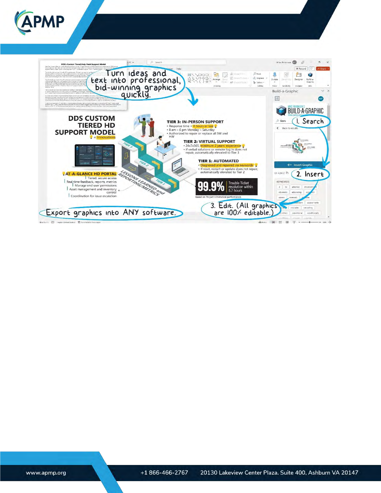
To conceptualize and render proposal graphics efficiently, consider graphic builders that
use an editable library of imagery and prebuilt graphics. You can build your own by developing
a library of meta-tagged elements and graphics, or invest in a commercial tool. Build-a-Graphic
is a tool used by many in the proposal industry to streamline conceptualization and rendering.
BODY OF KNOWLEDGE
Page | 35
(APMP_024) Figure 8.2-1. Using a Graphics Builder Like Build-a-Graphic. Using add-ins for graphic design
can extend the functionality and efficiency of your existing tools.
If you embrace emerging technologies, you can use a combination of AI, a graphics builder,
and a library of your own assets to conceptualize and render graphics where each tool is most
applicable.
9.0 When and where to flex design principles
Strive to always adhere to design best practices, but know when to deviate. The two big-
gest drivers in flexing design principles are aesthetic (look and feel) requirements and tech-
nical requirements, which are often dictated within the RFP. Aesthetic requirements may in-
clude factors such as branding and style, font choice, and customer preference. Technical
requirements pertain to elements like graphic dimensions, page or slide limitations, animations,
file size, delivery methods, and the tools used to create or exhibit graphics.
As a specific example, you can overlook the “rule of thirds” design principle (i.e., dividing
designs into thirds is more visually appealing) in favor of improving understanding, being com-
prehensive, and meeting compliance.
Another example might be to deviate from your corporate brand standards in support of
RFP requirements and reflecting the customer’s brand to help build trust.
Some other considerations to meet aesthetic and technical requirements include the fol-
lowing:
• Image scaling and maintaining proportions
Be cautious when resizing images because it can result in noncompliance, loss of

BODY OF KNOWLEDGE
Page | 36
image quality, and distortion (vector graphics are resolution independent and will not
lose quality when scaled up or down). When possible, lock the aspect ratio of your
graphic to avoid distortion.
• Image density
It’s important to strike a balance between fitting images within the available space and
preserving their visual integrity (including ensuring text within images is still clear and
legible). Edit text or break visuals into multiple graphics to avoid overcrowding with too
much content. Including balanced white space (the area of the graphic with no content)
improves legibility and professionalism.
• Nonstandard text
You may need to use vertical text or rotate the placement of text to fit content into the
allowable dimensions. Ensure that the text remains as legible and easy to read as pos-
sible. Experiment with different layouts and positioning to find the optimal balance be-
tween text and visuals.
Balancing clarity and compliance requires adaptable design. While flexibility is permissible,
a good designer exercises judgment and maintains visual cohesiveness within the constraints
of the requirements. Strive to meet the specific needs of the proposal while adhering to as
many design principles as possible to ensure professional and impactful graphics use.
Common pitfalls and misconceptions
Not writing the summary (e.g., action caption) first: Failing to know what you want to say
before you say it almost always results in wasted effort and frustration. Always write the sum-
mary of your graphic first.
Using more detail than needed: A visual becomes too complicated when the author attempts
to convey too many messages in one graphic, includes detail not relevant to the summary, or
fails to effectively edit the included content. Focus on simplicity and clarity to avoid too much
detail.
Failing to explain yourself: An unclear graphic can happen when the author erroneously as-
sumes that the customer understands the subject matter on the same level that they do. Know
your audience’s proficiency level before creating your graphic.
Making aesthetic mistakes: Poorly rendered graphics result from a lack of design skill. These
graphics are homogeneous at best and unprofessional at worst. All aesthetic choices should
have an objective reason that aligns with the goal of the graphic and the proposal. To ensure
graphics are as professional as possible, work with a trained designer, follow design principles,
and always have an objective reason for every design choice.
Failing to differentiate between conceptualization and rendering skill sets: Align the needs of
the team with the designer’s skills to avoid wasted effort. Not all designers are both. Know the
skill needed before starting the task.
No quality control: Graphics riddled with spelling errors, omissions, duplicate content, or inac-
cessible content reflect poorly on the designer and solution provider. Always run spell-check

BODY OF KNOWLEDGE
Page | 37
and cross-check your work. Ensure interactive files, including documents including hyperlinks,
work as intended. The best-case scenario is to ask someone else to check your work.
Summary
• Write the customer-focused summary (titles and action captions) before conceptual-
izing and rendering graphics.
• Create key graphics before writing your proposal.
• Start with a graphic that summarizes your entire proposal (i.e., executive summary)
and use it as a road map during proposal development.
• Use an objective, repeatable process and graphic templates to ensure consistency,
lower cost, and improve win rates.
• Know when and when not to use graphics.
• Ensure that all aesthetic decisions have a clear purpose that is consistent with the
RFP, audience, and message.
• Track graphic development to effectively schedule and staff graphics support for fu-
ture proposals.
• Understand that the style and professionalism of your graphics reflects your com-
pany culture, the professionalism of your company, and the quality of your solution.
• Design graphics to be as accessible and inclusive as possible.
• Graphic compliance is critical. Often, the RFP requirements will state that content
within your proposal response must comply with certain content and aesthetic re-
quirements such as font style and size. Follow these requirements to avoid noncom-
pliance and/or avoidable losses.
---------------------------------------------------------------------------------------------------------
Other resources
To learn more about proposal graphics, read Billion Dollar Graphics by Mike Parkinson.
For more information on effectively creating statistical graphics, refer to The Visual Display of
Quantitative Information by Edward R. Tufte.
For more information on how to use type effectively in infographics and graphics in general, re-
fer to The Non-Designer’s Design Book, fourth edition, by Robin Williams.
For a high-level view of how neuroscience impacts good proposal design refer to Impossible to
Ignore: Creating Memorable Content to Influence Decisions by Carmen Simon, PhD.
