
UX Analysis of Star Control: Origins
The purpose of this document is to identify issues with the user experience (UX)
of playing the game Star Control: Origins and oer suggestions for improvement. UX
here diers from gameplay in that the focus is not on concepts such as world/level
design, content design, or story. There is a strong focus on user interface (UI) design,
but also a general critique of how the player is made able to draw information from the
game to understand their situation in-game and go about gameplay in an informed
manner.
The following points are issues in the user experience of playing the game with a
Microsoft Xbox controller. Some issues translate over to play with keyboard and mouse
and many points stand regardless of controls used. The issues are categorized accord-
ing to some of the ten usability heuristics originally devised by Jakob Nielsen, selected
and modied for their relevance to video game UX, along with additional heuristics that
were informed by gameplay across multiple games, for a total of eight heuristics. Sug-
gestions provided are quick, unpolished options for possibly solving the problems pre-
sented, and should inspire rather than dene one’s own solutions to these problems.
Purpose
Joseph Hoggatt
Game Version: 1.3

Heuristics
Visibility of system status: The system should always keep users informed about
what is going on, through appropriate feedback within reasonable time.
Match between interface and game world: The interface system should speak the
world’s language, with words, phrases and concepts native to that universe, rather than
modern colloquial terms. Show how the game’s language relates to controls and status
indicators.
Consistency and standards: Users should not have to wonder whether dierent
words, situations, or actions mean the same thing. Follow platform and game world
conventions.
Informed failure: Games must allow for mistakes and failure to make risks and loss
meaningful, but such errors must be due to poor planning or bad strategy, rather than
ignorance due to the game’s failure to provide necessary information. Exceptions in-
clude scenarios wherein ignorance or powerlessness on the character’
s or player’s
part is desired.
Reference:
https://www.nngroup.com/articles/ten-usability-heuristics/

Heuristics Continued
Recognition rather than recall: Minimize the user’s memory load by making objects,
actions, and options visible. The user should not have to remember information from
one part of the dialogue to another. Instructions for use of the system should be visible
or easily retrievable whenever appropriate.
Eciency of play: In just about any game, certain actions are universally the most fre-
quently taken. Examples include taking all of a weightless valuable into one’s inventory
,
accepting quick and free help, conrming a choice to engage in default gameplay, etc.
For customizable games and variant control schemes, allow users to tailor frequent
actions. Don’t waste players’ time.
Help and documentation: Even though it is better if the system can be used without
documentation, it may be necessary to provide help and documentation. Any such
information should be easy to search, focused on the user’s task, list concrete steps to
be carried out, and not be too large.
Suspension of play: Gameplay can be benecially suspended in situations such as
pause menus, inventories, dialogues, and cutscenes. Ensure that such suspensions
don’t detract from enjoyment of the game, and that the transition between suspended
and active play allows for players to reassume control.
Reference:
https://www.nngroup.com/articles/ten-usability-heuristics/

Heuristics - Severity
Each heuristic will be graded on a scale of 0-4 to determine the severity of the game’s
usability issues.
0 = I don’t believe this is a usability problem
1 = Cosmetic problem only: need not be xed unless extra time is available
2 = Minor usability problem: xing this should be given low priority. I also include
missed UX opportunities under this rating.
3 = Major usability problem: important to x, so should be given high priority
4 = Usability catastrophe: imperative to x this before game can be released
OK/Excellent Cosmetic Minor Major Catastrophe
0 1 2 3 4
Reference:
https://www.nngroup.com/articles/how-to-rate-the-severity-of-usability-problems/
Evaluation
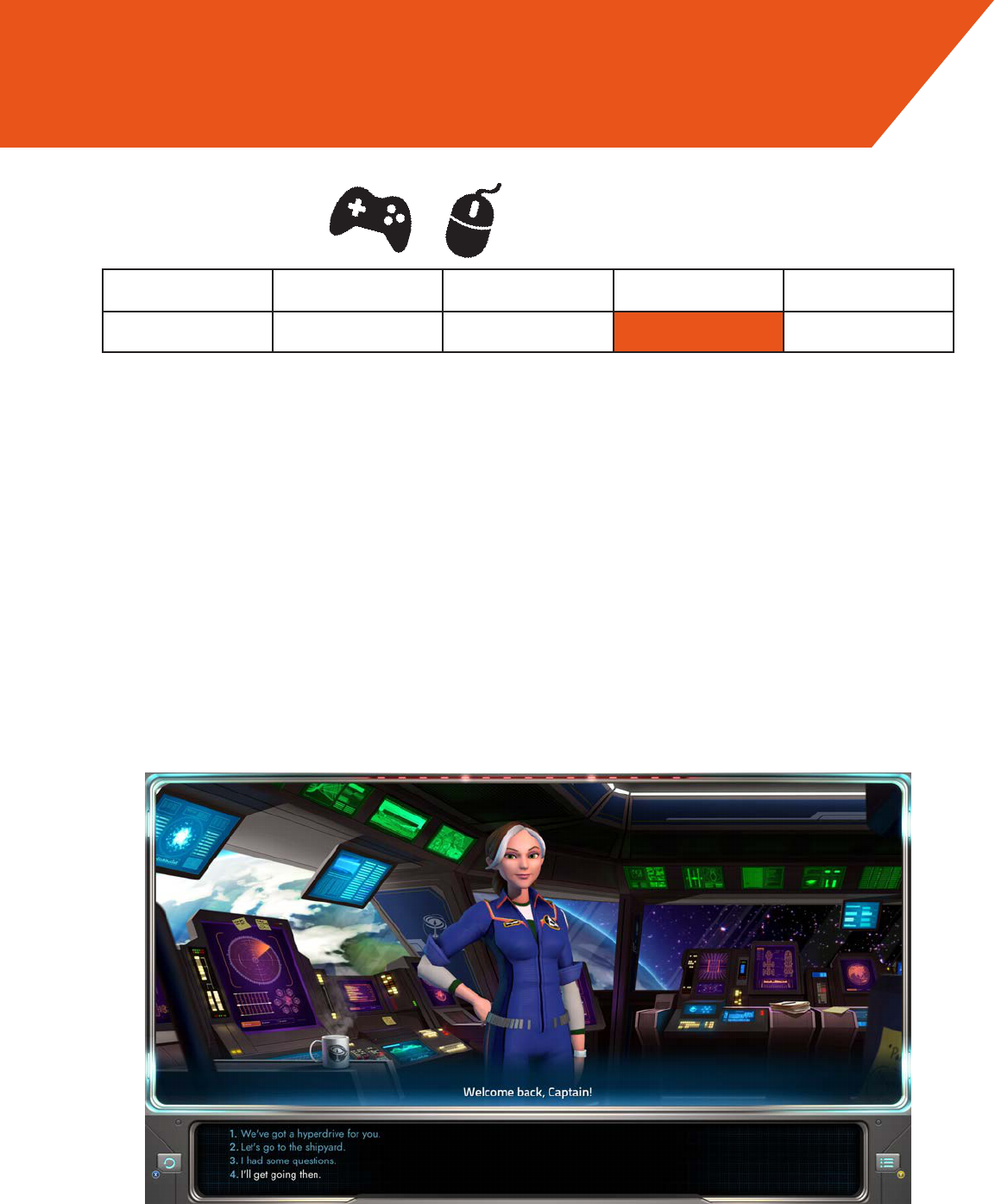
In dialogue screens, the same key/button that is used for advancing the dialogue is
used for entering/exiting the dialogue screen. When these commands are the same,
especially the ones for entering and exiting dialogue, it often results in players but-
ton-mashing their way out of dialogue and right back in, or skipping through lengths of
dialogue and accidentally selecting a decision choice they weren’t prepared for.
There is no universal cancel/exit button, so the player is forced to cycle to the
exit/back dialogue option when in the Communication window, made worse by the fact
that cycling through menu and dialogue options is currently a little clumsy on a control-
ler.
OK/Excellent Cosmetic Minor Major Catastrophe
0 1 2 3 4
Suggestion:
Designate a universal ‘exit/back’ command, like the ‘ESC’ key or ‘B’ button.
Suspension of Play
Severity
Evaluation
Wait a minute! You’ve already designated a ‘back’ command! Why isn’t this ubiquitous
throughout the game? Make it so.
OK/Excel-
lent
Cosmetic Missed Opportunity Major Catastrophe
0 1 2 3 4
Consistency and Standards
Severity
Evaluation
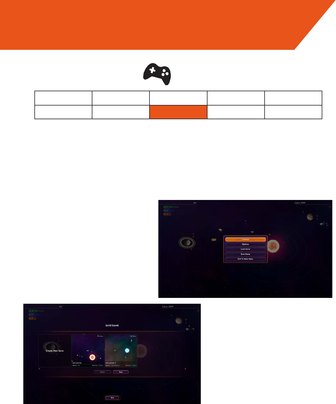
When opening some menus—notably the save menu—there is no menu option that is
highlighted at the start, requiring the player to either guess which option will be high-
lighted upon moving the control stick, or to wiggle the stick to reveal where they are in
the menu. This is not an issue for mouse controls.
OK/Excellent Cosmetic Minor Major Catastrophe
0 1 2 3 4
Suggestion:
When controllers are connected, pre-select an option to be highlighted so players know
where their next input will take them.
Visibility of System Status
Severity
Good
Bad
Evaluation
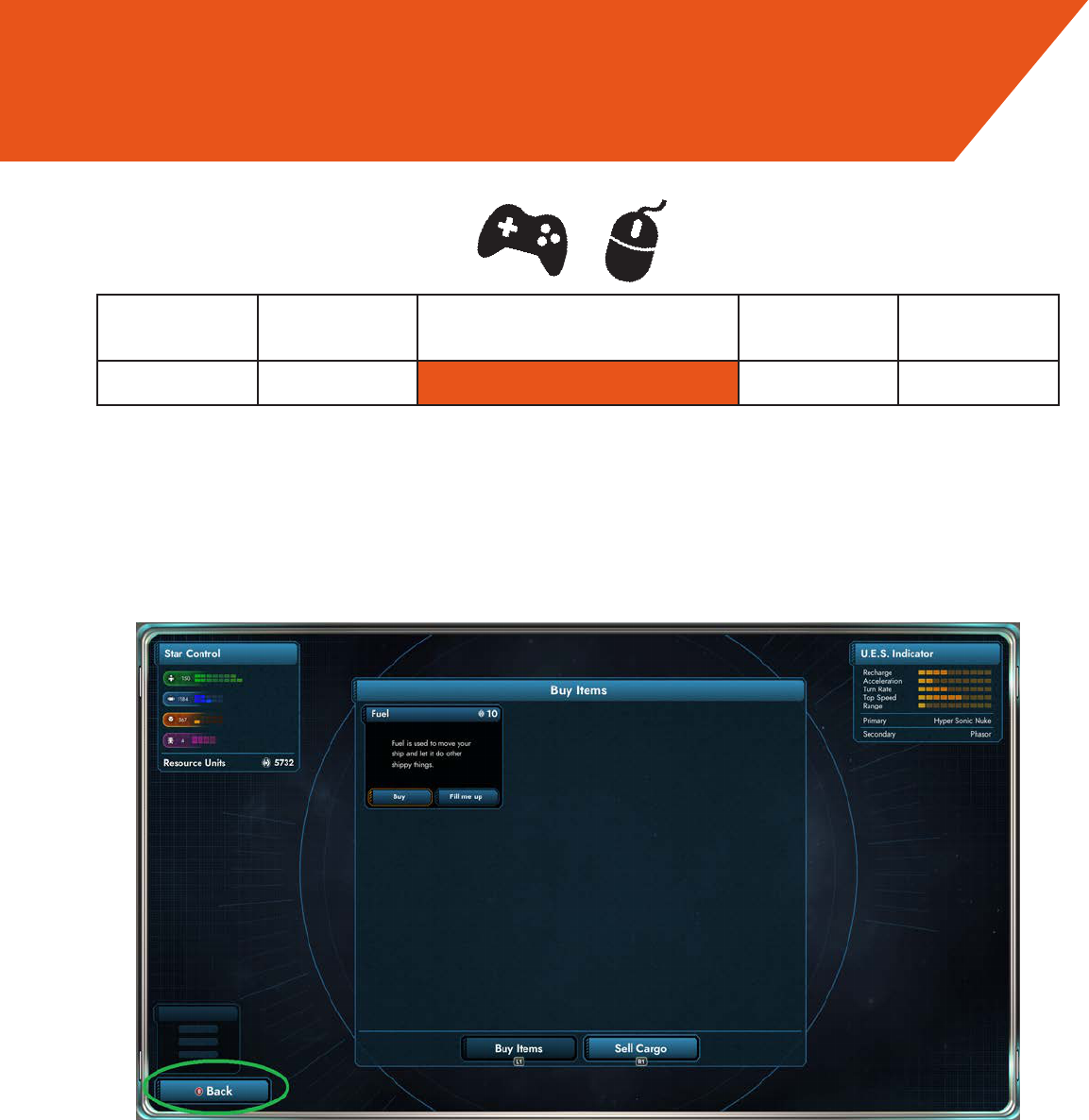
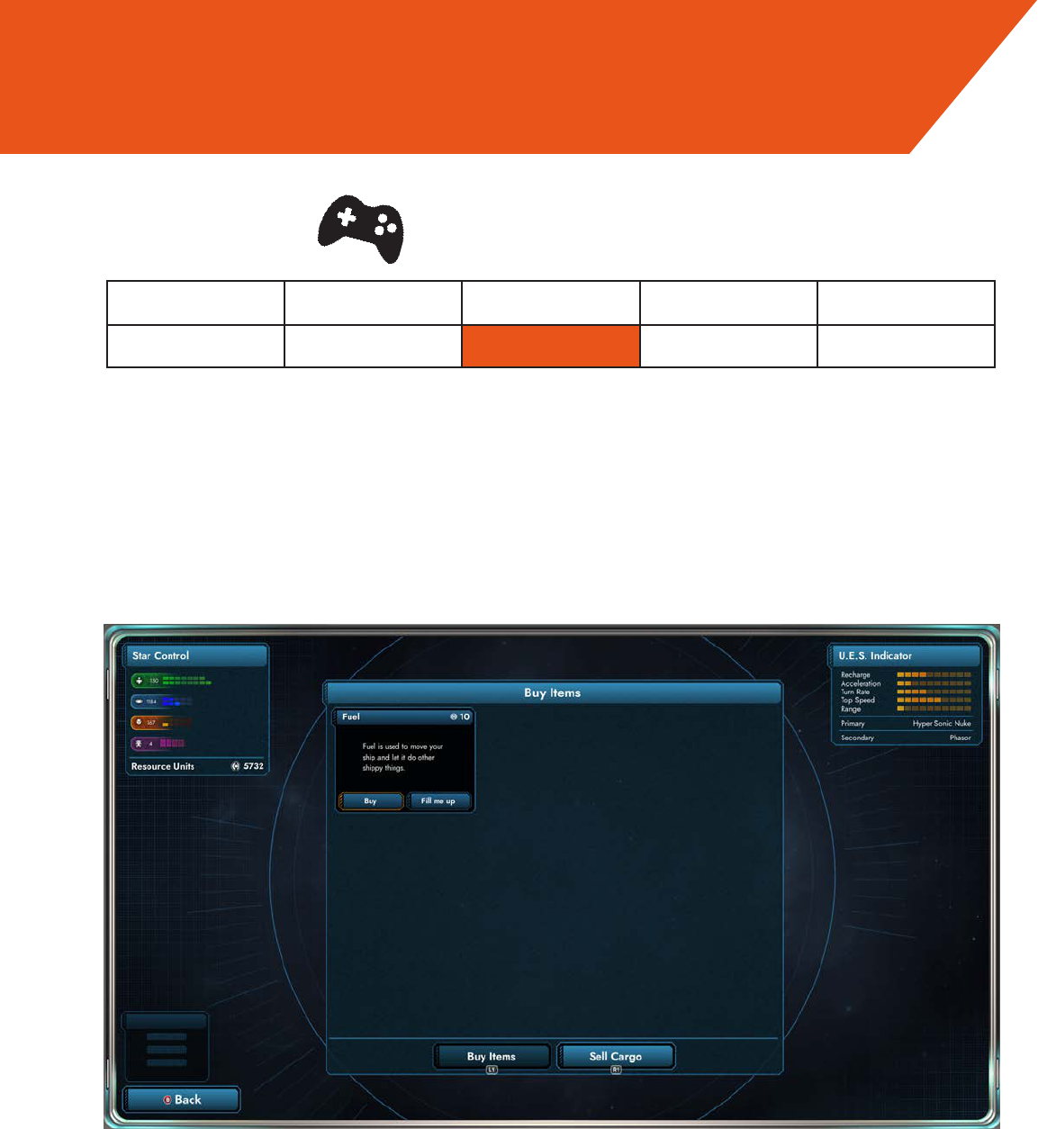
When refueling, no one buys fuel by individual 10-RU amounts, yet that is the rst
option to be highlighted upon entering that screen with a controller.
This isn’t a problem
for mouse controls, but the fact remains that the per-unit buying option is largely un-
necessary.
OK/Excellent Cosmetic Minor Major Catastrophe
0 1 2 3 4
Suggestions:
Make “Fill Me Up” the default option to rst be highlighted when navigating into the fuel
purchase screen.
You might consider adding an easily accessible refuel button on the main Starbase
screen, alongside the trade, outt, eet, and warp buttons.
Eciency of Play
Severity
Evaluation
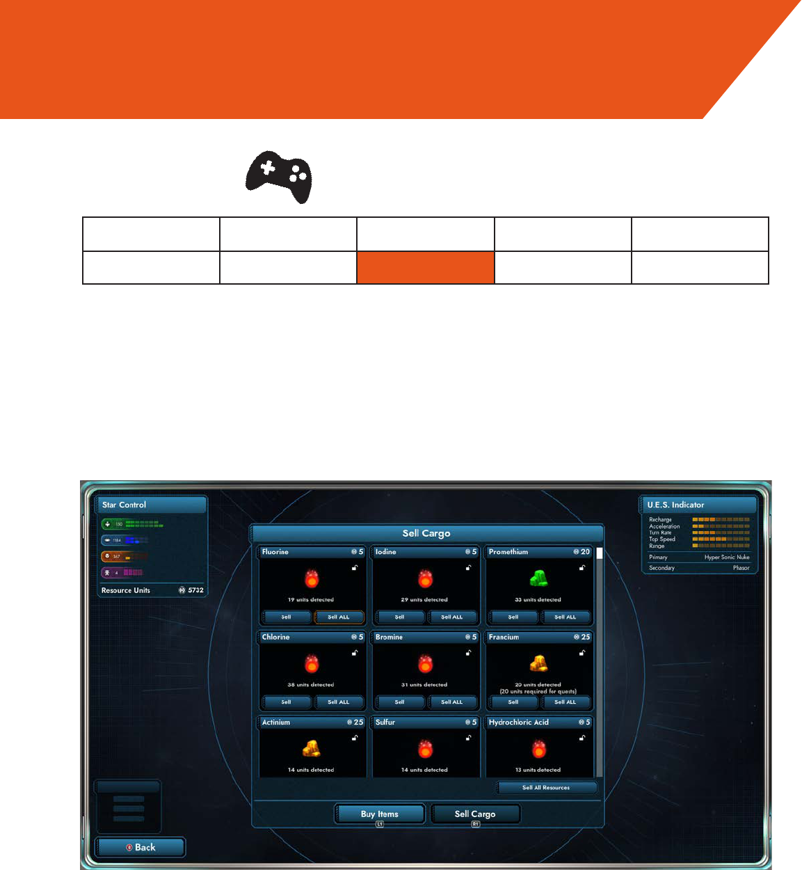
When selling cargo, “Sell All Goods” is selected the most often, yet reaching it with the
controller requires cycling through the entire height of the cargo screen to reach it, a
long process when your hold is full. I eventually gave up and now use the mouse to
click it.
OK/Excellent Cosmetic Minor Major Catastrophe
0 1 2 3 4
Suggestions:
Consider moving “Sell All Goods” to the top to be the rst thing highlighted when nav-
igating with the controller or at least nearby, and/or adding a hotkey/button that auto-
matically sells all items.
Eciency of Play
Severity
Evaluation
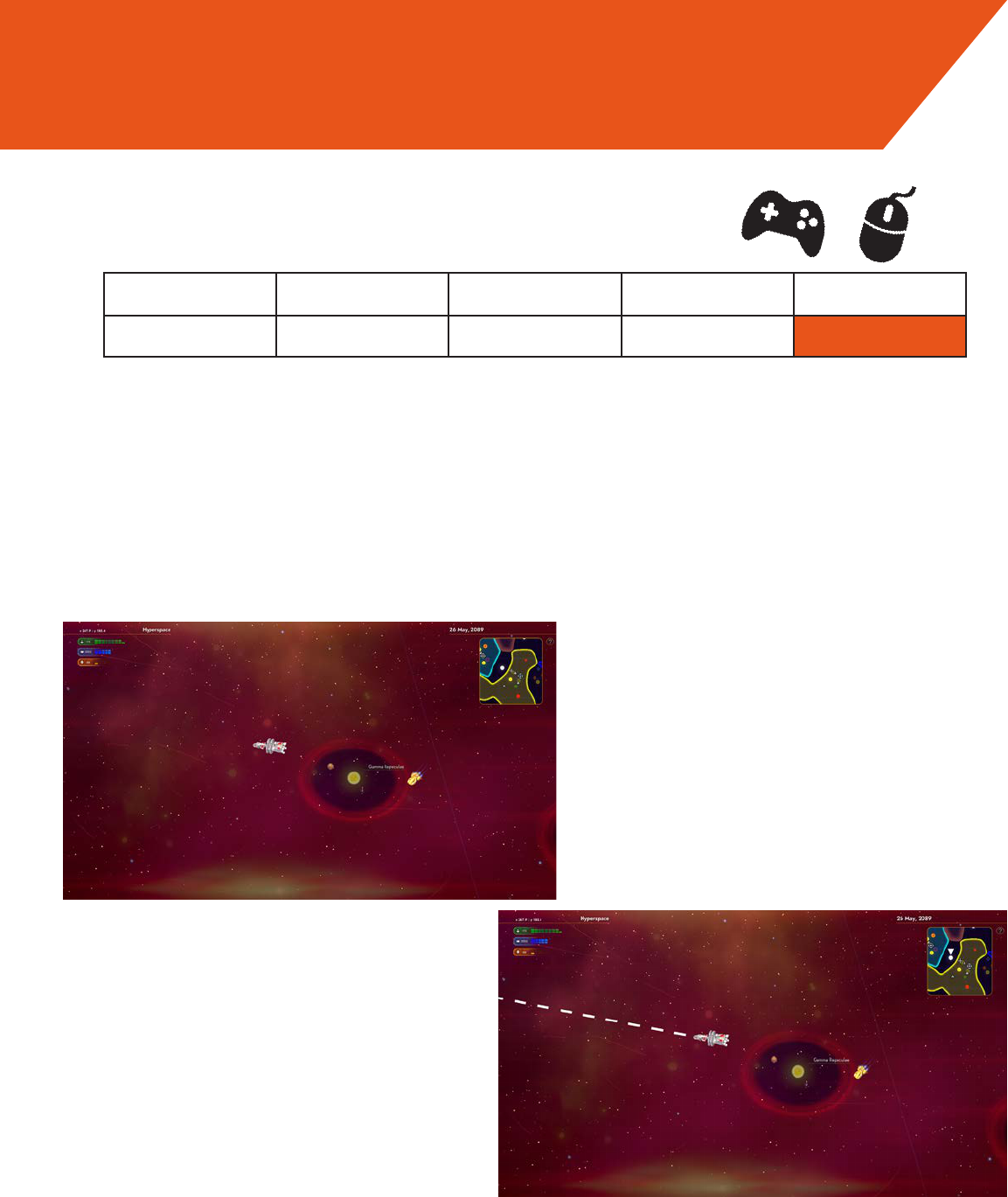
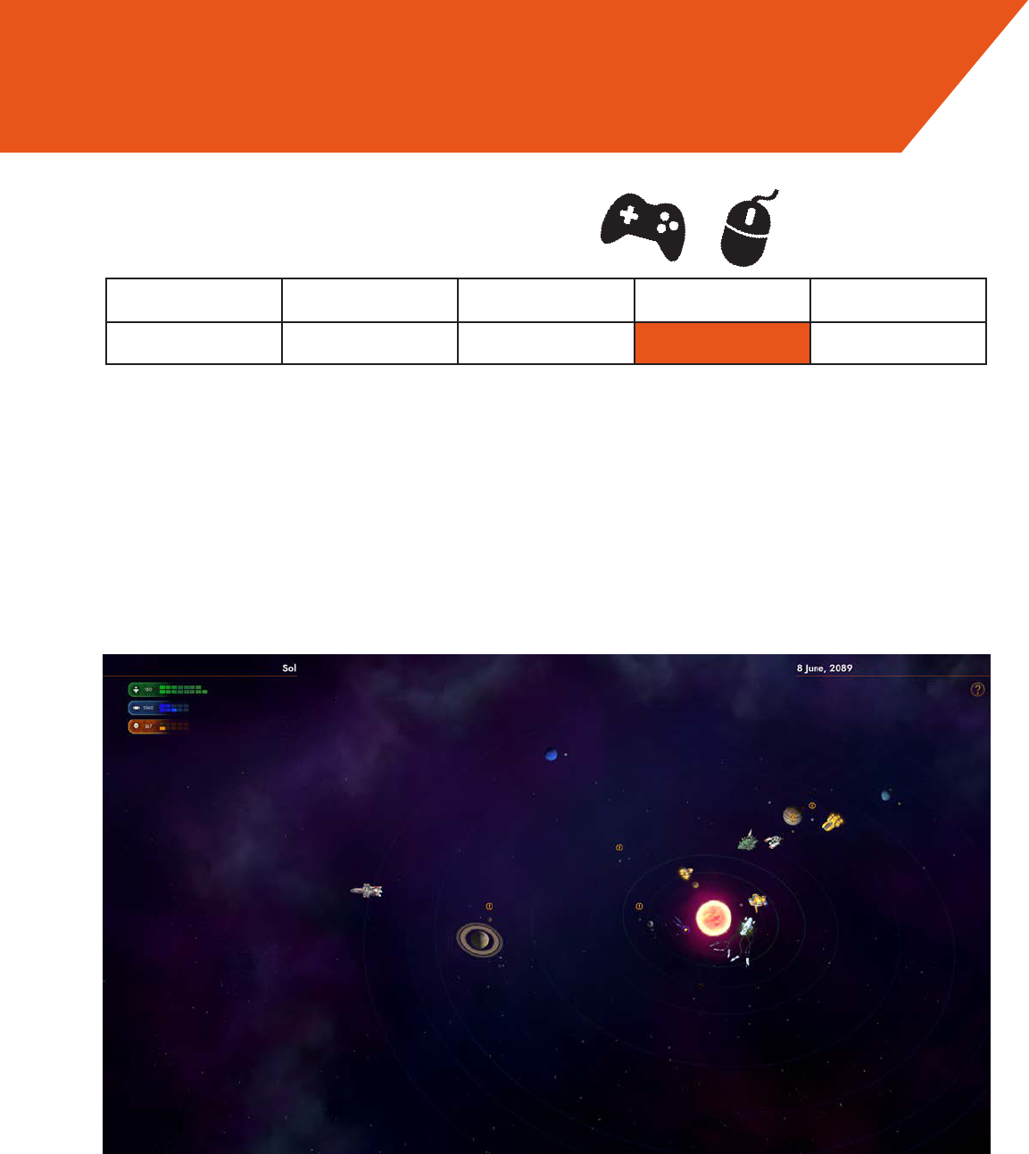
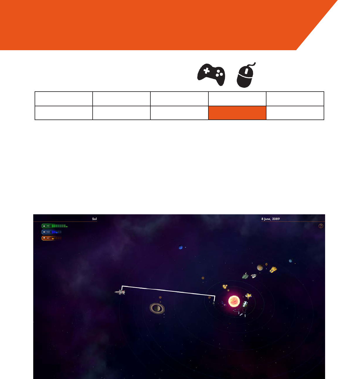
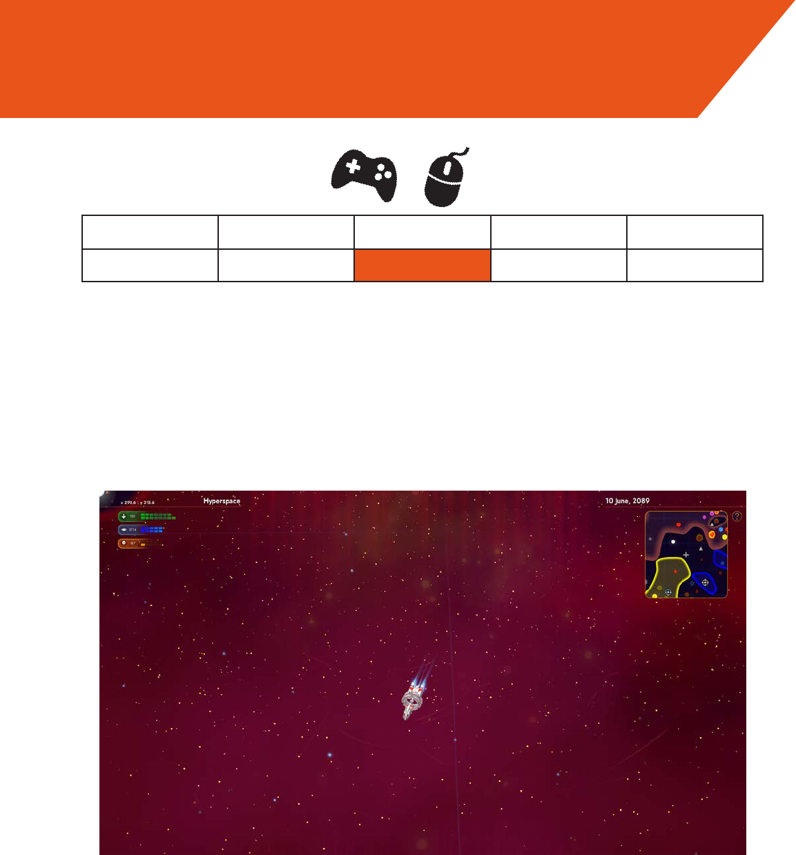
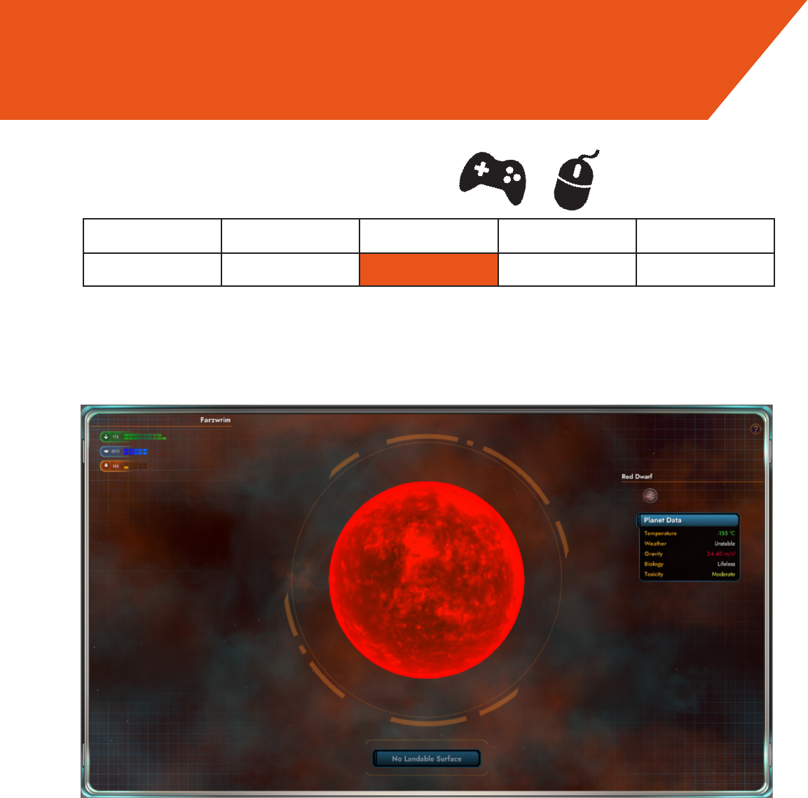
You can’t set any system as a waypoint visible on the hyperspace screen. Currently
autopilot is the only way to reliably maintain your bearings in hyperspace. For a game
that bills exploration as a selling point, this makes productive exploration towards any-
where outside minimap range impossible without frequent visits to the System Map,
disrupting gameplay.
OK/Excellent Cosmetic Minor Major Catastrophe
0 1 2 3 4
Suggestion:
It would be helpful to allow the player to set waypoints that vanish once they reach their
destination; this would allow players to select a given destination and explore their way
towards it, without staring at the minimap.
Visibility of System Status, Recognition vs. Recall
Severity
Current
Suggestion
Evaluation
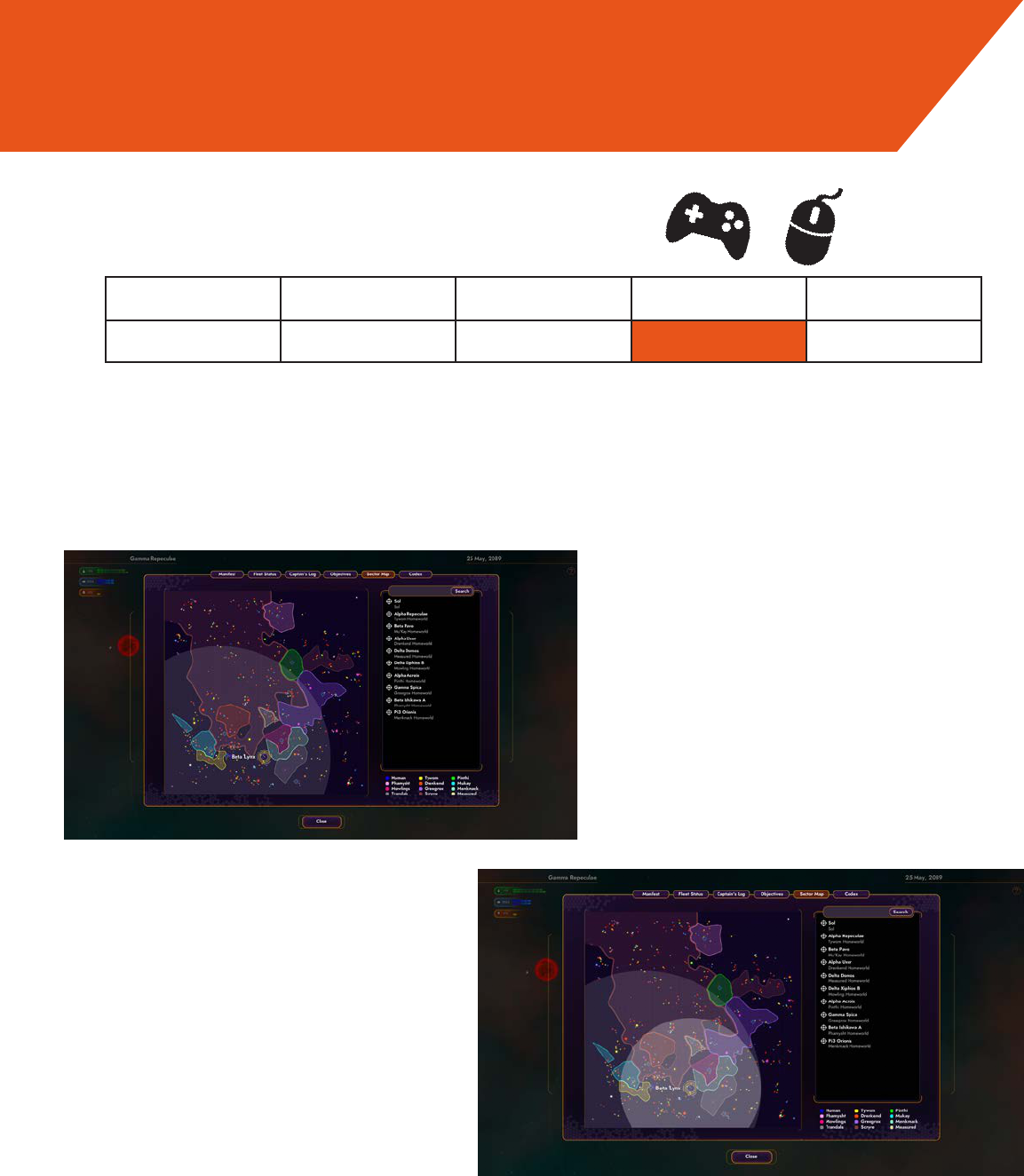
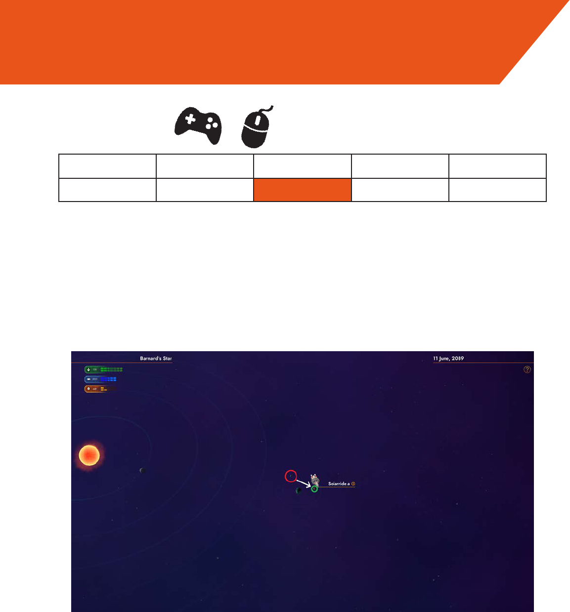
In the System Map, the transparent circle is a useful way to determine max range, but
it is not possible to accurately determine the possibility of returning to one’s original
position.
OK/Excellent Cosmetic Minor Major Catastrophe
0 1 2 3 4
Suggestion:
Implement a second circle, one that appears centered on any system the mouse/selec-
tion cursor hovers over, that illustrates the remaining range after reaching the selected
system, allowing players to determine whether a two-way trip or a detour is possible
without refueling.
Visibility of System Status, Informed failure
Severity
Current
Suggestion
Evaluation
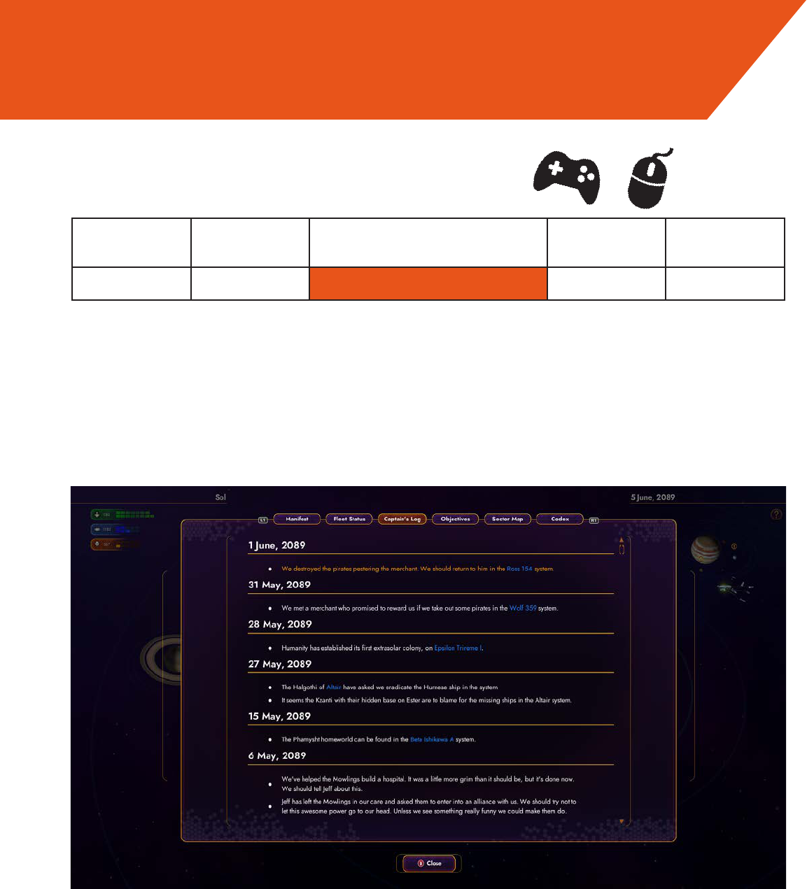
The ability to select locations from within the Captain’s Log for quick access to auto-pi-
lot is very good; I would suggest adding that same ability to the Objectives screen so
people can view these important locations in the context of their relevance to a given
mission, rather than chronologically, as in the captain’s log.
OK/Excel-
lent
Cosmetic Missed Opportunity Major Catastrophe
0 1 2 3 4
Eciency of Play, Visibility of System Status
Severity
Evaluation
The ship is way too slow during both interplanetary and interstellar travel, especially
when it approaches the edge of the solar system in interplanetary travel. This is less-
ened as one comes across better hyperdrives and engines, but is crippling in the early
game, and remains annoying even into mid-game unless the player sacrices precious
outtting slots for accelerators.
OK/Excellent Cosmetic Minor Major Catastrophe
0 1 2 3 4
Suggestion:
Consider changing speed to either faster overall or—as is seen in games like Elite:
Dangerous— having the ship accelerate as it distances itself from important locations,
and decelerate as it nears them, providing expediency on departure and control on
approach.
Eciency of Play, Suspension of Play
Severity
Evaluation
When starting autopilot within a star system, it adds nothing to the game to force the
ship to y to the edge of the system; the player is just sitting there waiting for the game
to continue.
OK/Excellent Cosmetic Minor Major Catastrophe
0 1 2 3 4
Suggestion:
Allow the ship to jump to hyperspace from any point in the system, and you could dis-
able this capability while enemy ships are in the system to prevent people from easily
eeing pursuing ships with autopilot.
Eciency of Play, Suspension of Play
Severity
Evaluation
When leaving a planet/dialogue view, you are prevented from immediately entering
another planet/dialogue view even when the ship makes contact, or the “Hail” button/
key is pressed. This is clearly useful to prevent players from accidentally reentering the
screens they just left, but is a bit annoying when the player is quick enough to get from
one moon/ship to another within that time delay, only to be forced to wait for the time to
pass.
OK/Excellent Cosmetic Minor Major Catastrophe
0 1 2 3 4
Suggestions:
This is only necessary for collision-initiated interactions like planet landings on the
same planet, and not for interactions that are initiated by the “Hail” command; allow
such interactions to be initiated instantaneously.
Eciency of Play
Severity
Traveling from the red moon to the green moon, the ship is forced to wait,
nestled against the surface.
Evaluation
The “Turn and Thrust” controls for the ship work well enough for the keyboard, but
don’t map as well to the controller, especially when the player must push the control
stick up to make their ship go down or sideways.
OK/Excellent Cosmetic Minor Major Catastrophe
0 1 2 3 4
Suggestions:
I would suggest having the ship’s heading bound to the left control stick, pointing in
whichever direction in which the stick is tilted, and keeping Thrust bound to the “X” but-
ton.
Visibility of System Status
Severity
“Why do I go down when I point the stick up?”
Evaluation
When the ship runs into a sun or gas giant, a landing window appears declaring land-
ing to be impossible. This is a wholly unnecessary waste of the player’s time.
OK/Excellent Cosmetic Minor Major Catastrophe
0 1 2 3 4
Suggestions:
Just make the sun a solid impassable object. You might consider doing the same to
gas giants.
Eciency of Play, Suspension of Play
Severity
Evaluation
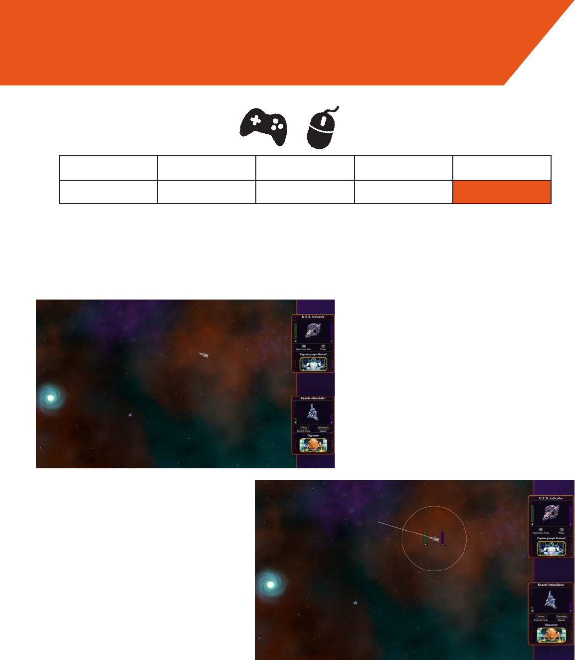
In combat, it is dicult to keep track of your ship’s heading and properly aim shots.
The player also has to look away from the ghting ships to check their health or weap-
on charge on the right hand side of the screen.
OK/Excellent Cosmetic Minor Major Catastrophe
0 1 2 3 4
Suggestion:
A simple indicator would be able to convey important information such as ship/weapon
direction, spread, and range, making combat much more intuitive and rewarding.
Find a way to put important combat information near the ship so the player doesn’t
have to divert attention from the battle.
Visibility of System Status
Severity
Current
Suggestion
Evaluation
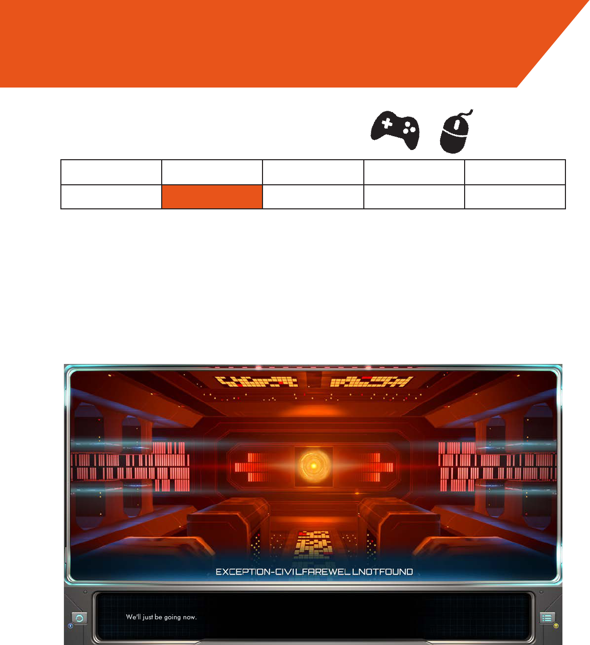
This is less of a usability concern, but I personally think it would be a positive change
for the Starbase A.I.’s vocabulary and memory to gradually improve as the player dis-
covers more Starbases, both because this would help convey progress of their discov-
ery over time, and because the [CIVILFAREWELLNOTFOUND] joke gets a bit old after
too many visits.
OK/Excellent Cosmetic Minor Major Catastrophe
0 1 2 3 4
Suggestions:
Have Starbase vocabulary gradually improve, perhaps learning new but incorrect/rude/
funny words and phrases before eventually getting everything right.
Match Between Interface and Game World
Severity
